Announcements, Community, Guides
Making every letter count
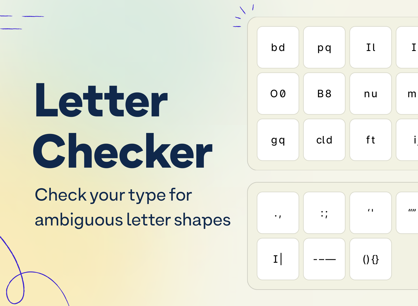
Use this free Figma resource to check the typefaces you use for ambiguous letter shapes so that your brand, marketing and product interfaces are inclusive and accessible for everyone.

Team Stark
Nov 29, 2023
Let’s talk about ambiguous letters in typography (and the free resource we just released)! Typography is a nuanced aspect of design that often slips under the radar, but as we know, the devil is in the details — especially when it comes to accessibility. And given that, text makes up large parts of any user interface (especially so given we’re looking at text-based conversational interfaces).
At its heart, typography is an art form, but it’s also a science and mode of communication. When letters on a page or screen look too similar, like the lowercase ‘l’ and uppercase ‘I’, or the number ‘0’ and the letter ‘O’, it can create a visual confusion.
This isn’t just a minor inconvenience either. For many individuals, it’s a barrier to understanding and accessing information – be it the text in an online article for school, banking interface, or employment information
So where do these typography issues show up? Often in…
-
Letters with nearly identical shapes such as a, e, o, & c
-
Mirrored letters such as d & b
-
Identical glyphs for different symbols such as I and l
- Flipped letters such as m & w
-
Anything potentially confusing or ambiguous
A tool to help you choose inclusive typefaces
We at Stark created a resource that helps you as a designer identify ambiguous letterforms and glyphs in the typeface you’re using. So, whether you’re doing an audit on your existing fonts or are in the process of picking a typeface for a new project, this little tool we created will help you make a choice that’s inclusive and accessible by default.
And here’s how you use it
We created this resource to exist right in Figma where you’re already doing all your design work. Open this free file to get started!
Auditing your typeface only takes 3 quick steps.
-
Open the style panel to edit the style called “Edit this style”.
-
Change the style’s typeface to the font you want to audit.
-
See test examples magically change so you can audit them.
To help you along the way, we included some educational tips and tricks. Every text layer is labeled with the name of the glyph so you can be double sure if something is a Zero or an ‘O’. The pangrams we use as example phrases have been specifically designed to highlight potentially confusing letter pairings.
Why Does This Matter?
Imagine trying to read a block of text where the b and d keep dancing and swapping places.
For the 1 in 5 people with dyslexia, and individuals with visual impairments, these ambiguities aren’t just confusing – they can make text practically indecipherable. Distinguishing between similar-looking characters is a significant challenge.
For context, Dyslexia is a learning disorder characterized by difficulties with accurate and/or fluent word recognition and by poor spelling abilities.
Consider this scenario: a person with dyslexia encounters a block of text in a font where certain letters are ambiguous, such as the lowercase ‘l’ and uppercase ‘I’, or the number ‘0’ and the letter ‘O’. These letters, due to their similarity in appearance, can be easily confused.
For someone with dyslexia, this confusion is amplified due to the way their brain processes written language. As a result, reading becomes a much more challenging and slower process, potentially leading to misunderstandings of the text. For instance, distinguishing between ‘0’ and ‘O’ in contexts like password inputs can be problematic, leading to errors and frustration.
These are just a few examples of how the choice of typography in anything from educational materials to security in websites can have a significant impact on digital accessibility and the way a person engages with the content.
Whether it’s in digital design, public signage, or print media, clear typography can open doors to information and opportunities. Clear typography isn’t just a “nice-to-have”—it’s essential for inclusivity.
P.S. We created and used this resource as we’re in the process of developing our very own typeface to be simultaneously as inclusive as possible and distinctly Stark. And we can’t wait to share the result with you all soon!