How to make your everyday images and visual content accessible
From alternative text to figcaptions, here are some best practices to implement, as well as some of the key things to avoid, when making visual content accessible.

Claudio Luis Vera
Aug 12, 2021

Whenever you use visual content like photos or diagrams in your site, application, or social media posts, it’s important to ensure that it’s accessible to everyone. That includes those of us who are blind or who have a visual impairment, or for some reason simply can’t download those visual assets.
Alternative (“alt”) text
The best way to ensure that everyone can perceive or understand your visual content is to make sure it exists in an alternative format. Most commonly, this is provided by alternative or alt text via an alt attribute within the HTML image element itself. Here’s an example: <img src="myimage.jpg" alt="my image description"/>
Alt text needs to be short and to the point, as many authoring platforms strictly limit the number of characters you can use. It’s best to describe the image in terms of why it’s being included on the page. While you could use “two Black men speaking” to describe the image below, it’s far more useful to say “Martin Luther King and Malcom X chatting before a press conference in 1964”. If the intent of the image is to describe how the civil rights leaders got along, then a better description is: “relations between Dr. King and Malcolm X were friendly but sometimes strained”.

When in doubt, always try to match your alt text to match your editorial intent.
Figure and figcaption
Another technique is to use a figure tag for the visual content and a figcaption element to provide a visible caption for the image. This technique is visible to both screen readers and sighted users, so it isn’t technically considered alternative text.
<figure>
  <img src="martin-malcolm.jpg" alt="Martin Luther King and Malcom X" />
  <figcaption>
    Figure 1 - Martin Luther King and Malcolm X Waiting for Press Conference
  </figcaption>
</figure>
Social media
If you’re posting images in social media, it’s important to always include alt text or a description of your image. So, what if the social media platform doesn’t have a place to add your alt text? Easy! You simply write out your alt text starting with "description:" in the post, or as the first reply to the original post.
Description: Martin Luther King and Malcolm X waiting for a press conference.
If you’re posting a banner for an event, make sure that all of the text in your graphic is included in your description or in the alt text. It wouldn’t be fair to only let sighted people know the date or venue of your event, right?
Decorative images
What if the image is just there to set the tone? If it’s not important to the content, then you have a few ways you can mark it as decorative, so that screen readers skip it. The simplest (and most popular) way is to add an empty alt attribute, as in alt="". Another technique is to tell the screen reader explicitly that the image is just there to pretty up the presentation of the page, as in this example: <img src="bk-pattern.png" role="presentation" />
Things to avoid
If you can avoid it, don’t use images as a way to deliver your text, especially just to make it prettier. Instead, use text and headings whenever possible, so that screen readers and search engines can actually pick up your text.
For the last century, laying text over an image has been a popular device in graphic design. More recently transparent “ghost” buttons have become popular as well. But in movable or responsive layouts, these can lead to illegible combinations, where white text can be over a pale sky or a busy patch in a photo. For the sake of accessibility, you can sidestep the issue by placing your headline next to the image, or by placing the text over a solid color. A more daring technique involves using a translucent shape or gradient under the image, or to colorize the underlying image. But never place text directly over an image unless you have 100% certainty that you’ll have enough color contrast anywhere the text lies.
Alternative content for graphs and diagrams
Translating data visualization to text requires more attention than static images. There’s far more information than 128 characters or even two sentences could convey. The best approach is to use a pyramid structure for writing alt-text, going from the most general to the most specific.
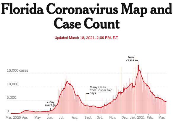
- First, describe what is being displayed in the graphic - if that’s not in the title already. If there are X and Y axes, describe them, such as COVID-19 infections in the state of Florida over time.
- Next, describe the point that the graphic is meant to prove, such as Florida is recovering from a second wave of COVID-19 infections. You could elaborate and describe the timing of the other waves of infections for example, or you could cite highlights of certain interest in your visualization, such as a peak of over 15,000 new infections on January 6, 2021. Try to describe outliers and other elements that would be readily visible.
- Finally, you should link to a table that contains the data used to build the chart. If you have thousands or millions of results, then summary or redacted data will do. You’ll allow a screen reader user to check individual data points and to draw conclusions of their own.
How’s that for empowerment?
Designing accessible graphs and diagrams
Data visualizations can be difficult to make out at small sizes — and they’re even more of a challenge if you have low vision. Choosing colors with high contrast is a great start. But what if your graph has 10 colors? or 15? or 20? In those cases, it’s impossible to have enough contrast between adjacent colors. Leaving a visible gap between elements can be a huge help, especially if you’re building a pie or doughnut chart, or if you have a stacked bar chart.
Don’t forget that data labels need to be easy to read as well. Make sure your font size is adequate that the font color has enough color contrast against the background that it’s on. Some data vizualization tools allow you to place the data labels inside the colored blocks and to manipulate their size, two tricks that are well worth trying out.
In general, it’s best to think of an alternative storytelling path that doesn’t rely on sight. If you had no visuals at your disposal, how would you make the same points? If you keep this strategy in mind, it’ll inform the editorial choices you make, like what to include in your alt text and how to describe complex visuals.
A previous version of this article included a section on longdesc as a means to add alternative content. It has since been deprecated by the major browsers and will see declining support.
Want to join a community of other designers, developers, and product managers to share, learn, and talk shop around all things accessibility? Join our Slack community, and follow us on Twitter and Instagram.
To stay up to date with the latest features and news, sign up for our newsletter. And as you’re diving in to the new feature, let us know what you think!