Stark’s developers share their favorite tips for writing accessible apps with Apple’s SwiftUI
Learn how we used SwiftUI to make sure Stark for Mac was accessible from the start.

Matt Curtis
Oct 25, 2022

Here at Stark, we think a lot about how we can build every tool and feature accessibly from the start. “Baked-in” accessibility is one of our most important values.
When we started working on Stark for Mac (now available in the App Store) we knew we wanted to build the app with Apple’s SwiftUI, a framework for defining the user interface and behavior an app will have across platforms.
Since SwiftUI was relatively new when we started, accessibility “best practices” were less clear, which meant figuring them out as we built the app. To our delight, we found that Apple’s new framework makes it easy to build accessibly.
In this article, we’ll share some tips we created while building Stark for Mac and how you can use them to develop your own SwiftUI apps.
Tip #1: Take advantage of SwiftUI’s native controls
This might be controversial, but I’ll say it anyway: custom isn’t always better.
I know, I know, SwiftUI makes it easy to create a rectangle and slap on a tap event handler to create a button, but custom controls like these are hard to make accessible.
For example, suppose someone is using VoiceOver (or similar assistive technology) to access your app. To find and use your controls, they will need to
-
Have proper labels
-
Be clear about what kind of control they are (e.g., “button”)
-
Be fully interactive
Doing this can take time and is easy to get wrong. That’s why we used SwiftUI’s native controls, which are accessible out of the box. (We like that here at Stark!) Here are just 2 benefits native controls have to offer:
-
Free accessibility. Using native controls meant we spent far less effort making our controls accessible. This includes the semantics like labels, roles, hints, and interactions (think changing a slider’s value or activating a button) that an accessible control must have.
-
User familiarity. Because our controls look and act the way users expect, they don’t have to guess or learn how to use them. This can dramatically improve the mental accessibility of your app.
What if you need to create custom controls?
If you need to stray from Tim Cook’s Happy Path™ and do something more custom, don’t worry—you can customize SwiftUI’s native controls without sacrificing accessibility by using their styling APIs.
A great example of this is when you're working with buttons. Let’s say we wanted to create a red button that contains a vertically-stacked icon and label. We could write:
Button {
   favorite()
} label: {
   VStack {
       Image(systemName: "star")

       Text("Favorite")
   }
   .padding()
   .background(.red)
}
This would work, but it’s not an ideal solution. If we wanted to reuse this button, we’d have to create a wrapper around it with the same parameters (the label and action). This feels redundant, especially if we have to do it for every button style we want to create.
Using SwiftUI’s styling APIs, we can get the same result, but one that’s reusable and lets us focus on what we care about — the control’s appearance — without those extra parameters we don’t care about.
Let’s revisit the red button example, this time defining styles for the button and its label:
struct VerticalRedButtonStyle: ButtonStyle {

   private struct VerticalLabelStyle: LabelStyle {

       func makeBody(configuration: Configuration) {
           VStack {
               configuration.icon
               configuration.title
           }
       }

   }

   func makeBody(configuration: Configuration) {
       configuration.label
           .labelStyle(VerticalLabelStyle())
           .background(Color.red)
           .padding()
   }

}
Now let’s apply those styles to the button:
Button {
   favorite()
} label: {
   Label("Favorite", systemImage: "star")
}
.buttonStyle(VerticalRedButtonStyle())
And there you have it—the same effect, but reusable and accessible. The best part is that these styling APIs are also available for other controls like pickers, menus, toggles, and indicators.
Beyond the styling APIs
If SwiftUI’s styling APIs don’t work for you, there are a few other options.
The easiest is the View.accessibilityRepresentation() method, which lets you reuse the accessibility of a native control for your custom one. Here’s an example of a slider that, despite being custom, remains accessible by using accessibilityRepresentation():
@State var value: Double = 0

MyCustomSlider(value: $value, in: 0..<100)
    .accessibilityRepresentation {
        Slider(value: $value, in: 0..<100)
    }
Another option is manually defining your view’s accessibility, which is more effort but might be the right choice depending on your needs. You can read more about the accessibility view modifiers available to you.
Tip #2: Stick to SwiftUI’s system colors
When it comes to color and accessibility in your app, there are several things you’ll often need to consider:
-
Contrast. Can users clearly distinguish your icons and text against their backgrounds?
-
User preference. Do your colors adapt to accessibility preferences a user might have enabled, like high contrast mode?
-
Dark mode. Do you have dark mode versions of your colors?
This is where Apple’s system colors come to the rescue and solve these problems for you.
When you diverge from system colors, you have to do a lot of this work from scratch. If accessibility is important to you, consider passing these responsibilities over to Apple by using the system colors in SwiftUI.
Tip #3: Make sure everyone can understand and use your app
We often think of an app’s interface as visual, but the reality is that people interact with an app’s interface in many different ways. This means that you need to think about how your interface’s semantics, or meaning, can be understood by someone who might not be interacting with it purely visually.
A common example is images, which you can categorize as either decorative or non-decorative.
A decorative image doesn’t contain any information that impacts how a user navigates or uses something. For these images, you’ll want to ensure they can’t be read by assistive technology. Otherwise, they’re more likely to confuse a user.
A non-decorative image, however, contains information a user does need to understand and use your app and therefore does need a description.
With SwiftUI, there are a few ways to add descriptions to your images:
//  A labelled image:

Image("Kangaroo", label: Text("A kangaroo in a field"))

//  A "decorative", or inessential, image:

Image(decorative: "Kangaroo")

// Alternatively:

Image("Kangaroo")
    .accessibilityLabel(Text("A kangaroo in a field."))

Image("Kangaroo")
    .accessibilityHidden(true)
Beyond images
There are more complicated instances to consider besides images. Here’s one example from Stark for Mac:
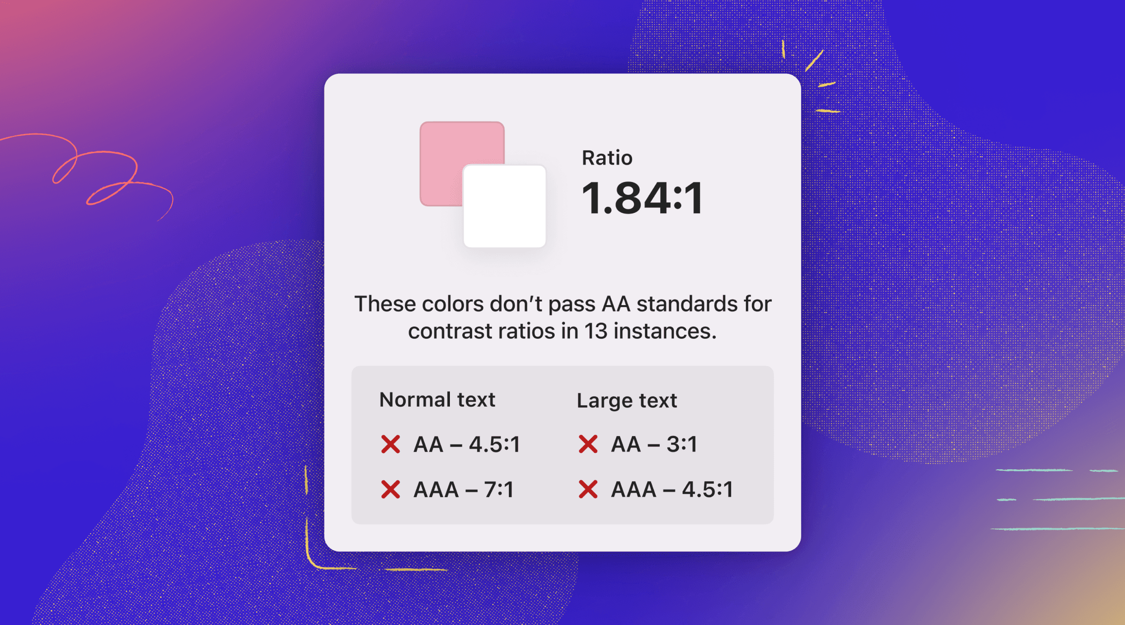
If you're a fully-sighted person, it's likely easier to understand what's happening here. You have a number of visual cues — like the red "x" next to each level failed — to help indicate how your colors' contrast is failing. But for someone who is not sighted or simply has a different type of vision, what's here still needs to be communicated.
In Stark for Mac, we use SwiftUI's View.accessibilityLabel() and accessibilityElement(.combine) modifiers to give these views labels that make them more accessible, like "Colors fail to meet AA minimum contrast ratio of 4.5:1."
Here’s an example of what this looks like with SwiftUI:
HStack {
    Image("fail-x")

    Text("AA — 4.5:1")
}
.accessibilityElement(children: .ignore)
.accessibilityLabel(Text("Colors fail to meet AA minimum contrast ratio of 4.5:1"))
If you want to learn more about how you can implement accessible apps on Apple’s platforms, their accessibility documentation for developers is a great place to start.
And if you want to supercharge your accessibility efforts, check out Stark for Mac in the App Store!