An all-new beautiful design, smart suggestions from your design system, new annotation tools, and so much more.
Stark in Figma and your browser just got a brand-new look and feel that’s faster and more intuitive than ever plus a host of new features for design systems and developers.

Team Stark
May 29, 2024
This is what we call a jam-packed release! As usual, our team has been on fire – talking to our customers and community, digesting feedback, prioritizing feature requests, all with the goal to create the best Stark experience yet. Pssst, without sharing any spoilers, we have a lot more in store for you in the coming weeks!
So, without further ado, let’s dive into the details of today’s major update to Stark for Figma and your browsers.
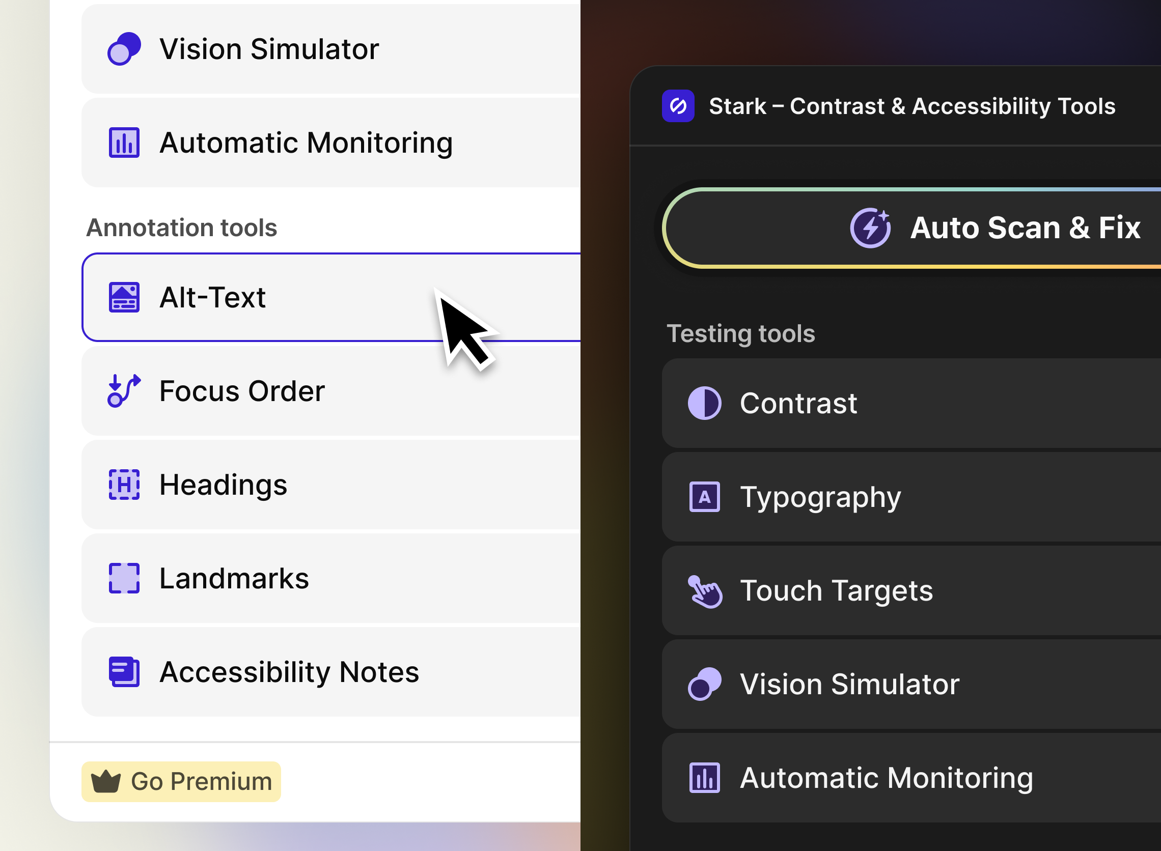
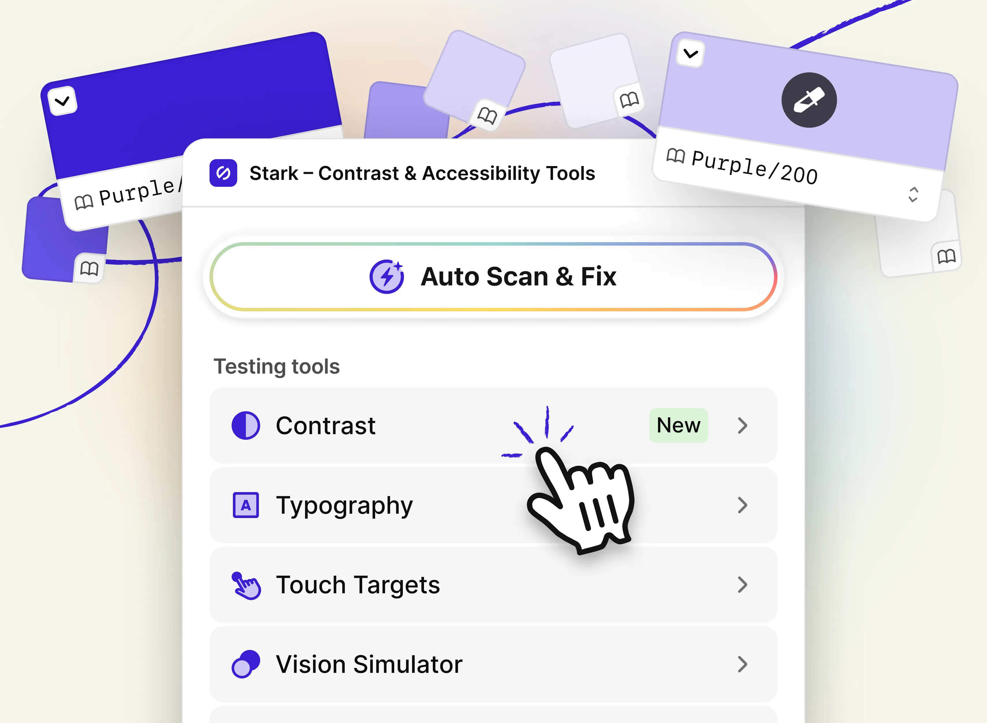
An all-new beautiful design
The first thing you’ll notice when you open Stark for Figma or in your browser is the beautiful, clean, redesigned UI. As we’ve been adding more and more tools to Stark, our goal is to ensure your experience stays as easy to use as possible.
With the new design, we’re reducing visual clutter while adding elements such as section headers to make our UI even more intuitive. Now, it’s crystal clear which tools are for testing, inspecting, and annotating.
The redesigned tool buttons feel more lightweight with their new rounded corners and light gray background. And with the newly added subtle animations on hover, we’re adding a new quality of interactivity. They’re so fun to use!
Color suggestions from your design system libraries
This has been the most requested feature for a long time, and we couldn’t be more excited to finally launch the ability to merge accessibility and your design system with Stark’s color suggestions (to start!).
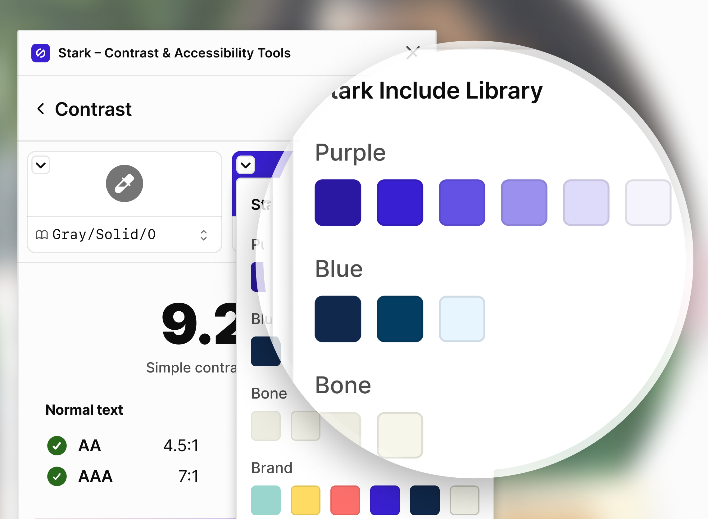
The coolest thing about this new feature is how intuitive it is. Our product team really went all-in, and made this experience super seamless. These new color suggestions are a major boost for teams working within a sophisticated design system and will speed up your workflow!
As soon as you check an element in your design file that’s using a color from your design system, it’ll show up in the color swatches on top of the contrast checker with its variable name. Stark checks the contrast ratio in real-time, then automatically looks through all colors in your design system library that fall into the same color category, and presents the ones that match in the suggestions panel at the bottom for both foreground and background.
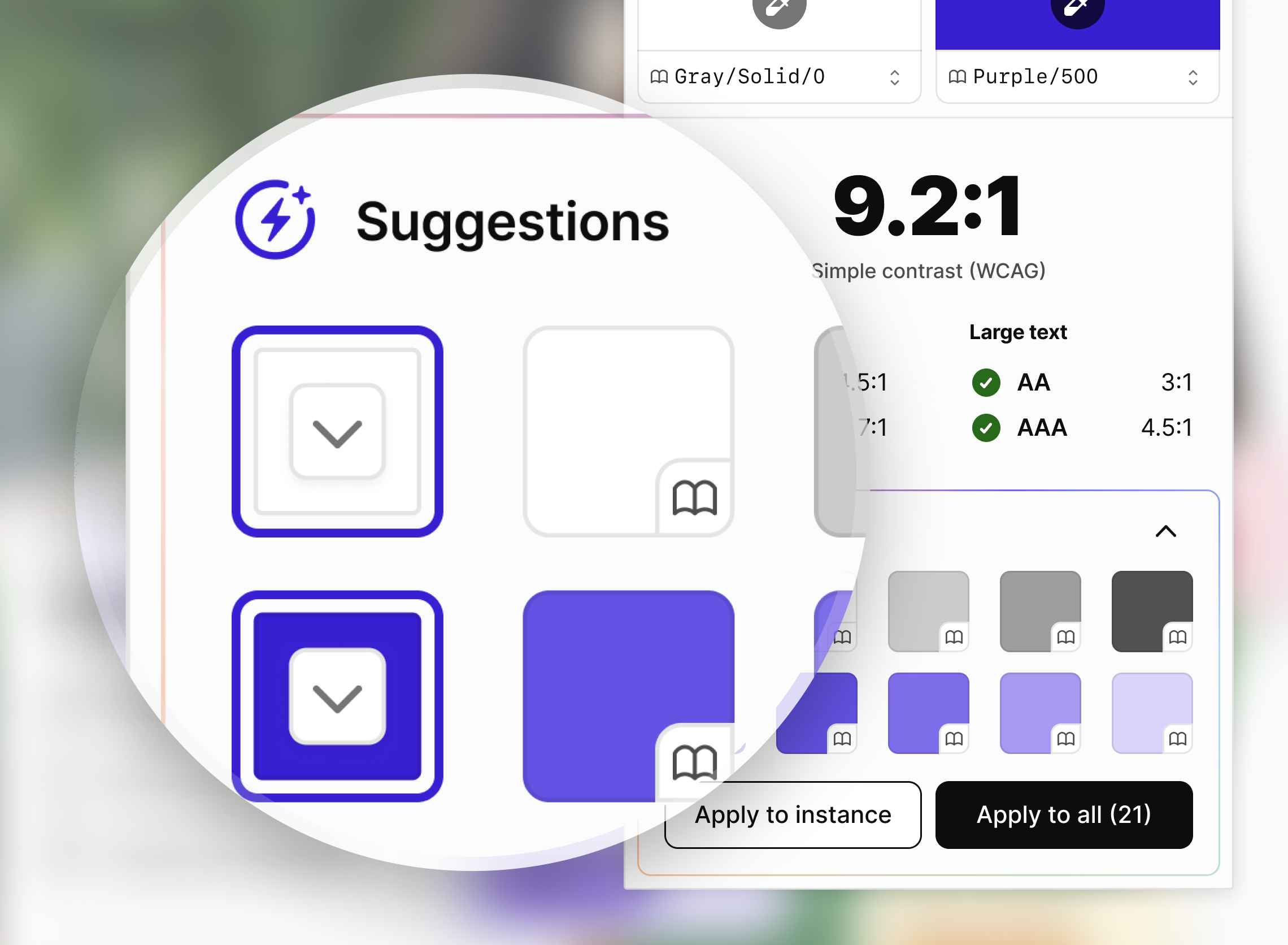
You can identify which colors come from your library thanks to a little “open book” icon as well as the color name that will show on hover. In case Stark can’t find other colors in your library that fall in the same category, it will auto-generate hues that will pass for you to choose from. That way you can also add colors that might be missing to your design system with ease.
And just in case you want to go for a completely different color from your design system to fix a contrast issue, you can do that as well, simply by clicking the down arrow on the first swatch which will bring up the color picker with all your design system colors in one place.
Three brand-new annotation tools to streamline design-dev handover
Ensuring designs and design intent are clearly communicated when handing files over to developers is critical to reducing accessibility issues and in turn ensuring the development of inclusive product experiences. With Stark’s annotation on the canvas combined with the new annotations sidebar plus our integration into Figma’s Dev Mode, annotations are seamless.
So, today we’re announcing two new annotation tools that many of our customers had requested as well as a major update to our landmarks annotation tool.
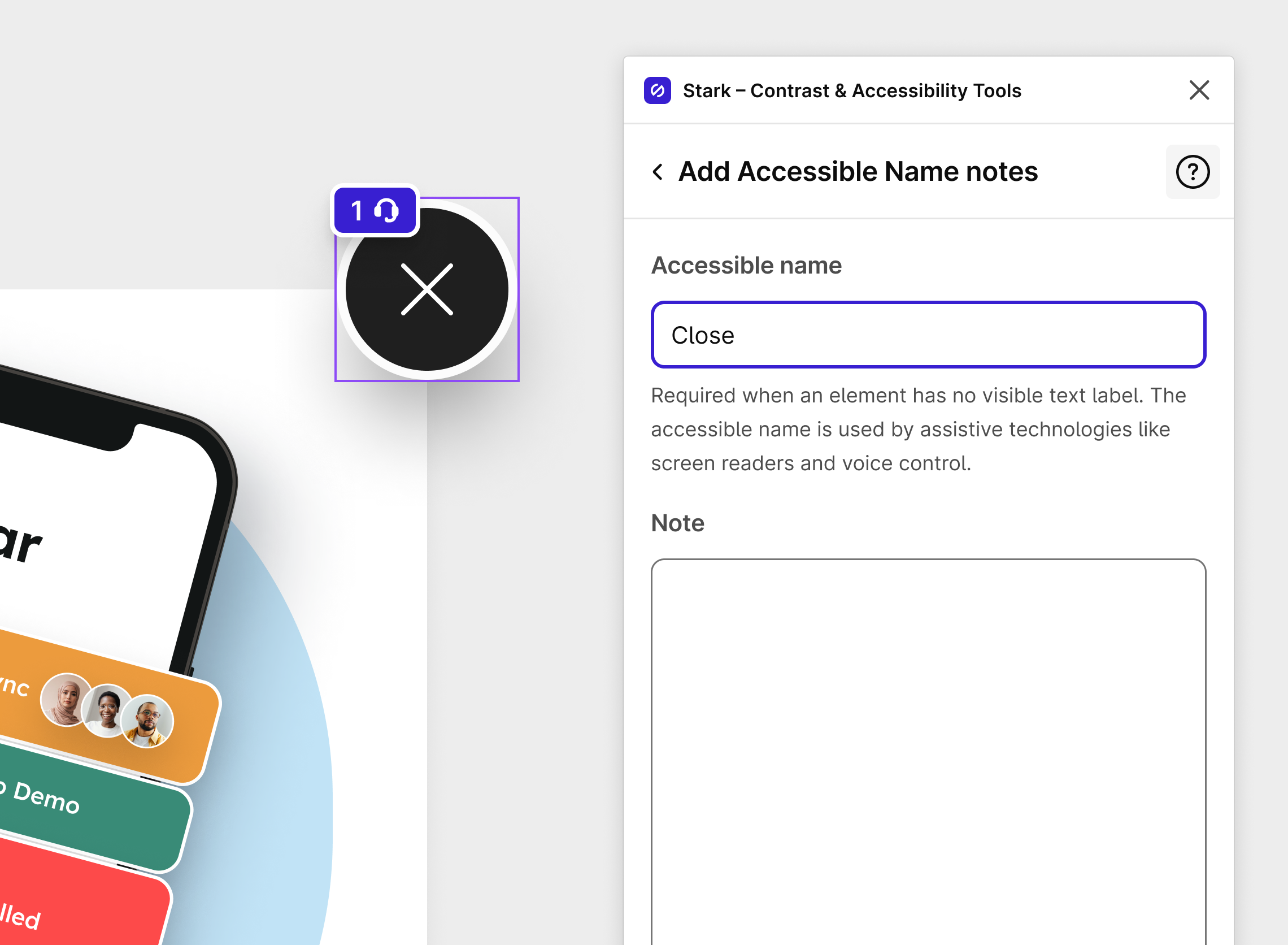
New Accessible Name annotations
If you’re on a team that is designing for a variety of different platforms, you might want to specify screen reader output or voice commands in a technology-agnostic way to capture the intended experience without having to be specific about its implementation. The new Accessible Name annotation tool offers just that.
Like with any other Stark tool, you interact directly with the canvas to annotate accessible names:
-
Select the element on the canvas that you’d like to annotate
-
Click “Add item” to fill in your information and any notes for your developers
-
Hit “done” to add the annotation which will appear both on the canvas and in the annotation side panel.
New React Native annotations
Many product teams embrace the platform-agnostic development workflow React Native enables. For designers that means you need to deliver annotations that are in-line with what our developers would expect to ensure the React Native codes creates fully accessible experiences.
To annotate your design according to React Native conventions:
-
Select the element on the canvas that you’d like to annotate
-
Click “Add item” to fill in your information and any notes for your developers
-
Hit “done” to add the annotation which will appear both on the canvas and in the annotation side panel.
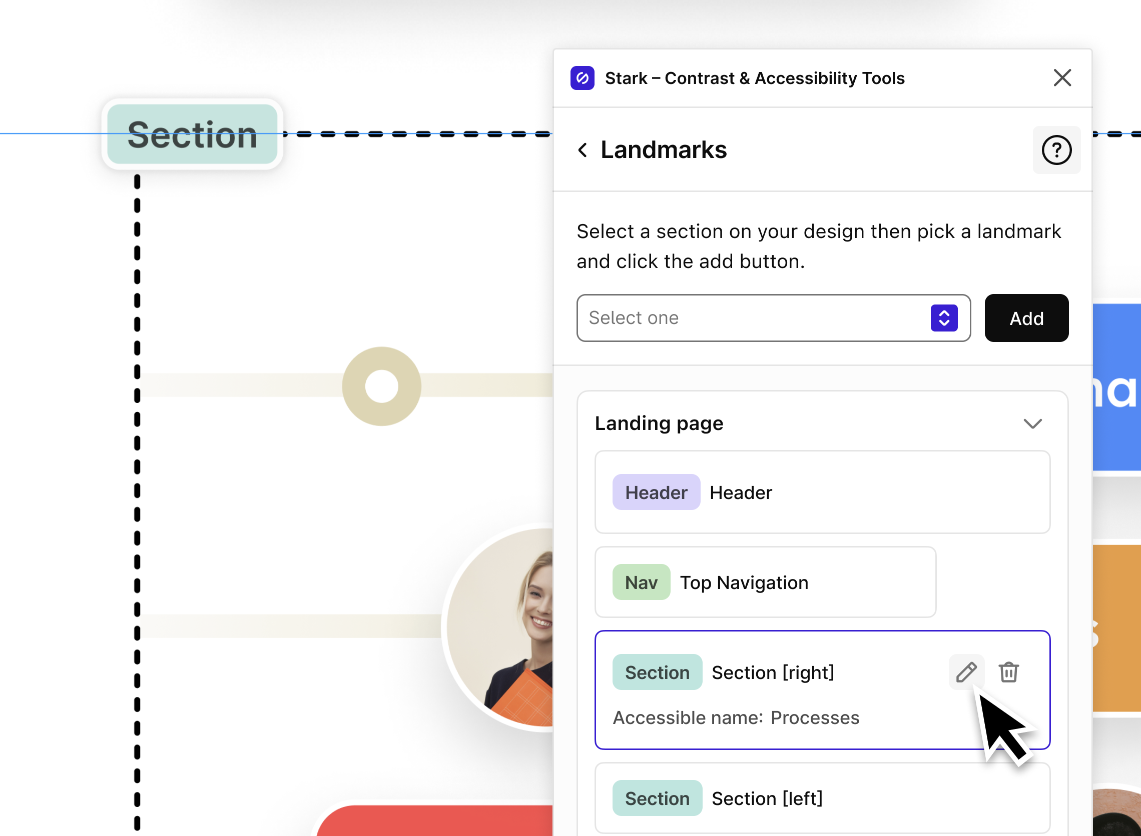
Updated Landmarks annotations
For screen reader users landmarks are an important way to navigate your experience with clarity and ease. Annotating your design with landmarks ensures that developers know where to place them in the code in accordance with the intended user experience. Today we’re updating the much-loved Landmarks tool in Stark, and here’s how:
When a page has multiple landmarks of the same type it’s imperative that those have specific accessible names. With the latest version of Stark’s Landmarks tool you can now specify accessible names for each landmark directly in your annotations. The accessible name and note will appear in the annotations sidebar together with the rest of the landmark information so it’s easy for your developers to bring into code.
To get started with landmark annotations, you simply:
-
Select the element on the canvas that you’d like to annotate
-
Select the landmark type from the dropdown and hit “Add” which places the landmark annotation on the canvas
-
Click the specific landmark or the pen icon to add / edit an accessible name and note for this landmark
Stark for your browser got a whole lot better for developers
We see countless developers, QA testers, PMs, and of course designers use Stark in their browser to test and audit their products across the entire lifecycle. The earlier you test in process the better (and cheaper) it is to fix accessibility issues, but you also want to keep track of your existing live sites to prioritize updates and fixes.
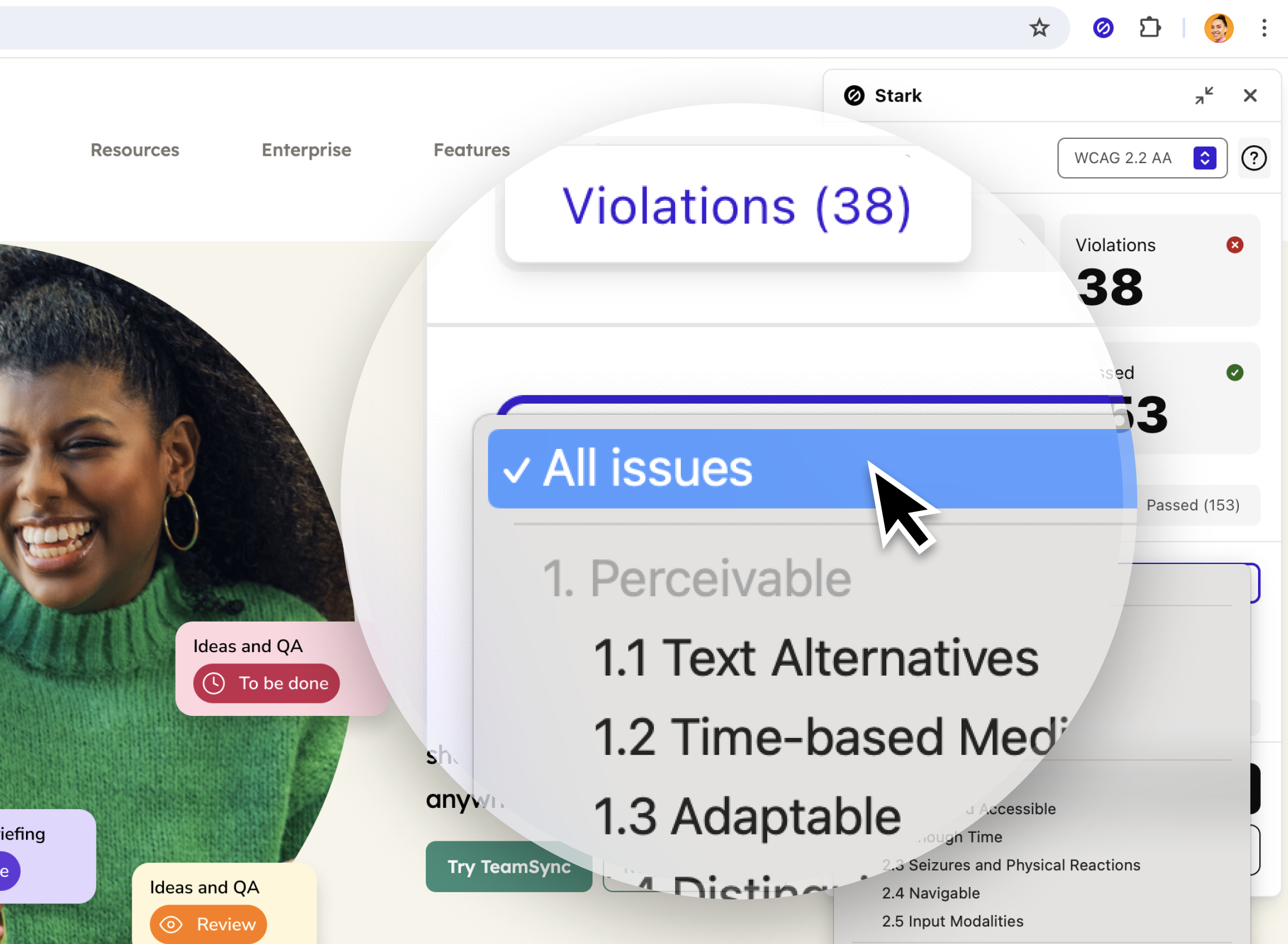
Filtering WCAG Audit results
Depending on how many issues your WCAG audit returns, you might want to focus on a particular WCAG criterion as you work through the results. With the brand-new filter dropdown you can do just that. Simply select the WCAG criterion you want to filter for and the issue list updates in real-time.
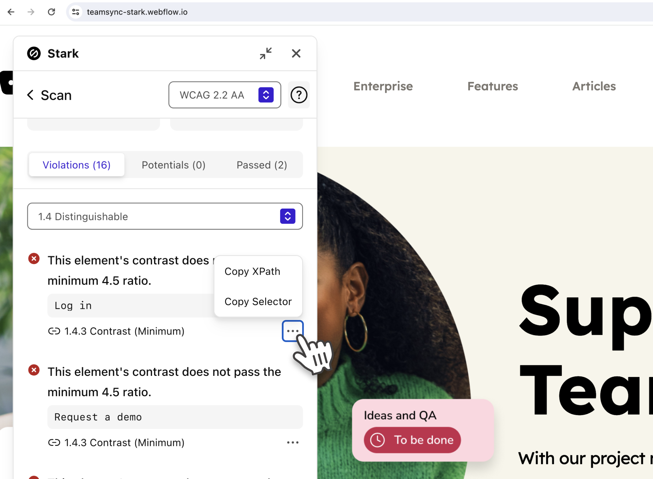
Copy XPath and selector from WCAG audit
In order to reference accessibility issues in your code, developers can now copy the XPath and/or selector info for each element that causes an issue directly from the results of the WCAG Audit scan. Click the 3 dots button below the issue highlight to copy the relevant information.
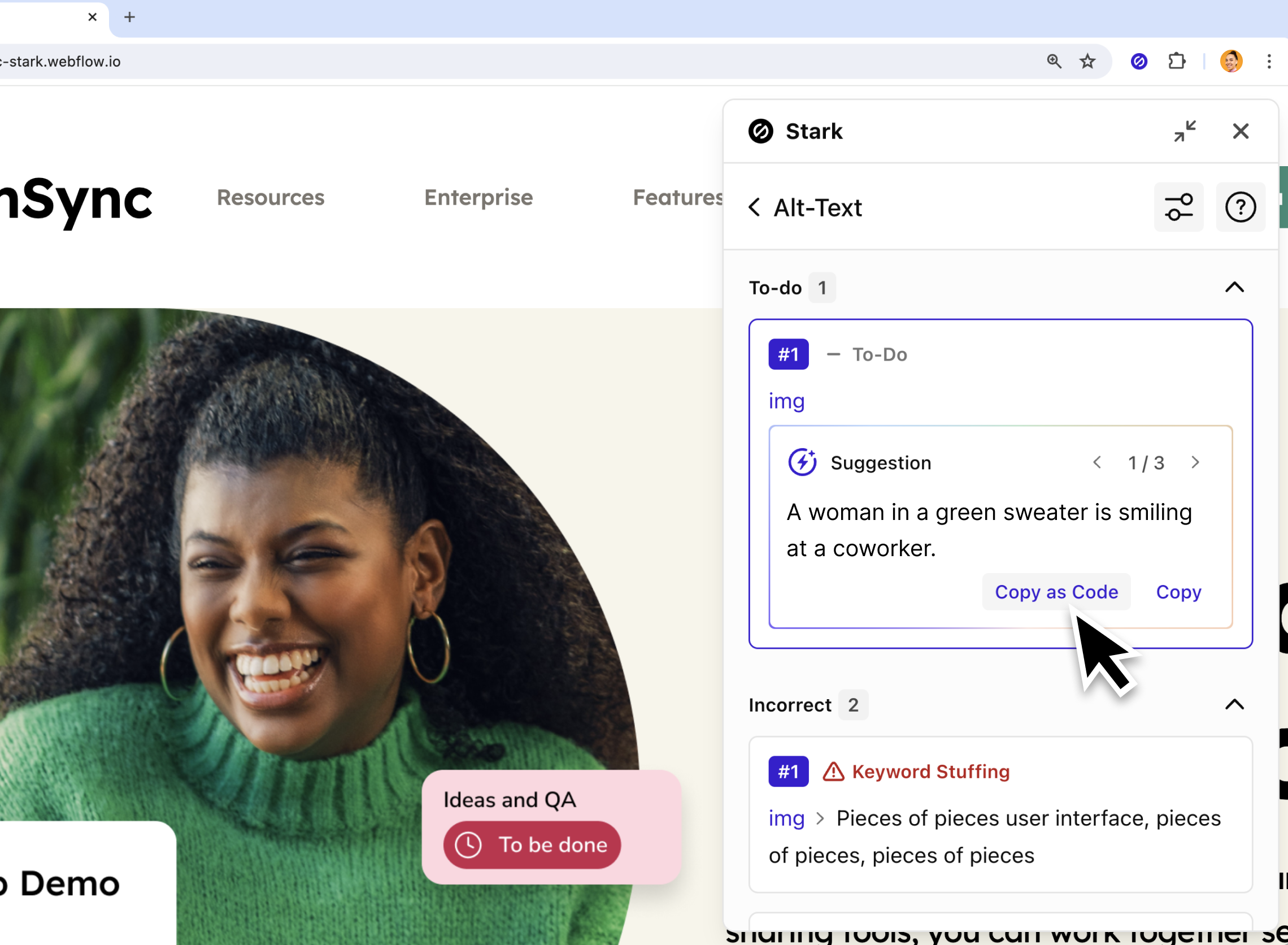
Auto-generated alt-text for images with missing tags
We’ve brought the most loved auto-generated alt-text feature from Figma to the browser so that testers and developers can all benefit from this powerful tool. As soon as you click the Alt-Text tool in the Stark extension, your entire page is scanned for images and their alt text. Images that have no alt text tag at all will be grouped at top and marked as “To-do”.
With this update, you’ll find a new “Generate Alt-Text” button on each element.
-
Click the button to generate 3 variations of alt text for an image
-
Use the arrow buttons to switch between them
-
Click “copy” to copy only the text, or “copy as code” to copy the full code snippet with the alt text included.
Available today for all paid Stark plans
All of these new features are available for users and customers on Stark Premium, Business, and Enterprise plans. If you want to take them for a spin with your team, start a free Business trial to experience Stark’s proactive accessibility workflow that matches the speed of your development process – integrated right into the tools your team already loves to use.
And if you have any questions or feedback, don’t hesitate to reach out to us at support@getstark.co, or join the conversations in our Stark Slack Community, on LinkedIn, or on Twitter.