Leveling up contrast against gradients and images in Stark
Now supporting images, gradients, and more—Stark’s Contrast Checker is built for how modern interfaces are actually designed. In this post, we cover what’s new, how to use it, and how free vs. paid plans stack up when it comes to scaling accessibility work across teams.

Team Stark
Jul 08, 2025
::taps mic:: Are we still looking to 10x designs? Because if so, we have a nifty update!
Starting today, you can use Stark to check contrast against images and gradients—not just flat color fills on shapes and text. That means no more workarounds, no more missed issues, and no more pretending modern interfaces are built in solid color blocks. Stark makes it easy to measure real-world contrast, the way interfaces are actually being crafted.
Our mission from the beginning has been to go beyond the basics of accessibility, raising the bar with how teams think about accessibility as a non-negotiable quality requirement, and in turn baked into the software development lifecycle — with functionality integrated into and streamlining your workflow so well maybe sometimes you don’t even notice it. And as odd as it may sound? For most teams that starts with contrast.
The makeup of Stark’s contrast checker
When we shipped our initial contrast checker in 2019, we weren’t the first—and we knew we wouldn’t be the last. Contrast checking is the first touch point most people have with accessibility, and for us that means ensuring it is always an “aha!” moment when engaging with Stark. But we also knew the bar was painfully low. Many of the tools launching today still only support basic shape-based contrast checks. That’s not enough anymore—and if we’re being honest it wasn’t enough then either.
Even on Stark’s free individual and team Starter plans, you get the core essentials for contrast checking in modern interfaces. You can test shapes and text against solid colors, and now you can do so against gradients and images. You see exactly where contrast fails and passes across multiple WCAG and APCA levels—all in a beautifully simple interface.
But as your work scales, so do the demands. That’s where Stark’s premium features unlock advanced functionality that help teams go from “just” catching problems, to instantly remediating and in turn confidently shipping accessible work — at scale.
-
Auto-Scan & Detection of issues
Stark surfaces contrast violations automatically across your entire design—no need to manually check every layer. Just click ‘auto-scan & fix’ to quickly surface what needs your attention. -
Remediation with a click
Once contrast issues are detected, Stark provides smart accessible suggestions instantly. You can fix a single instance or apply changes across all layers using that color combination. It’s as easy as clicking “Apply to all” wherever that issue appears, all in one click. This gets especially powerful when you’re utilizing Stark on your design system’s accessibility itself. -
Design System integrations
For teams working from a centralized design system, Stark links directly to your color libraries—making it simple to align contrast fixes with approved tokens. No need to reinvent colors or break brand consistency. -
Smart Typography handling
Contrast checking in Stark isn’t just about color—it accounts for font size and weight to ensure your typography meets the correct WCAG thresholds based on context. Whether it’s body copy or headings that may be too small to read, Stark calculates accordingly.
Together, these upgrades turn Stark into more than just a contrast checker within a wider set of accessibility functionality—make it a true game changer and an exciting entry point into your team’s entire accessibility workflow.
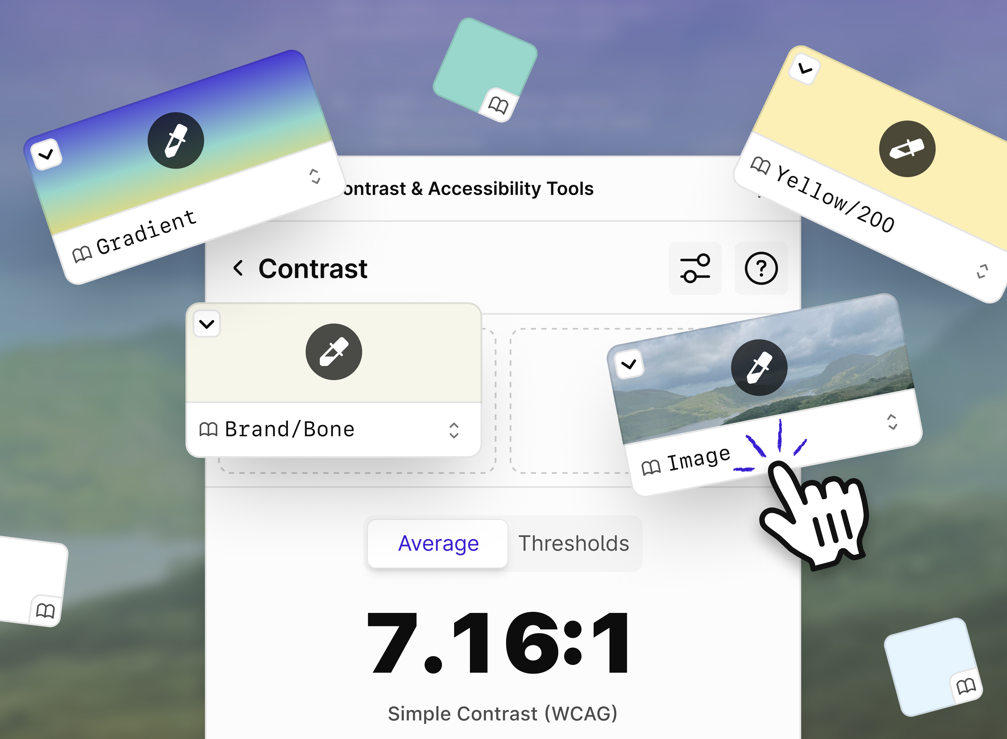
How to check the contrast of images or gradients
Whether you’re checking contrast on a text layer over an image, a button sitting on a gradient background, or a simple color fill—Stark handles it. Just select the layer you want to test and Stark will automatically detect the background type (image, gradient, or solid color) and surface the appropriate contrast checking interface.
You’ll see two ways to evaluate your results:
-
Average: Calculates the average contrast ratio across the background based on WCAG guidelines.
-
Thresholds: Breaks down how much of the background passes or fails against WCAG guidelines using predefined thresholds.
Why Averages and Thresholds?
Well, averages can be skewed. A lot of 15+ contrast ratios in a large image will skew the results above the 4.5 minimum, and Thresholds are another way to verify by determining how much of the colors were above the minimum threshold. So if you find the average is less than 80%, that's not good enough.
Ready for what's next: To liquid glass and beyond
Apple’s recent announcement of liquid glass technology underscores just how crucial sophisticated accessibility detection will become — solely by helping designers that aren’t completely certain of how to account for new interface shifts and paradigms in our day-to-day work. Stark is already ahead of the curve, and continuing to iterate on new ways to help designers navigate these emerging challenges and ensure seamless accessibility for billions of iOS users.
We’re committed to staying ahead, so you can focus on creating beautifully inclusive experiences without worrying about losing critical accessibility functionality.
💬 Does your company's brand and products use gradients and imagery often? What are alternate ways you'd like us to support that? Share your thoughts and feedback at support@getstark.co, or join the conversations in our Stark Slack Community, on LinkedIn, and on Twitter.