Hello, World. Introducing Stark for Chrome
The Stark tools you know and love, now right in your browser. Learn more about our first foray into the world of developer tooling.

Team Stark
May 18, 2021
Our mission has always been to help product design and engineering teams make world-class accessible products by making tools that live right alongside the programs they already use. Our tools have given designers a way to kickstart projects, QA projects in flight, and retrofit work that’s already been done. Given the product development process starts with design, Stark’s initial efforts into the world of accessibility have largely been in the design realm.
Today that changes with the launch of Stark for Chrome.
We’ve long advocated that accessibility should be baked in at all points in a product's lifecycle and Stark for Chrome is our first entry into the workflow of developers. Our talks with numerous teams have shown that development is usually the first place accessibility starts but then is often simultaneously skipped—which is unfortunate since that's typically the last stop your product makes on the ride to your users' screens.
In the US alone, approximately 12 million people 40 years of age and over have some form of vision impairment. Looking at that same demographic, the CDC reports the economic impact is more than $145 billion every year. It's not just adults either, as it's one of the most consistently cited disabilities among children. Zoom out to a worldwide scale and look at just those with color blindness and the number sits at approximately 300 million people–yup, getting real close to the population count for the entire United States.
These numbers are simply too large for anyone to ignore.
So how does Stark for Chrome help with that? We’ve made it ridiculously easy for those developing a site, designing in the browser, or doing QA to ensure the product is meeting accessibility requirements, optimizing for the best outcomes, and ensuring it’s usable for as many individuals as possible.
Let’s get into what to expect when you hit that download button.
Using the Contrast Checker
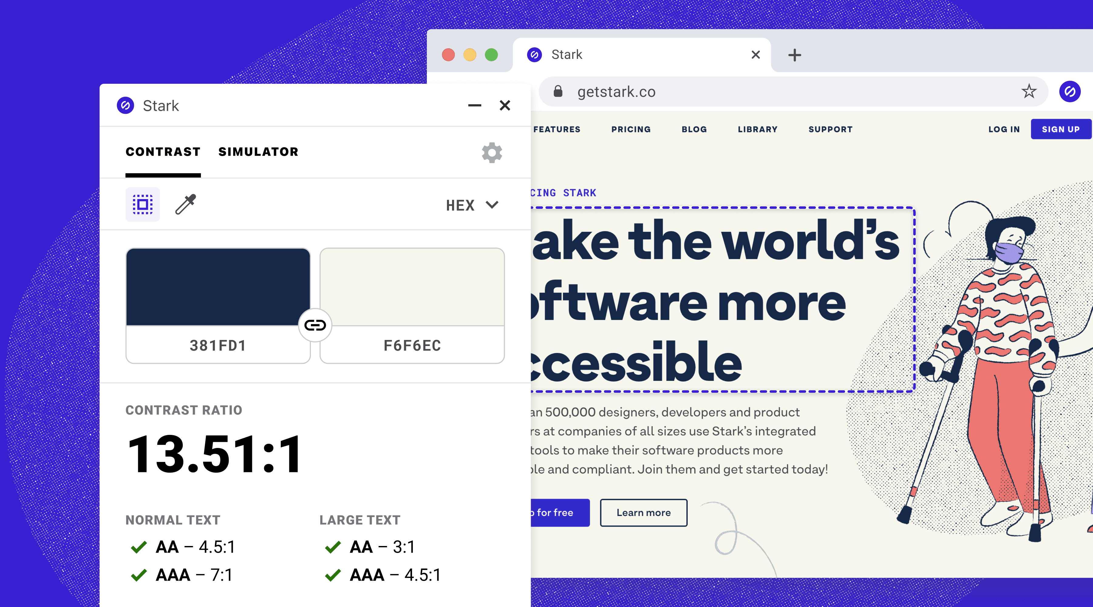
Once you open the extension, you'll find the contrast checker front and center. You have two options to choose from: a quick and easy-to-use one we call Object Selection Mode and the other, which we call the Dropper, allows for more fine-grained control.
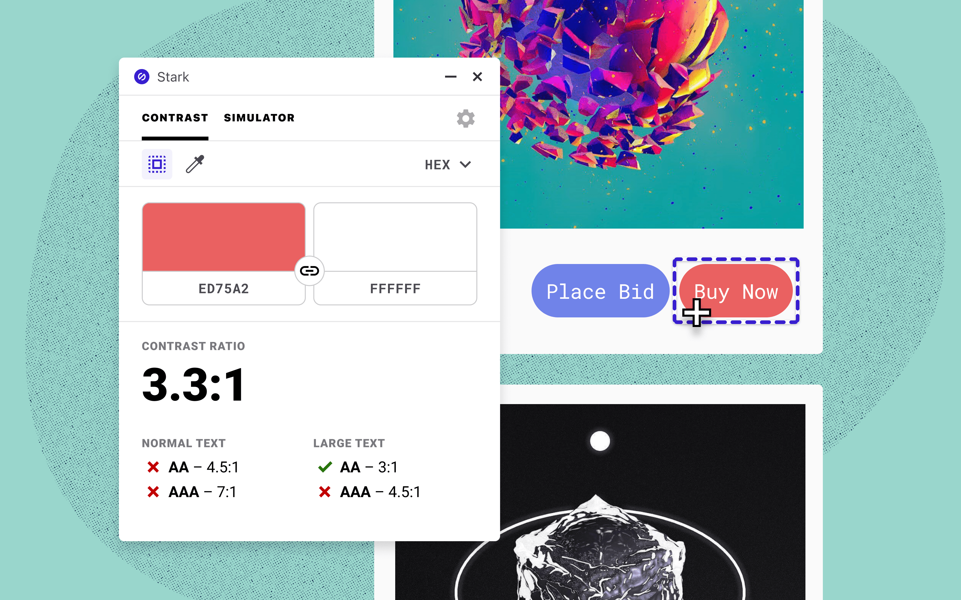
We've defaulted to the "Object Selection Mode", which allows you to simply click any element on your site and get its background and foreground colors checked. When an element is selected, we draw a box around it to indicate where we're getting the colors from. This is by far the quickest way to check your site's contrast ratios.
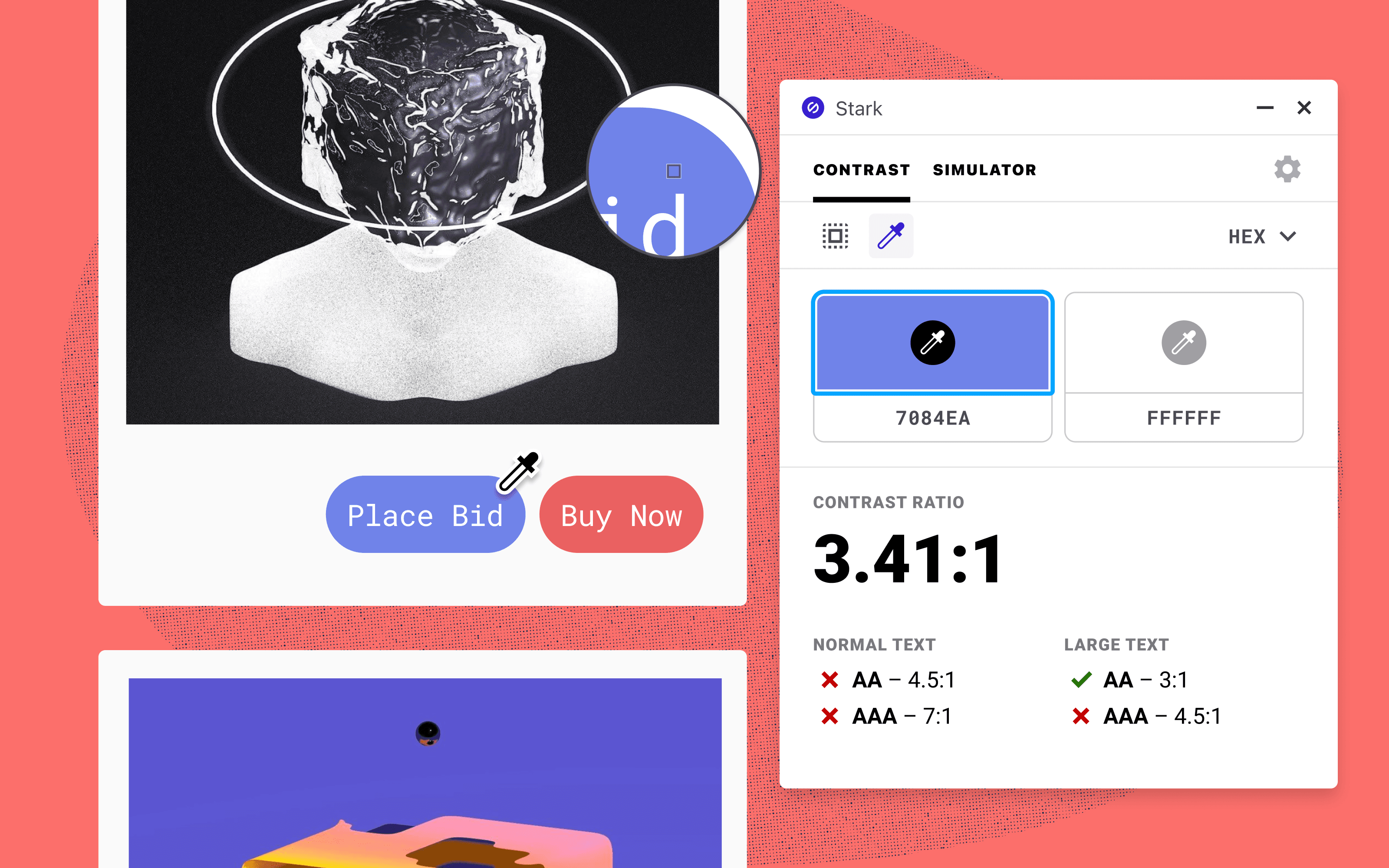
If, for whatever reason, you need more fine-grained control, click the Dropper. This mode will be instantly familiar to anyone who's ever used a design tool before–just put the dropper over the color you want to check and click.
We understand developers have different preferences for the values used in their code. Use the dropdown in the top-right to switch between different color formats, such as HEX, RGB, and HSL, allowing you to copy and paste into your code with ease. No matter what mode you use, the bottom will always clearly spell out whether your color combo passes WCAG 2.0 standards.
While the ethical imperative of making your site accessible to those affected is argument enough, we'll go one step further and add that addressing contrast issues in this way also improves your site's usability for everyone. You're most likely reading this article indoors on a nice, bright screen, but that's not the case for all of your users. Maybe they're looking at your site outside on a bright day or it's loaded up in a store kiosk with a subpar display. Perhaps they prefer to have their screen brightness as dim as possible (why do you do this, Mom?). Just having proper contrast can mitigate those issues and more.
Using the Simulator
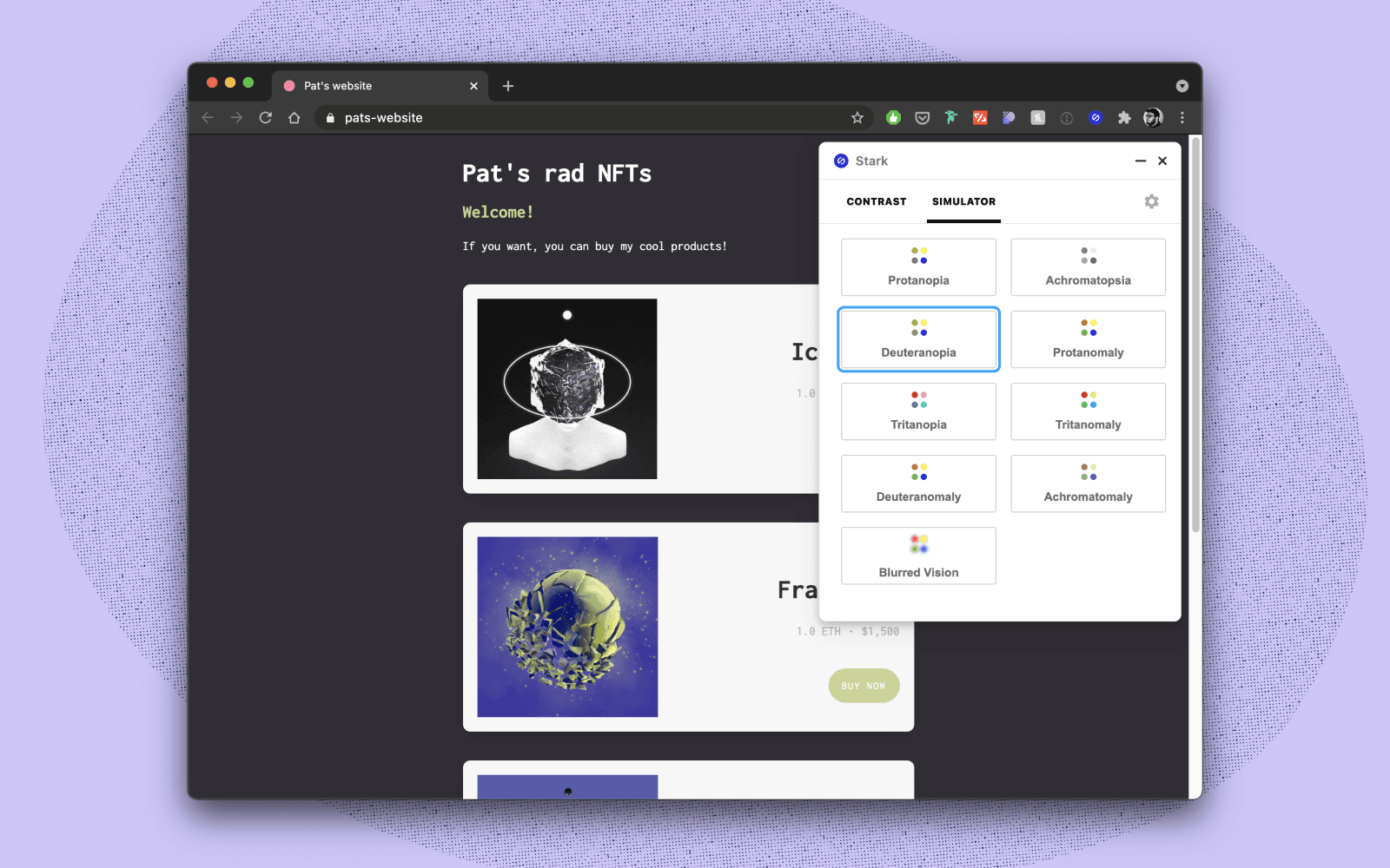
So, now that we've covered Contrast, it's time to head over to the Simulator tab. We've covered the numbers for those impacted by color blindness, but did you know there are many different types? You'll find all of them here from Protanopia (red-green blindness) to Tritanopia (blue-yellow blindness). We've also included the Blurred Vision simulator we added recently to our design tool plugins. Using the simulators is as simple as clicking any of them–they'll be applied to your entire page, meaning you can scroll through it like normal.
Getting out of the way
You have complete control of where Stark sits on your page. If you find it’s in the way, just grab it and move it out of the way. Want to take a screenshot? Just hit the minimize button and Stark will step aside. Speaking of, if you want to change the default location of where Stark shows when you open it, just head over to the Settings tab and choose among the four options.
Signing in with your account
Stark accounts ensure you always access the latest and greatest we have to offer. For many of you already using Stark in design software, sign in with your account in the same way you have previously. From Free to Pro accounts, creating a Stark account allows you to capitalize in prep for the added features coming, and gain access to resources, educational material, and new features before the rest of the world knows about them!
Click here to create your account if you haven’t yet.
More to come
We know accessibility goes beyond colors, but color is universal and one of the greatest on-ramps to the world of access. It’s what bridges disciplines, and in a world where silos are the catalyst for a lack of accessibility education and execution in the product development process, we’re all for easy on-ramps. In the same way we’re quickly expanding the suite of tools provided in design software, we’ll also be adding more features and improvements in Chrome in the very near future.
Having said that, we're making the entire set of features contained in Stark for Chrome available to both free and paid users. Whether you're a designer that likes to push pixels in a browser, a developer that's cranking out pages, a QA expert making one last sweep, or someone that just wants to screenshot and point out a brand's site for its lack of accessible features (we won't judge–in fact, we encourage), we want you to check it out and let us know what you think.
It’s great to officially be in the game with you, developers. We're only just getting started!
Want a preview of what's coming down the pipe? Our PRO users get beta access and more.
To stay up to date with the latest features and news, sign up for our newsletter.
Want to join a community of other designers, developers, and product managers to share, learn, and talk shop around all things accessibility? Join our Slack community, and follow us on Twitter and Instagram.