How your landmarks in design support screen reader users
An overview of the inner workings of Stark’s Landmarks, how to include them in your workflow while designing, and the benefits of implementing them for screen reader users and engineers.

Sagal Muse
Feb 17, 2022
This may be dating a few of us on the Stark team, but [try to] think back to the time when you could only listen to your favorite songs on cassette tapes. Remember how you’d have this long string of tape that you could only wind forward and backward? Remember how much of a pain it was to even navigate between both of those?
Well, that’s what it’s like using a screen reader without the implementation of landmarks.
For users who require assistive technology (AT) such as screen readers, it can take 20-30 minutes to read the entire contents of a long web page at a normal speed. Sighted users, on the other hand, can easily skim or skip through irrelevant information and get to the end of a page in a couple of minutes.
So how do AT users manage to navigate web pages quickly you ask? Well, experienced screen reader users will speed the narration as much as four times the regular speed of human speech. Others will find some way to jump around forward and backward through the narration like you would with a cassette tape. For instance, if you were watching a YouTube video with just pictures, moving forwards and backward means you're just sampling random pieces of the audio as you go—rather than getting the big picture.
As a screen reader user if all you have are these two techniques, then navigating pages can be a big headache. By including landmarks in your designs you’re not only helping these individuals navigate your website with simple keys, but you’re also building a more usable product for everyone.
Here’s a breakdown of how landmarks work, along with an explanation of how to include them in your design workflow, and how to hand them off to engineers.
The basics

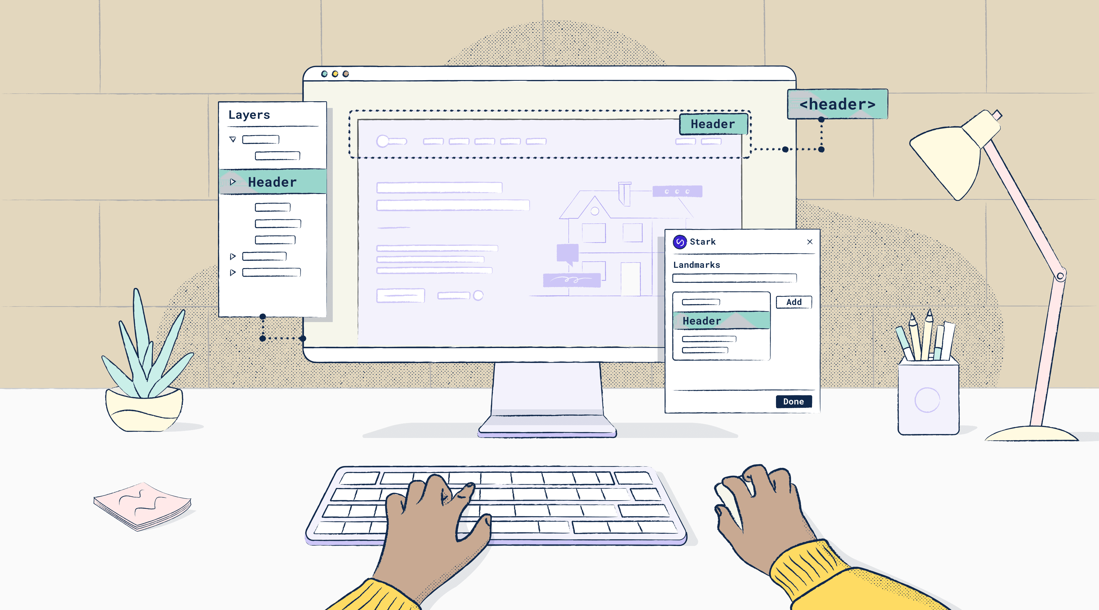
Landmarks are the structural elements in HTML that define the regions of a web page, and they’re used by screen reader users for navigation. Using the Landmarks feature in Stark, you can easily select the header of your web page design for example, and mark it as a header. You can take the same steps to mark the navigation bar as nav and then move onto the body of the page to mark it as main.
The area marked as main is where most people want to begin reading anyways, and it’s where a skip to main link would point to. so it’s important to mark anything that comes before it (such as header and nav) to make it easy for screen reader users to skip them and get to the good part.
Next, you can mark sections within the body of your web page. Section is what you want to mark to flag a piece of content that’s inside of a large main area. It’s particularly good for flagging parts of your page that don’t already have semantic headers.
Once you’re done marking the main section you can highlight the footer of the page and mark any sub-elements within the footer such as a newsletter subscription form or a social toolbar nav.
Order of operations
When it comes to the reading order of your landmarks, it’s always going to be read in the order they appear in your code or the DOM. However, in some cases, content is not coded in the same order that someone would read it. For instance, the contents of a web page are most likely to be mixed up when there are overlays or popups. For this reason, it’s important to have your content appear in the same order as your code. This allows landmarks to appear in the right order and makes it easy for screen reader users to follow the page logically.
Landmarks: an accessibility annotation or a component?
👍🏻 Within Figma or Sketch, you’ll see that once you annotate your landmarks in Stark they’ll show up as a group within your list of layers, which you can hide or display. Because your landmarks are displayed as part of the document, you can export the frame as a PDF for example. This means that Stark’s landmarks is, as of now, an accessibility annotation tool rather than a component that is fragmented.
❌ Having landmarks available as a component isn’t as useful right now for several reasons. First, the process is highly manual and fragmented from the workflow since you can’t guarantee you’re properly labeling everything necessary or in a way that is technically correct. Second, it doesn’t sit on an artboard in a way that makes sense and can easily be toggled or exported. Lastly, it ignores the reality that in many enterprise and corporate company teams are using multiple pieces of software for design. Having it as a component in your design file that can’t emulate the same and remove chances of error is not efficient.
How Landmarks are acknowledged by screen readers
Although you can use most landmarks more than once on a page, most screen readers will only read the top-level instances that aren’t nested within another landmark. For example, a sub-element such as the footer to an article that contains the author’s bio usually isn’t picked up by a screen-reader and announced.
However, section, forms, and nav elements are an exception to this rule: screen readers typically announce these landmark elements even when they’re nested inside other landmarks. In fact, you can break up a long or complex main element with section landmarks for the screen reader to navigate. It’s particularly useful when headers aren’t a good fit, like for a card grid.
On the flip side, screen readers will also announce top-level landmarks that are repeated from one page to the next such as header and nav. This is to let screen reader users skip those sections if they’ve heard it already. Otherwise, it can be frustrating if they have to hear all the contents of a header or menu before getting to the main content.
Is there a difference between landmarks in web vs native apps?
On the web, you have discrete elements that are a set of HTML tags that create landmarks, such as nav, header, section, and so on. Like we noted above, you would simply implement landmarks into your designs by marking each element (such as the footer of a web page) with its accompanying landmark label.
In native apps, you'd be using container objects with an accessible name, role, and value assigned to them by the developer. They won’t work as landmarks unless the developer on your team gives them roles associated with landmarks. Those landmarks would then work as top-level elements in your DOM stack.
How Landmarks in Stark helps design and dev collaboration
Watch our latest webinar "Implementing Landmarks in your software design" to learn how you can use Landmarks to remove the guesswork from the designer-developer workflow and help end-users navigate your website with ease.
Landmarks in Stark bridges the gap between designers and developers by allowing you to map things out earlier on in the process. Designers are able to specify the exact elements that would be associated with the landmarks, rather than having that be a decision made on the fly by a developer while they're coding. It’s also a great way to loop in copywriters to help write accessible names. This saves developers a ton of time, especially in trying to understand ARIA labels if they’re not well versed in it.
How to apply landmarks to web apps that don't follow the typical structure
You can actually apply the same rules that we just went through to a web page that doesn’t follow the typical structure, it’s just that it may take a little longer to mark your landmarks. For example, if you look at Spotify on the web, you’ll see that the header that repeats on all of the pages is actually displayed on the far left column instead of the top. Even though the menu content isn't visually at the top of the page, it's still repeated on every screen, and a screen reader user would still want to skip past this to get to the main content. For this reason, it makes sense to still mark this section as a header.
Understanding how landmarks work and benefit AT users is just the start. Whether you're building a web page or app that follows a typical or unique structure, take the time to try out landmarks in Stark, loop in your dev team, and let us know what you think!
To stay up to date with the latest features and news, sign up for our newsletter.
Want to join a community of other designers, developers, and product managers to share, learn, and talk shop around all things accessibility? Join our Slack community, and follow us on Twitter and Instagram.