Introducing Accessibility Governance: ensuring implementation is consistent and scalable when automated
The Governance tab in Stark gives product owners, accessibility product managers, and/or operation teams the controls for tool permissions, customization, and design system enforcements. It turns accessibility from a per-product checklist into a scalable, consistent, and automated practice.

Team Stark
Aug 6, 2026
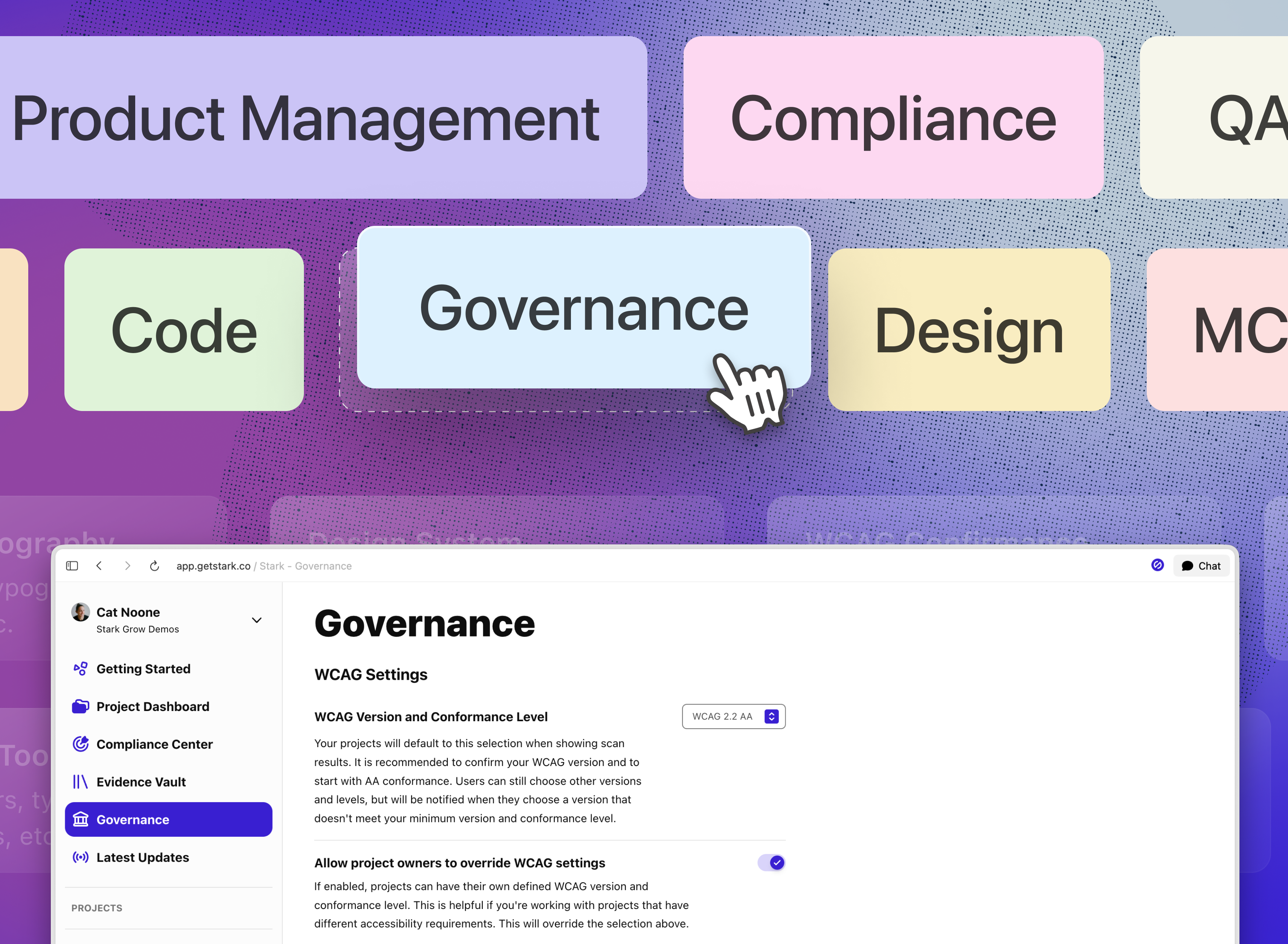
Governance is built to address not just visibility at the top, but to empower accessibility program managers, product owners, and more to create the right foundation to enable product teams to rapidly iterate inside a bounded, compliant system. For design and development teams who have already developed a design system to help provide that structure, Governance now integrates design systems directly to ensure that context forms the basis for remediation suggestions across the organization. This supports the overall accessibility program by closing the implementation gap between the creation of work and/or a design system, and each individual designer’s delivery of their project.
With Governance, you're setting the controls, customization, and systems enforcement to ensure your organization operates efficiently across all projects and product touch points. Governance in Stark is organized into four configuration areas, available now:
Design System Settings
The gap between "flagged" and "fixed" is often an options problem. Stark now restricts its fix suggestions to your team's design system library. A designer who gets a contrast alert may reach for the nearest compliant color without knowing whether that Stark suggested color is on-brand, or consistent with the rest of the system. The fix used to resolve the WCAG check but introduces palette or brand drift.
Now, connect your Figma library and define how Stark surfaces suggestions relative to your design system:
-
Force Text Style Suggestions → only text styles from your linked Figma file(s) appear as suggestions in the Stark Figma plugin
-
Force Color Variable Suggestions → only color variables from your linked Figma file(s) appear as suggestions
-
Skip Component Instance Scanning → Stark skips elements that are component instances or live inside one when scanning your designs
The approved palette and the accessible palette are now the same surface.
This also handles the case where a designer goes off-brand entirely. If a user is not pulling from design system color variables, Stark's suggestions will route them back.
Accessibility becomes a diagnostic for the design system, not just the screen.
Configure Available Tools
Choose which tools are visible to your team. Unchecked tools are hidden from the corresponding plugins and extensions, so each team sees only what's relevant to their work.
This enables administrators to take the roles and responsibilities you've already defined for your product development process and implements it inside Stark. If engineering owns [navigation]: then let’s turn off the relevant tools (like Focus Order, Headings, and Landmarks) for the Design Plugins. Does the Content Marketing team own alt-text? Mark it unavailable in Figma to avoid any confusion.
Content Settings
Alt-Text is your brand’s voice at the image layer. For teams managing large content libraries, it's one of the highest-volume writing tasks in the product. With Alt-Text Voice & Tone Prompt in Stark, you enter a custom prompt that shapes how Stark generates alt-text suggestions across your workspace; completely tailored to your brand guidelines.
For commerce brands, this means product descriptions that match the tone of your Product Detail Pages (PDPs). For editorial teams, it means image captions that fit your publication's register. For enterprise SaaS, it means interface descriptions that stay precise and neutral. The suggestions come out on-brand by default — no manual rewriting at scale, and no alt-text that's technically compliant but tonally inconsistent with every other piece of customer-facing copy.
The difference is audible to anyone using a screen reader or unable to load an image at that moment. A product shot described in clinical terms ("image of a red shoe") reads differently than one written in the brand's actual voice ("bold crimson high-top, slightly worn-in, built for all-day wear"). Both adhere to accessibility requirements. Only one sounds like a brand that cares about communicating value to the customer.
No image for alt-text and only typography? Not a problem. Much like forcing color suggestions from your design system, you control the Minimum Font Size Suggestions you receive from Stark on any content written. While the default is set to 12px), it’s configurable to match your system's standards.
WCAG Settings
Not every project in your organization operates under the same accessibility requirements. A consumer-facing mobile app may need to meet WCAG 2.2 AA. Software servicing a government contract would require AAA on specific criteria. Managing that variation without a central default is how orgs end up with teams making conflicting judgment calls about what “accessible” and "compliant" means.
WCAG Settings lets you set the floor and decide how much flexibility sits with it.
-
WCAG Version and Conformance Level → set the default standard for all projects across the workspace (default = WCAG 2.2 AA). Users can still select other versions and levels, but are notified when their choice falls below the org minimum — so deviations are deliberate, not accidental.
-
Allow project owners to override WCAG settings → for organizations with genuinely mixed requirements, this gives project-level teams the ability to define their own conformance target without breaking the org default.
The maturation of an accessibility program follows a recognizable arc: from individual heroics to documented practices, from documented practices to embedded tooling, and from embedded tooling to organizational policy. At each stage, the tooling has to fit the organization's structure or it becomes a bottleneck. The governance controls shipping now are how Stark fits the org, so the org can drive the outcomes connecting product to policy.
💬 The Governance tab is available on Grow and Scale plans for organizations. If you'd like to understand how Governance can support multiple products and teams under a single workspace? You can book a call or kick off a free two-week trial (no credit card required!) straight away.
Feel free to share your thoughts and feedback at support@getstark.co, or join the conversations in our Stark Slack Community, on LinkedIn, and on Twitter.