Introducing Stark’s Landmarks
Remove the guesswork from the designer-developer workflow, while helping end-users navigate your website without the frustration of tabbing through blocks of large or repeated content.

Sagal Muse
Jan 11, 2022
Navigating a web page is a seemingly easy task if you’re someone who uses a mouse, trackpad, or a touch screen to maneuver from one section to another. However, it can become an extremely frustrating process if the experience isn’t designed to cater to your needs.
Take someone who relies solely on using assistive technology (AT) such as screen readers or a keyboard for example. They’re often met with the challenge of having to go through blocks of content when all they really want to do is navigate to one section of the page (for instance: the footer) and complete one task (like finding contact information).
To make things worse these users are often met with the tedious task of having to tab through a large amount of content, or even repeated content, while navigating from one page to another—making their experience that much more frustrating.
Not too long ago we shared the importance of creating a meaningful experience for your users by setting up a sequence order and adding focus items to your screens. This process of establishing a focus order helps build the sequence in which your users access elements on your product. Today, we’re excited to continue fulfilling our mission of helping teams develop accessible products with the introduction of Stark’s landmarks!
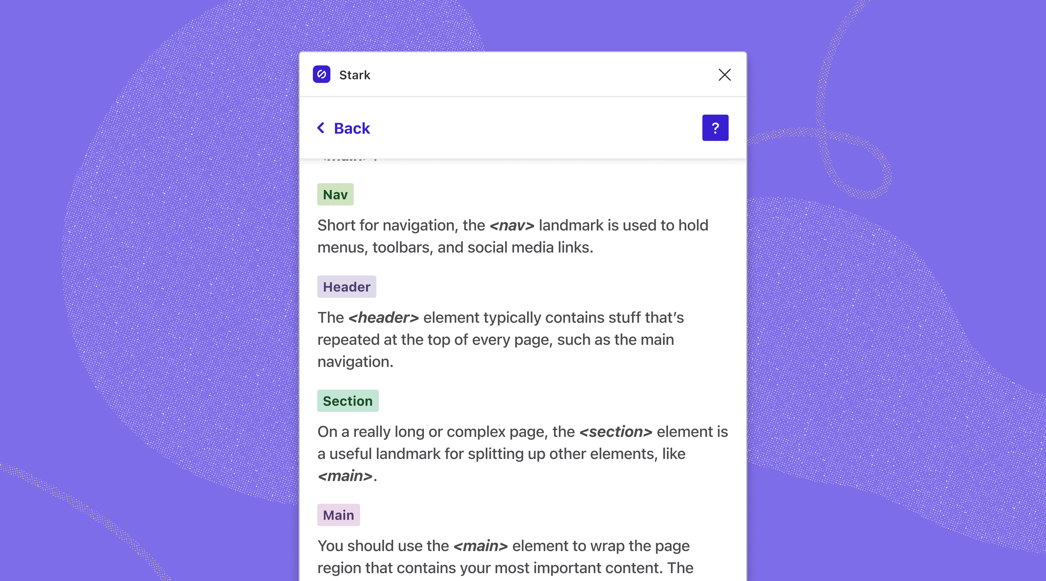
For anyone unfamiliar, Landmarks are attributes that are set to define sections of a web page to help AT and keyboard users navigate from one section of a page to another. Landmarks act similar to “skip to” links in the sense that they allow keyboard and AT users to use a shortcut key to skip past any section that they may not necessarily need to read through at the moment—saving them both time and effort. While using a screen reader, labeled landmarks also make it easier for users to be aware of exactly which section of the page they’re currently navigating through with a quick announcement.
For example, a visually impaired user who navigates web pages using a screen reader may want to skip past menu links to get straight to filling out an intake form on your site. Thanks to your labeled landmarks this user is able to have a more intuitive experience by navigating directly to the intake form, allowing for them to complete their task in a timely manner.
By thinking through the navigation of your digital product and therefore the placement of your labeled landmarks, more often than not, you’ll be able to carve out a seamless experience for your end-users. Even so, labeling landmarks doesn’t just benefit the end-user, it also simplifies the relations between designers and developers by removing the guesswork from the process.
When designers intentionally label landmarks, developers no longer have to approximate where exactly they should be included in their code, saving them an abundance of time. This not only results in a better user experience for your end-users, but also allows designers to see a final product that works exactly as they intended to out in the world.
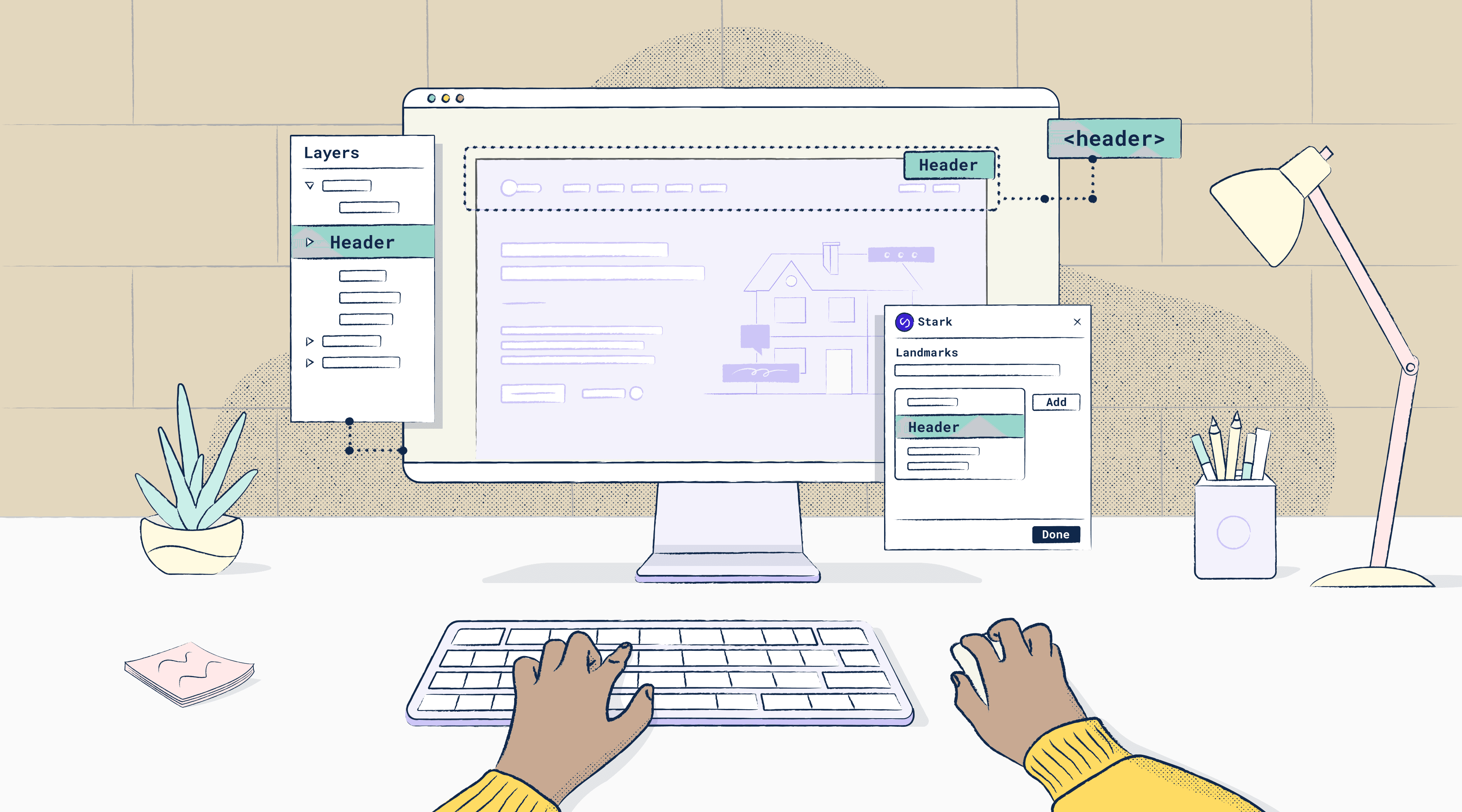
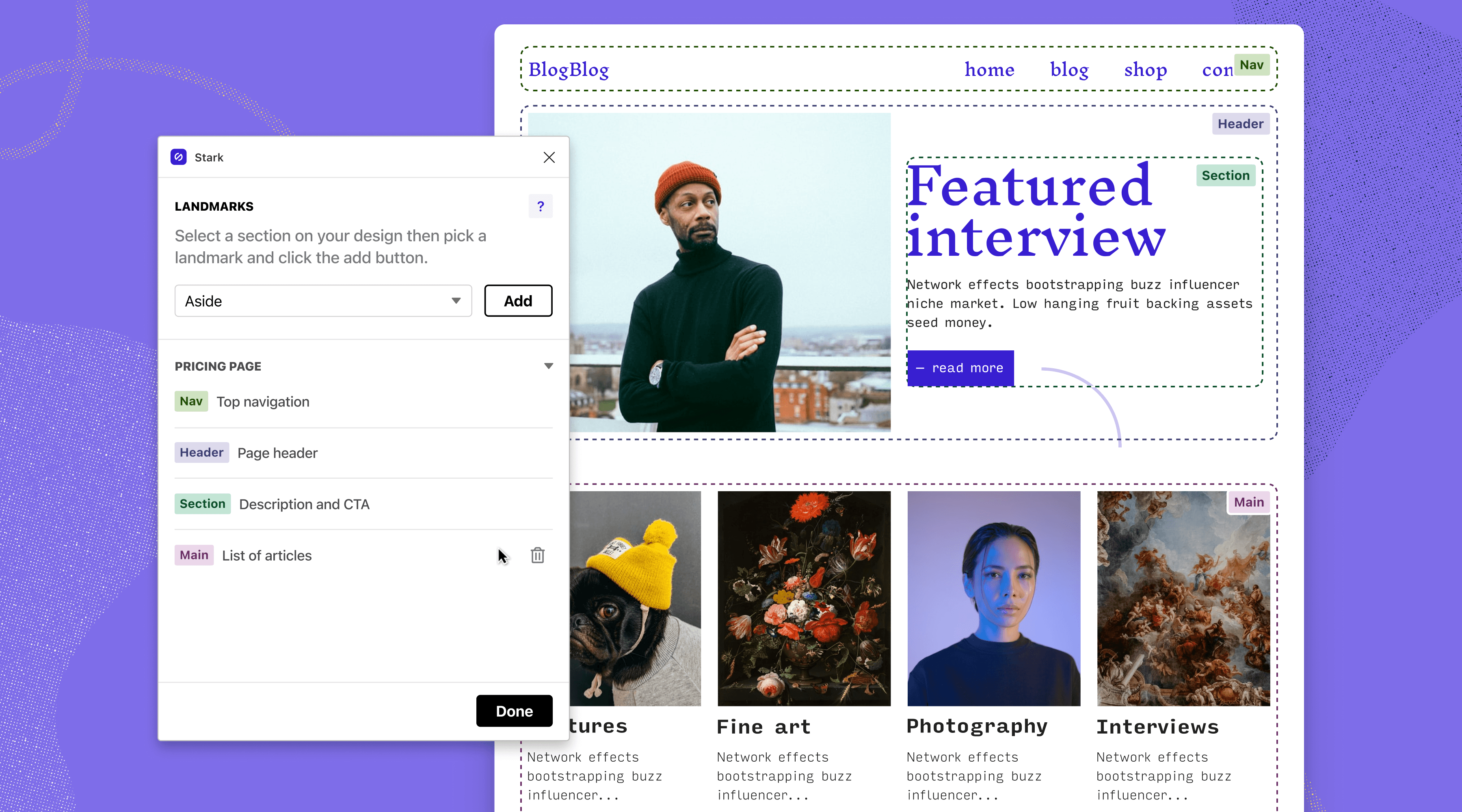
Stark’s landmarks isn’t just a tool for those designers who are easing into building accessible products. It’s also a quick and easy way to annotate landmarks directly in the design platforms you’re used to using (i.e. Figma, Sketch, Adobe XD), without jumping from one plugin to another, or worse having to add them manually through code at the end.
Once you login to your free or PRO member account, open the new Stark tool, simply select a section on your design, pick a landmark element, click the add button, et voilà, you’ve annotated your first landmark! Not sure which element to choose amongst the many listed? You can click the question mark icon (i.e. help button) to access additional information on the different landmarks and learn where exactly to place them in your design.
What are you waiting for? Login to your design platform of choice and try out our new Landmark tool! As you’re getting acquainted, we’ll be sharing tons of helpful resources and tips—from social posts, support docs, Stark Public Library resources, and more!
To stay up to date with the latest features and news, sign up for our newsletter. Want to join a community of other designers, developers, and product managers to share, learn, and talk shop around all things accessibility? Join our Slack community, and follow us on Twitter and Instagram.