Announcing Stark’s APCA beta
Introducing a new way to check contrast with our first beta release of APCA in Stark for Figma, Sketch, and our browser extensions.

Team Stark
Feb 08, 2023
In December 2021 our co-founder and CEO Cat shared initial thoughts on the WCAG 3.0 draft work and our research-driven approach to bringing the new APCA contrast model into Stark. Today, after many prototypes, conversations in our team, and feedback sessions with our community, we’re thrilled to announce APCA as a beta in Stark’s contrast checker. We took the time to dive into the science as well as speak to many of our customers and are excited by the possibilities APCA potentially opens for designers around the world.
With this blog post we’re calling on the Stark community to take our new Contrast beta for a spin and let us know about your experience, bugs and wishes for APCA support in Stark.
Evolving contrast checking
Checking color contrast in your designs and product is one of the most performed tasks using Stark. Ensuring accessible contrast ratios is not only an essential part of every software experience but for many product makers it’s also their first step into broader accessibility work. For decades we’ve been using the relative luminance-based contrast model referenced in the current WCAG guidelines.
While this model has served us well to make progress thanks to its simplicity and easy to understand application, it became increasingly clear that evolution is not only possible but necessary. With the advancements in our understanding of physiological factors as well as technological possibilities we’ve seen one contrast model stand out and become part of the wider conversation: APCA (Advanced Perceptual Contrast Algorithm).
What is APCA?
APCA stands for Advanced Perceptual Contrast Algorithm, and is a new model to calculate color contrast based on modern scientific research on color perception. It was created with the goal to optimize readability of content for all users. Compared to the AA/AAA guidelines, APCA is more context dependent and in turn aims to be more accurate in creating a great, readable experience for people with different types of vision.
The contrast is calculated based on the text’s font weight and size, color (taking into account perceived lightness difference between text and background), and context (for example ambient light, surroundings, intended purpose of the text).
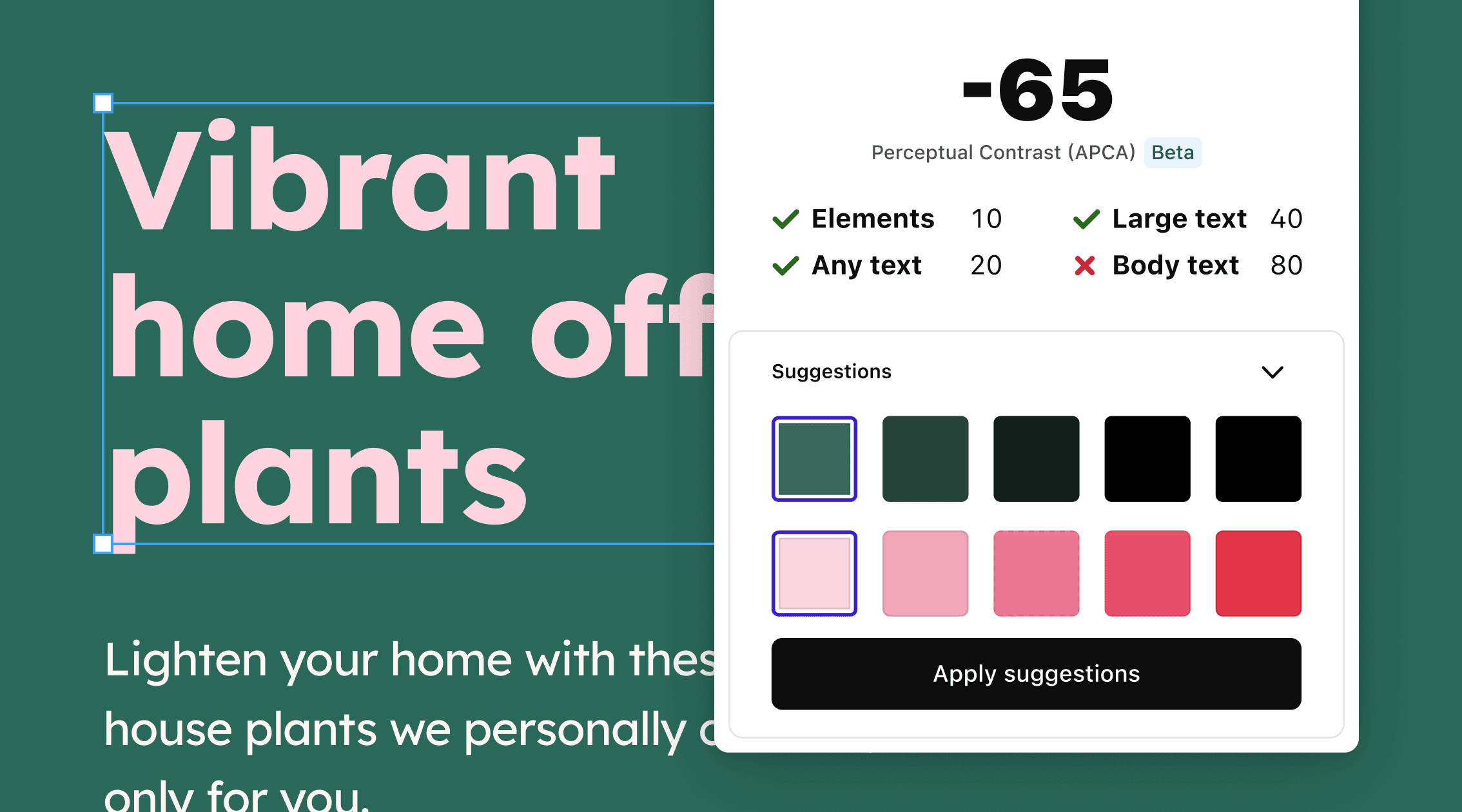
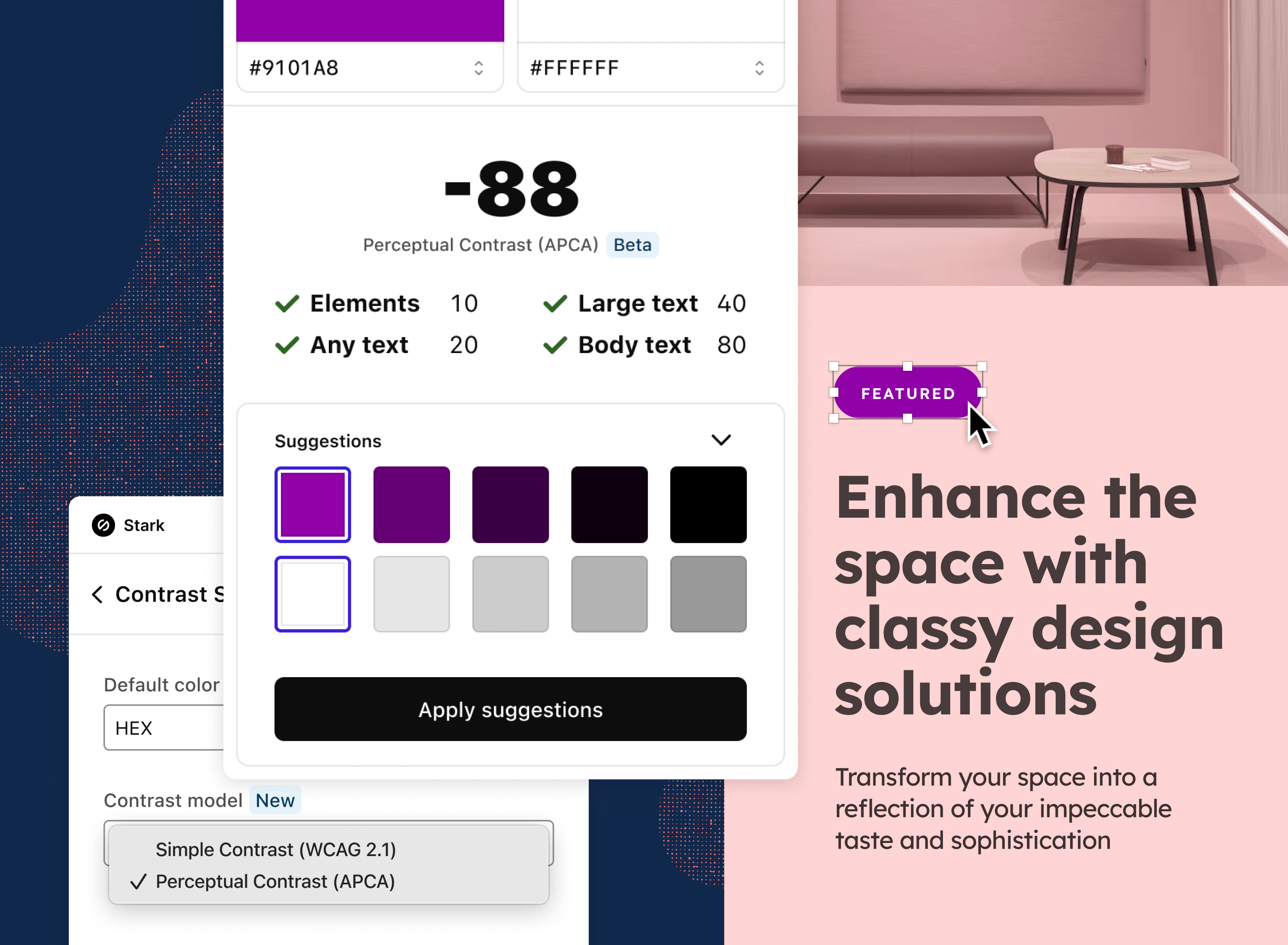
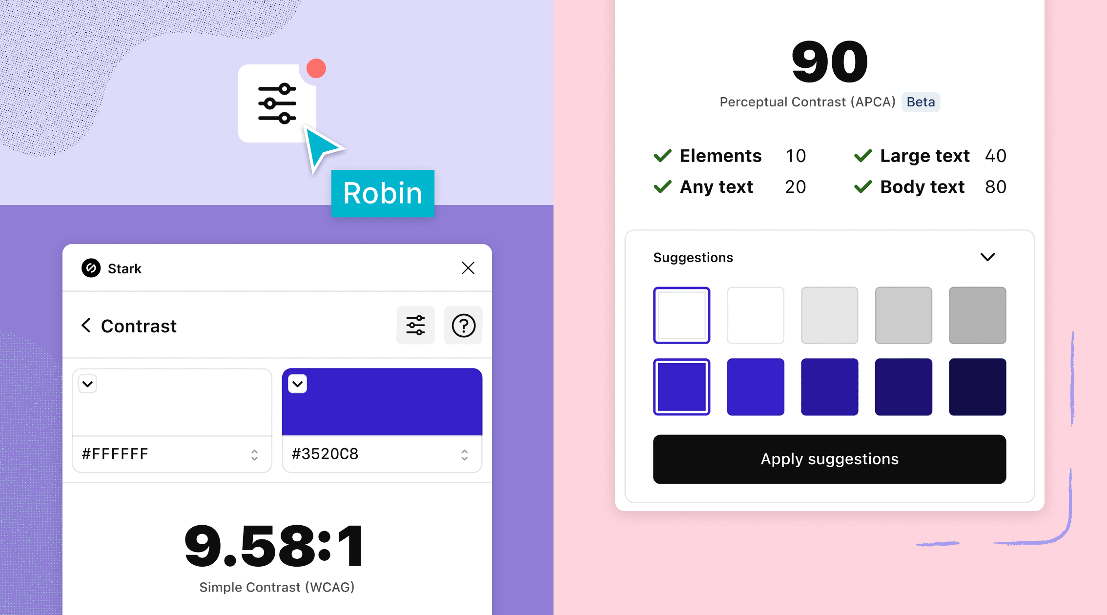
APCA in Stark (beta)
At Stark, we believe in grounded research to drive our innovations. As mentioned above, we’ve been having many conversations with our community members who have asked for APCA support in Stark. We’ve spent countless days and weeks diving into the APCA documentation and the science behind it. We tried to learn as much as possible from what others, like the folks in the Google Chrome team, have done. All of that informed our own prototypes and internal testing to understand how to best bring APCA into Stark with the benchmark to deliver an experience that’s both easy to use and empowering our users to create better, more accessible designs.
To turn on APCA mode, simply click the new settings icon in the top right corner of Stark’s Contrast tool. Here you can switch back and forth between the WCAG model and APCA. You can also click on the big contrast ratio number in Stark’s UI to switch between the conventional AA/AAA mode and APCA. We provide initial guidelines and pass/fail tests to inform your decision making. These are derived from the latest experimental Google Chrome build since there’s no official WCAG guidelines published yet and the community discussions are ongoing. However, our goal is that through your feedback we’ll be able to help move the conversation forward.
What feedback are we looking for
One of the factors that made the current AA/AAA model successful in terms of adoption is the simplicity of its guidelines and the easy pass/fail test results. As with all strengths, there’s a weakness that comes with this contrast model.
As with every new technology that’s been created, its success or failure lies in the way we apply it in context and for the different needs of individuals. APCA is adding more nuance and context, but in turn also removes (for now) some of that ease-of-use. However, our beta implementation is aiming to bridge that usability and knowledge gap with the goal to inform the wider conversation in the accessibility community.
So, we want to hear from our users of what’s working and what you’re missing using our APCA beta implementation.
-
How can we make the APCA model most useful?
-
What contextual suggestions and/or education are you looking for to make most use of APCA in your workflow?
-
How can we make the UI as clear as possible?
-
How easy / hard is it for you to use APCA in your daily workflow?
-
If it’s hard, what could make it easier?
Join the conversation
Join our Slack community, and follow us on Twitter, LinkedIn, and Instagram to become a part of the APCA discussion. We can’t wait to hear from you!