Community
The endless search for “here” in the unhelpful “click here” button
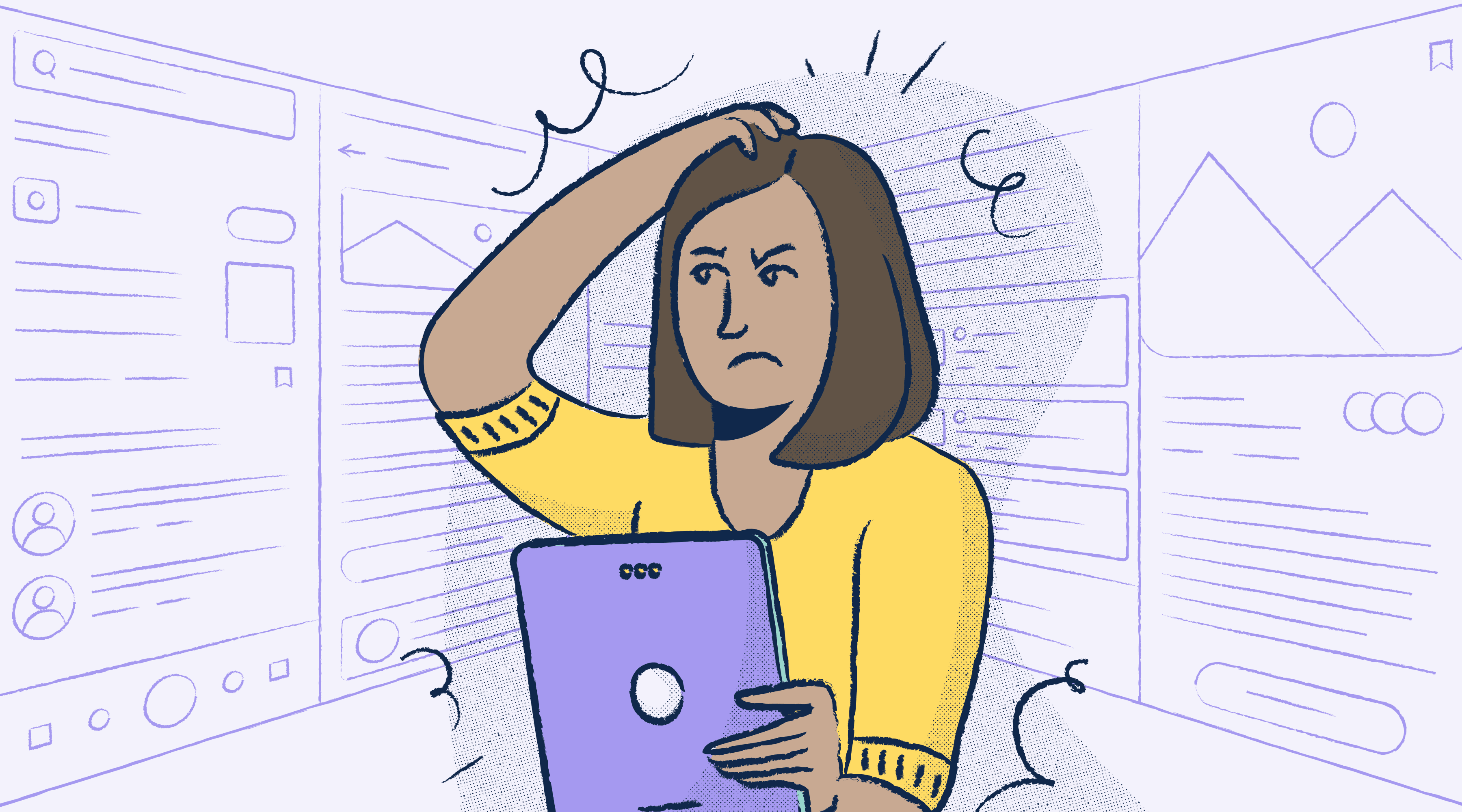
Accessibility advocate Eric Bailey explains how “click the button below” can be confusing to those of us who use the web differently. What if you’re using a screen reader? What if there’s no ‘click’ on your device?

Claudio Luis Vera
Nov 11, 2021
Words are hard. For example, I’m of two minds about the term “click.” You need to choose between being precise or being potentially misunderstood. The word “below” is a lot like the word “down,” in that it could mean a lot of things you didn’t anticipate.
Curious where I’m going with this? Read on.
The Stark Slack community workspace has a channel where people can ask questions and get help with accessibility and inclusive design-related issues. It’s a lovely space full of great people.
One question that was recently asked by another community member is if there’s a more accessibility-friendly way to say, “Click the button below.” The community member’s instincts were spot-on. This sentence contains two terms that are often used, but can be problematic from an accessibility or usability perspective:
- Click, and
- Below.
We’ll be unpacking the nuance behind these two terms, but first, we need to talk about how to create effective accessible names for interactive controls.
Accessible names should tell a story
Accessible names for interactive controls such as buttons and links should tell a story. You want to remove as much ambiguity about what a control will do or where it will go by giving a little preview of what to expect.
This practice of good copywriting benefits everyone, but is especially helpful for people who use assistive technology. Consider this sentence:
Click here to learn about how to roast Brussels sprouts.
Certain types of assistive technology can generate lists of buttons and links where this context is removed, meaning someone might not know what the link is referring to (more on this in a bit). “Click here” doesn’t make much sense when separated from the context of the rest of the sentence.
Terms like “it” and “this” are also guilty of this ambiguity, as well as situations where a link is applied to each word in a sentence to drive a point home.
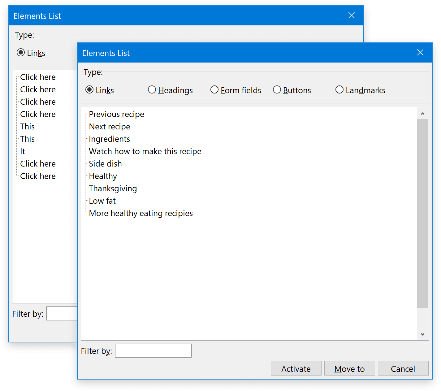
“Click here” also falls apart the more you read it. What’s the “here” in here? Is it the word “here”? Is it the word “click”? Or maybe it’s the space in between the two words. What is the most “here” part of “here?” If I don't click it, will something bad happen?
Break the habit
You might think this is absurd, but we’re really bad at making understandable interfaces. Without the affordance of an underline to communicate interactivity, “click here” just doesn’t hold up.
You could update the link to something like:
Learn how to roast Brussels sprouts.
“how to roast Brussels sprouts,” the main action, makes sense when separated from the context of the rest of the sentence. The length of the link also creates a nicely-sized touch target for interaction, without being too verbose. This is a good thing to keep in mind in that some people say the name of the link to activate it, much as how some people would use the Enter key on their keyboard.
Talking about how to use the thing
So now we know how to make an effective name for an interactive control. Great! We’re not done yet, though.
The person in Slack was trying to describe locating and using a control, not what the control itself does. There’s some nuance here.
What a click can be
If you were to chronicle all the different ways you can take action on an interactive control, it would include:
- Clicking a mouse
- Tapping a screen
- Clicking a touchpad
- Pressing a key
- Saying a word or phrase
- Pressing a nub
- Pressing a controller button
- Throwing a switch
- Moving your head
- Pressing a number pad
- Letting your gaze dwell
- Puffing some air
There are probably even more ways to take action on a digital experience that I’m not aware of—humans are incredibly inventive and resourceful. Through this lens, saying, “Click the save button.” doesn’t feel right. What if you don't click, or you can’t tap?
So what word can we use instead?
I like the term “activate,” in that interactive controls are in an inert/resting state until you decide to do something with them.
Understanding
That being said, the term “activate” sounds stodgy and strange. I could definitely imagine a Dalek screaming, “AC-TI-VATE” at some sort of corny doomsday device.
“Activate” is jargon—it isn’t used that much in everyday conversation. While technically accurate, the perceived stodginess of this phrase might confuse or scare off someone, especially if they're not digitally literate (“Does my laptop have an activate key?”).
For better or for worse, “click” has become the de facto term for communicating how to make an interactive control do its thing for a wide range of digital literacy. We can blame the early web for setting it up, and years of use compounding the term’s legitimacy.
Digital literacy is an important thing to consider. If the term “click” is understood by a wide range of people as how to use an interactive control, should we prefer it even though it’s not as accurate?
It depends
If the instruction is intended for a large audience of low or unknown levels of digital literacy, I’d say go with “click.”
If you’re speaking to a more known technical audience with a higher degree of digital literacy, I’d say use “activate” instead. This helps clarify that you want to engage the control, regardless of if it is a click event, a keydown event, a pointerdown event, a dblclick event, etc.
What does “below” even mean?
I’m not joking. This is a virtual space, not a physical one.
Exactly how far down is it? How can I know that someone can see what “below” means in terms of proximity? How can I be guaranteed the phrasing hasn’t been translated into a vertically-oriented language and therefore makes no sense?
We’re also assuming a 2D experience. Maybe we're reading this in VR, or will in the future. Does “below” now mean someone will think it is underneath them?
The beauty of jazz is that it's malleable
These questions get at the larger points I’m trying to make, in that you don’t know who is visiting your website or web app, the conditions they’re experiencing, the assistive technology they may be using, or what modifications they’ve made to their devices.
For that last point, know that the web is malleable and that this is by design.
The same way someone can translate a website, is the same way someone can force a dark mode theme, is the same way you can navigate by headings, is the same way you can adjust the text size, is the same way you can remove animations.
All of this is in the service of allowing a person to get what they want. This is a powerful thing to keep in mind, especially if it rocks your notion that the web should be static and pixel-perfect.
The enemy’s gate is down
Web Content Accessibility Guidelines Success Criterion 1.3.3: Sensory Characteristics deals with this issue. The gist of it is avoiding creating situations where someone can be confused or disoriented because of how content is arranged. Part of this extends to how we talk about where that content is.
In this context, phrases like “below” and “down” don't pass muster. With assistive technology, browser extensions, alternate reading modes, and translation features, “below” could become “left,” “stage left,” or even become completely not applicable due to all non-interactive content being conditionally stripped away.
What to use instead
We’re not the aliens from the movie Arrival, by which I mean even nonlinear narratives have sequential order. By this, I mean content starts, and then is followed by more content, until the point is made and the content ends.
On the web, this is DOM order, something else that is very important for accessibility.
Sequential order means a thing will be followed by another thing until, er, it isn’t. Because of this, we can reliably say phrases like “next” and “previous” or “following” and “preceding.”
Putting it all together
We now know how to:
- Construct meaningful accessible names for interactive controls,
- Think about our audience in terms of digital literacy, and
- Use language that will hold up in different consumption contexts.
This is an accessible, resilient, future-proof way to talk about the location of interactive controls, and how to take action on them.
C’mon, won’t someone just know what you mean?
I’m not going to debate this in terms of striving to be accurate. That’s table stakes. I’d also say that making assumptions about others based on your own abilities is… not great.
I’d like to appeal to your sense of inclusion. Yes, most people probably can make the logical leap to get at what you mean, but think about the unnecessary work that requires. Then think about being reminded over and over again that how you interact with technology isn’t valid.
You don’t have to take my word for it
The W3C has also realized that the implicit default writing mode of left to right, top to bottom isn’t a great look for a platform that is supposed to work for the entire world’s population.
CSS’s Logical Properties module will be replacing top, right, bottom, left instructions with start and end properties for blocks and inline content. These will map to a writing mode’s start and endpoints, regardless of text orientation.
… these values have moved away from the underlying assumption that content on the web maps to the physical dimensions of the screen, with the first word of a sentence being top left of the box it is in.
I’m pretty stoked about the layout being tied to writing mode. It’s one of those ideas that makes perfect sense in hindsight.
In closing
There is a lot of nuance behind even the simplest-seeming words. Creating accessible, inclusive, and resilient experiences on the web means challenging your own biases and assumptions and thinking about how the words you use—or choose not to use—intersect with how other people experience the world.
Eric Bailey is an inclusive design advocate, writer, developer, and speaker. He helps maintain The A11Y Project and the MDN Web Docs. You can connect with him via Twitter, LinkedIn, or via his personal website.
Join the conversation with other designers, developers, and product managers on our Slack community, or chime in on Twitter and Instagram.