Understanding the new WCAG 2.2 criteria
Breaking down the 9 new WCAG 2.2 criteria, what they mean for your team and your products, and how you can seamlessly integrate them into your process.

Team Stark
Dec 06, 2023
In October, the Web Content Accessibility Guidelines (WCAG) 2.2 became the official recommendation of the W3C. And while these guidelines are critical for designers and engineers, updates like these have a tendency to get overwhelming very quickly. We want to make sure you have all of the information you need to ensure your products are accessible. So, if you’ve been wondering what this means for you, your teams, and your products, we got you covered.
Let's dive into the nine new success criteria together.
Clear Focus for Keyboard Navigation (2.4.11 & 2.4.12)
WCAG 2.2 emphasizes keyboard navigability, enhancing user focus. It's not just a feature; it's a necessity. The AA level ensures focusable elements are visible when a page loads, while AAA requires that focusable objects are always visible, ensuring keyboard users don't have to guess their way around.

Enhanced Visual Cues (2.4.13)
WCAG 2.2 demands bold, unmistakable focus indicators. Think eye-catching cues that stand out in the visual clutter. The guidelines specify that focus indicators, when visible, should be sufficiently large and contrasted, with an area at least as large as a 2 pixel thick perimeter of the unfocused component and a contrast ratio of at least 3:1.

Simpler Interactions (2.5.7)
For actions requiring complex inputs like dragging, an alternative interaction pattern is required. Every functionality involving dragging must be operable by a single pointer without dragging, except where dragging is essential or the functionality is determined by the user agent and not modified by the author.

Spacious Click Targets (2.5.8)
Larger, distinct click targets are essential. Targets for pointer inputs should be at least 24x24 pixels. Space around smaller targets must prevent overlap, with larger equivalents for anything under 24x24. Exceptions include browser-defined sizes, essential content, and user-created objects, balancing flexibility with digital accessibility.

Consistent Help Placement (3.2.6)
Help options across distinct pages must be located consistently. Basically, put help buttons in the same place across your product. Easy enough, right?
Visibility of Essential Controls (3.2.7)
Essential controls must be readily available, not hidden by default. Further proof that good user experience and accessibility go hand in hand.

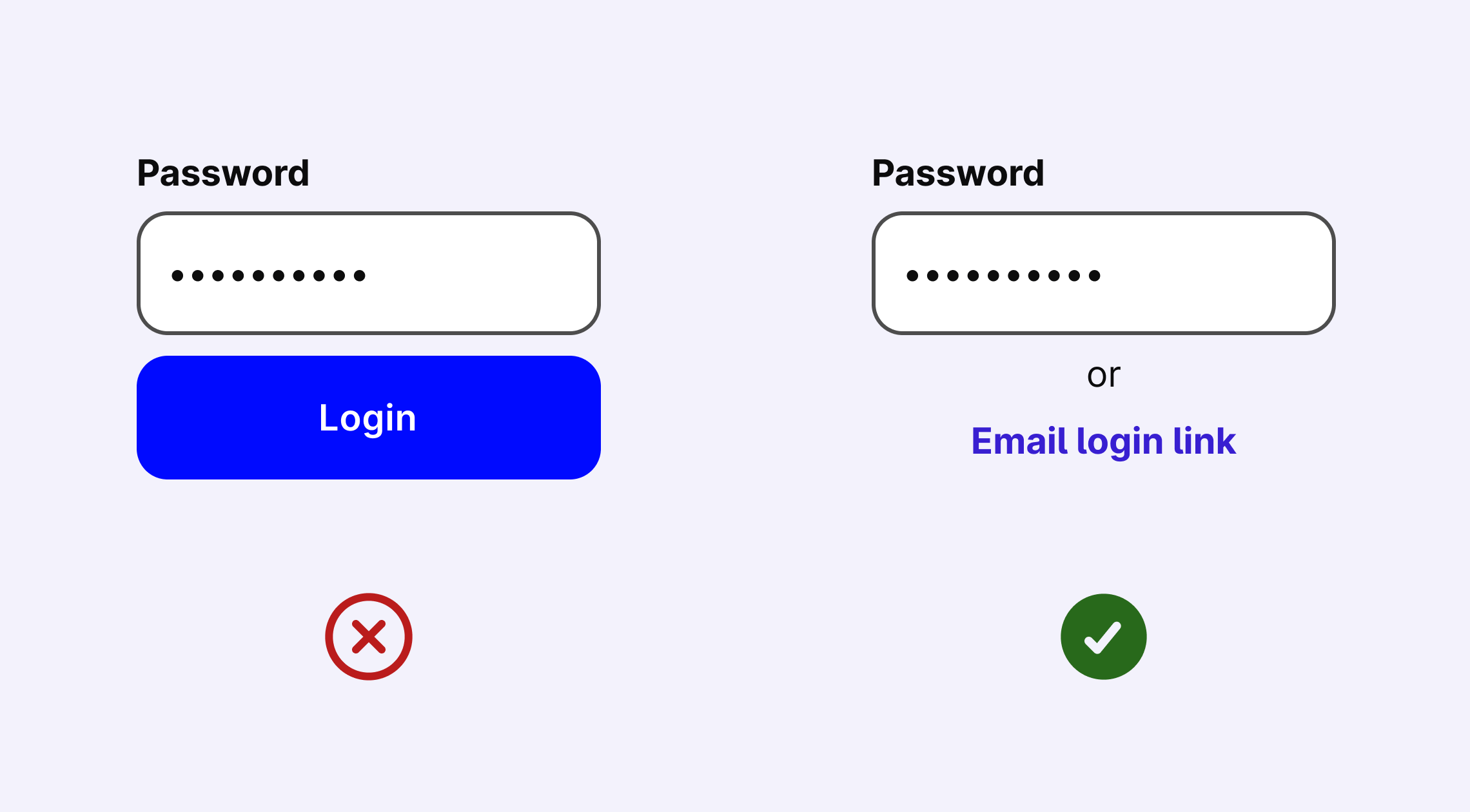
Accessible Authentication (3.3.7)
WCAG 2.2 advocates for alternative authentication methods, moving beyond traditional, memory-intensive passwords and CAPTCHAs. This specifically is helpful for people with cognitive disabilities or struggle to parse CAPTCHAs.
Less Redundancy, More Efficiency (3.3.8)
This criterion focuses on minimizing repeated inputs and reducing complexity. As a result, this will improve efficiency for everyone, especially those with cognitive and learning disabilities.

Start by conducting a comprehensive audit of your digital products with Stark. Our tools are designed to seamlessly integrate these new standards, supercharging your transition to WCAG 2.2. Don't just meet the new guidelines–raise the benchmark for what it means to excel at them.
As we embrace the guidelines within WCAG 2.2, it's important to understand them so we can make actionable moves towards implementing them — and in turn creating a more inclusive world. Ultimately? We know you have to comply (that’s why we pushed out the Compliance Center!) but this work can’t be and isn't just about compliance; it's about building digital experiences that are genuinely accessible to everyone.