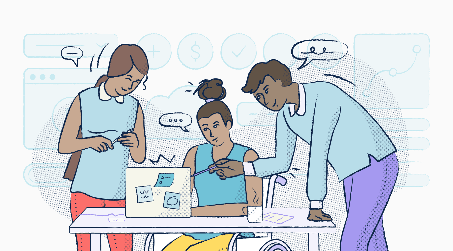
How WP Engine’s Flywheel hosted a hackathon to kickstart its accessibility journey with Stark
A three-day hackathon guides the WP Engine Flywheel team into learning and working cross-collaboratively, and ultimately building a design system centered around accessibility.

Sagal Muse
Feb 08, 2022
Every day, eight percent of the world visits a site that’s hosted on WP Engine—a platform founded in 2010 to provide its ~175,000 customers the solutions they need to build impactful websites and apps on WordPress. These visitors come from all walks of life and therefore require accessible experiences that cater to their unique needs.
Internally the company is guided by several core values including, “do the right thing”, “design matters”, and “customer inspired”. When it comes to product, the link between these core values and accessibility, in particular, are strong. It means that no matter the project, the WP Engine team ensures that they’re highly intentional about their design choices so that they can serve all of their customers—not just a select few.
“We believe that good design is good business,” —Bianca Jefferson, Product Design Manager at WP Engine
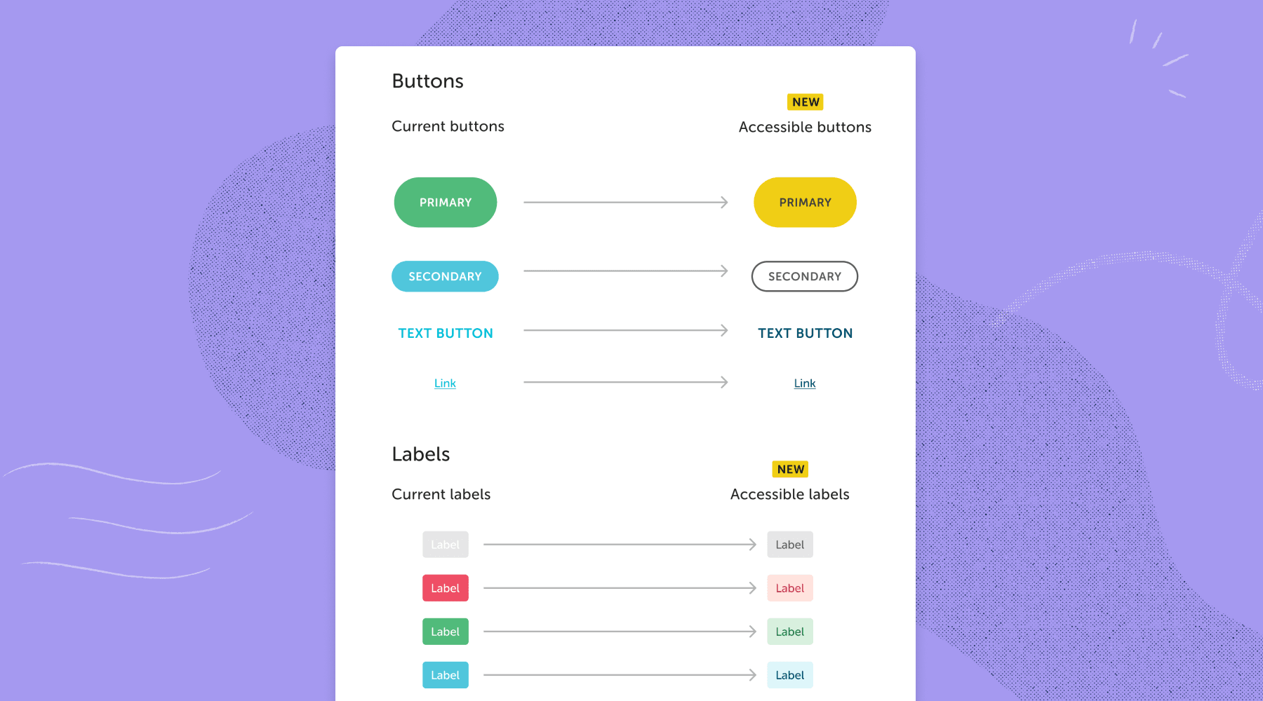
But what happens when you're looking to design new and accessible components, and realize that your current design system is built on an inaccessible brand palette?
Halfway through 2021, WP Engine’s Flywheel team experienced this challenge as they were building solutions to help creatives do their best work. The team took to solving this problem by hosting a three-day hackathon, where they used Stark tools to audit the Flywheel website and app.
The Challenge
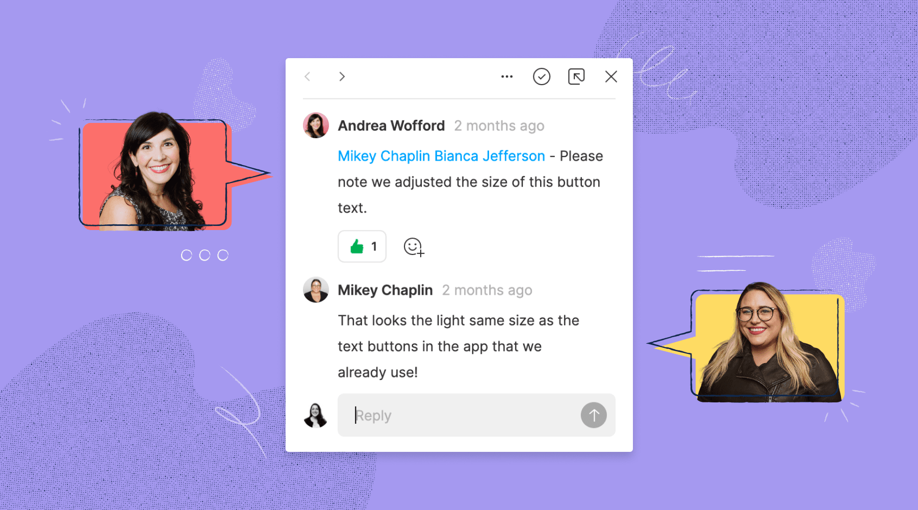
Mikey Chaplin, a Senior Product Designer at WP Engine, was working on a Flywheel design that required label tags when she noticed that they were using a similar inaccessible color palette for their existing buttons. She quickly came to a crossroads, wondering if she should make one-off label tags that are accessible or address the issue at a design system level.
Mikey turned to her team for help, and they collectively worked on putting together a pitch deck—explaining why it’s time to shift gears and bake accessibility into their design system.
The Hackathon
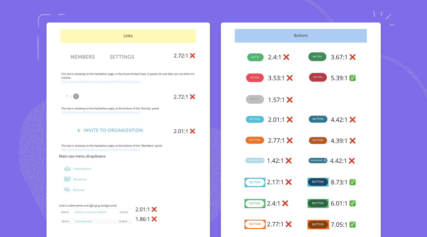
Focusing on low effort, quick wins, the product design team used Stark for Figma and Stark's Chrome extension to audit existing design elements such as buttons, text, alert banners, destructive actions, and confirmation banners. Within a few days, the team rigorously combed through the website and documented their findings in a digital whiteboard with pass or fail labels and screenshots.
“The only reason we were able to do the audit as fast as we did was because of Stark. I think if we didn't have this tool, we wouldn't have gotten a start on the hackathon.” —Kelsey Faherty, UX Research Intern at WP Engine
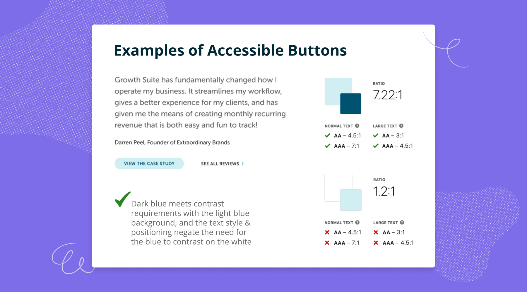
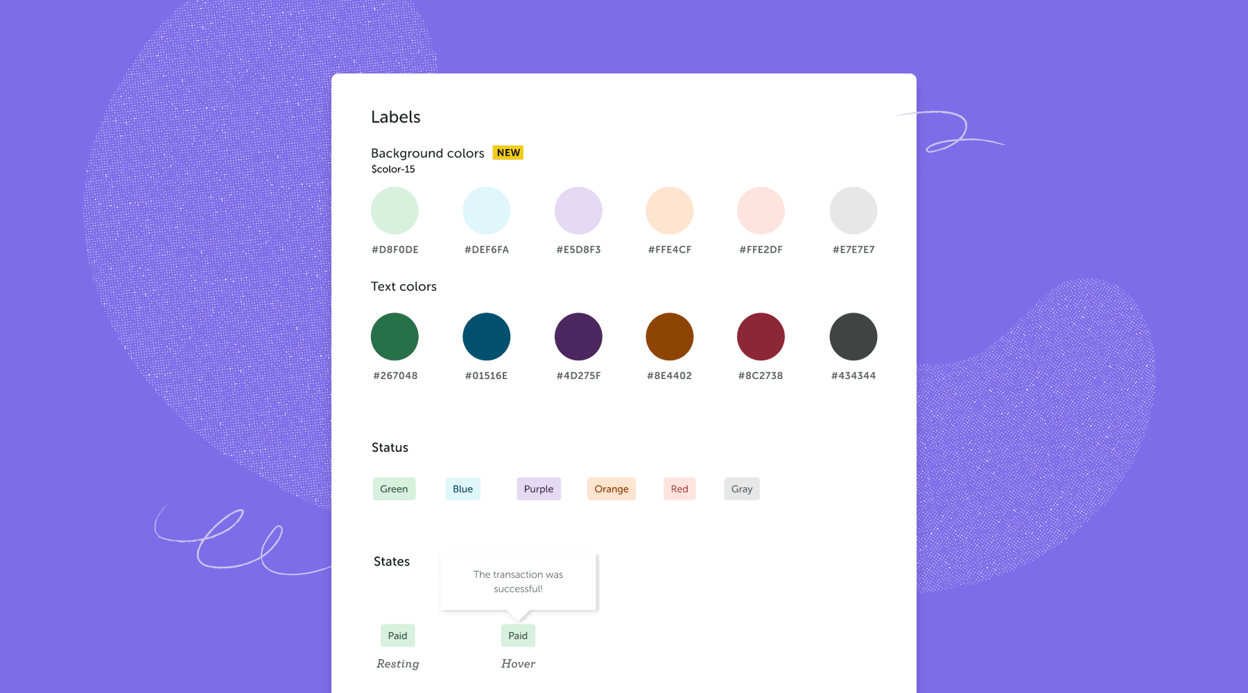
Once the audit was complete, it was time to move on to phase two, where the team used the contrast checker in Stark for Figma to ideate and test out different versions of their brand colors together. They used the WCAG checklist to triple-check their compliance level before presenting their iterations to the rest of the team. The goal here was to see which new design component passed the minimum accessibility requirements and which didn’t.
Cross-functional collaboration
The product team’s accessibility initiative quickly became a company-wide priority with buy-in from leadership and a commitment from the marketing team. Following suit, the marketing team launched their own audit, which lasted for six weeks and focused on all of the web pages that follow the buyer journey (i.e. the home, pricing, and checkout pages). They used Stark’s Chrome extension and took screenshots to work through in a Figma file—the remote version of printing pages and reviewing them on a wall. Both the marketing and product teams then provided all sorts of design and development feedback, ideas, and first gut reactions.
“When we were looking for new CTA colors, we made a predefined and accessible table of our brand palette. That really gave us a good visual of where to go and narrowed down our usable options quite a bit.” —Katie Gleason, Web Designer at WP Engine
What was really crucial in this cross-functional initiative was that both teams gave each other the ability and trust to play around within the two different environments. For instance, once the main portion of the marketing website redesign was complete, the product team began to review the newly accessible iterations. During their review session, they were looking to see which of the iterations made sense for the Flywheel app, and where they would need to come up with creative (yet accessible) solutions that meet the app’s needs.
Rather than having to take the hex codes and check them in another site, Stark was a really huge part of making the auditing process within our design software easier.” —Katie Gleason, Web Designer at WP Engine
Learning and documentation
Cross-functional learning at WP Engine took two folds. First, Associate UX Researcher, Brooke O’Connell, gave a talk during a company-wide meeting about accessibility, while interviewing internal employees who have visual disabilities. This was an opportunity for the entire company to learn firsthand from their peers the importance of accessible products, and how accessibility improves the user experience of products for all. Second, since the various teams across WP Engine are at different points in their accessibility journey, they shared a Slack channel where they came together to discuss accessibility topics and share resources.
As for the Flywheel product design team, getting started with accessibility wasn’t difficult. Most of the designers on the team have at least a foundation around accessibility and were thinking of ways to bake it into their projects. Even so, the team felt it was necessary to refresh their education on the topic. So they took an online course and used Stark’s Public Library to learn new information and keep existing guidelines top of mind. The team then met up once a week to talk about each lesson, while brainstorming ideas on how to implement them into their own projects.
“Something that I think is really exciting and attractive about Stark is the resources that I’ve seen out there are designed well, clear, and to the point. They’re not bogged down in the jargon of accessibility, which is cool because it’s making accessibility accessible to designers that don’t necessarily have a certificate in this field.” —Mikey Chaplin, Senior Product Designer at WP Engine
Additionally, the product design team worked closely with front-end developers in order to make sure that the designs were being built in a way that is accessible. The development team in particular utilized the Stark for Chrome vision simulator to experience the website as close as possible to users with common visual challenges.
The marketing team, on the other hand, took a different approach. Web Designer, Katie Gleason, who is passionate about accessibility, took an online course while conducting her own research to spearhead the initiative and share her findings with the team. Once the marketing team got started on implementing their learnings into the website, Katie made sure to document every step with references to share with various stakeholders across the company.
The presentation, which is a living document in the company’s Confluence, notes why it’s important to embrace these kinds of major changes and is meant to be a ‘one-stop shop’ that outlines: accessibility and brand guidelines, do’s and don’ts, things to consider as the team onboards new designers, tips for engineers, and so on.
Outcomes and takeaways
For both the marketing and product teams, their success came down to their ability to create accessible solutions that still felt like Flywheel’s fun, colorful and whimsical brand identity. And as the first phase of the project came to an end, the team found that they not only reached their goal, but accessibility was also now truly top of mind—not just for individual members, but for the company as a whole.
The initiative opened doors for Flywheel to explore how to further implement accessibility into future projects. It also helped improve relationships between all of the different design teams at the company. The team plans on using this momentum to become an organization that truly centers accessibility in its products and web presence.
“Product has been putting in this work behind the scenes, kind of unnoticed for so long. And I feel like this really public push on the marketing side has, if anything, helped open doors across all of the different teams to continue accessibility work in the future.” —Katie Gleason, Web Designer at WP Engine
For organizations that are looking to do the same, the Flywheel team shared some insights and takeaways to take into consideration:
- Be prepared to receive pushback and defend why accessibility is important. It may seem obvious, but for some individuals, it really isn’t. So it’s important to be prepared with the numbers that will backup your claims.
- If you have executive support, don’t just leave your employees to work on accessibility projects in their free time. Make time as a team, make it a priority, and set deadlines.
- Make checking accessibility a part of building anything new going forward. Just like it has to pass build steps and tests, it should pass through your audit tools, too, before you allow it to go into production.
- Empathize with ALL of your users. Talk to users that experience visual challenges and discover what it’s like for them as they try to use the internet, and especially your site. Don’t forget about cognitive challenges as well!
- Simple accessibility changes can completely upgrade digital experiences for someone else. So invest in education and learn about the tools that can help you make a difference.
Looking ahead
So you’re probably wondering what’s next for Flywheel and WP Engine as a whole? For both the product design and engineering teams the aim is to tackle the back end of accessibility by making sure that images have alt text, web pages have ARIA labels, and their products are generally accessible to assistive technology such as screen readers. The team also plans on focusing heavily on documentation and more specifically figuring out workflows and processes that work best for the company.
The marketing team will go into development with their newly accessible marketing site and will continue to refresh their other web pages with accessibility in mind. They plan on doing this in conjunction with the engineering team, by incorporating an accessibility checklist process into their workflow, which they’ll go through before launching any page.
And as they continue to streamline their design systems, Stark tools will be a huge asset for baking accessibility into their components. The team will be using Stark for Chrome to assess their existing web pages’ accessibility levels and to draw inspiration from other websites as they test out how accessible they are. The marketing team also plans on using Stark to build out presentations that help build understanding and improve the accessibility knowledge of others within the company.
To stay up to date with the latest features and news, sign up for our newsletter. And as you’re diving into the new feature, let us know what you think!
Want to join a community of other designers, developers, and product managers to share, learn, and talk shop around all things accessibility? Join our Slack community, and follow us on Twitter and Instagram.