Colors
Tools and resources to ensure your colors—in type, UI elements, design systems, and more—meet accessibility standards.

Colors
WCAG Colour Contrast Ratio
A Twitter thread on how the WCAG colour contrast ratio doesn’t always seem to work

Guide
Designing UI with color blind users in mind
Color plays an integral role in UI design. When done right, it improves user experience, influences purchasing decisions, and reflects the brands voice.

Colors
Accessible colors for user interfaces
As a designer, you should use high contrast colors. It will help users of websites and apps to perceive the content, regardless of visual impairments, technical restrictions, and external influences.

Guide
Reimagining Colors for Digital Accessibility
Accessibility is more than just a buzzword. Digital accessibility is the democratization of design and the efforts of some good designers can help ensure this design revolution.

Guide
How to design an accessible color scheme
Designing for web accessibility means intentionally building an experience for all users, regardless of their visual, hearing, motor, or cognitive ability.

Guide
How to Use Color Blind Friendly Palettes to Make Your Charts Accessible
Colors play a central role in data visualization. But what if your readers are color blind?

Guide
Making a Palette Accessible
Failures in the colour palette — how the colours are applied in the UI — are among the most prevalent of accessibility issues. So what happens when you know the palette you are working with has multiple points of failure?

Guide
Accessibility Design 101 - Color Contrast Considerations for UX Designers
Color is an inherent part of design. Even with the best digital design tools at their fingertips, designers have been known to agonize over choosing a hue or hexcode in the hopes of conveying a specific mood or message in a design.

Colors
Open Source Color System
5,390 accessible color combinations

Contrast Checker
Color Contrast Checker
Evaluating your design for color contrast is a critical aspect of accessibility testing and organizations may benefit from appropriate user experience training and expertise to ensure proper contrast.

Color Generator
Color Studio
It is too hard to build coherent and accessible themes with the right colors. This should help.
Contrast Checker
Color Contrast Checker
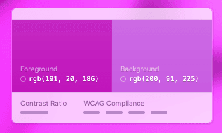
AA Large applies to text > 24px or > 18.5px for bold fonts. Learn more: Text Contrast Non-text Contrast (WCAG 2.1) For APCA font size and weight need to be taken into account, so the little colored dotis not really meaningful: WCAG 3.0 APCA (Working Draft)

Color Generator
ColorCube
A color A11y Tool for Designers & Developers
Color Simulator
Pika
An open-source colour picker app for macOS.
Contrast Checker
Contrast Checker
This tool is built for designers and developers to test color contrast compliance with the Web Content Accessibility Guidelines (WCAG) as set forth by the World Wide Web Consortium (W3C). These calculations are based on the formulas specified by the W3C.

Contrast Checker
Colour Contrast Determinator
The Colour Contrast Determinator contains text alternatives for screen reader users. For example, the text alternative for the hue slider might be "Hue values 0 to 217 fail. Values 218 to 285 pass. Values 286 to 360 fail".

Contrast Checker
ColorTester
Software for test contrast ratio (WCAG 2.0 (JIS X 8341-3:2010) color contrast success criteria) between fore color and background color.

Contrast Checker
Color Contrast Checker
Enter your colors in HEX format or click on the icon to use the color picker. Contrast ratio value will be updated automatically as you change color values. We use Web Content Accessibility Guidelines (WCAG) to calculate the color contrast ratio.

Contrast Checker
Contrast Checker
The tool tests the contrast of your background and text for accessibility. You can use it to visualize different color combination palettes for your website design that are in compliance with WCAG, EU directive, and ADA standards.
Contrast Checker
Color Contrast & Color Perception Accessibility Checker
This tool lets you check the color contrast between different color pairings and also check for common color perceptions against Web Content Accessibility Guideline (WCAG) standards.
Image Color Checker
Color Check for ADA image compliance
Color Check in an interactive tool for validating web image compliance with ADA (Americans with Disabilities Act) contrast and readability standards.
Color Simulator
Check My Colours
A tool for checking foreground and background color combinations of all DOM elements and determining if they provide sufficient contrast when viewed by someone having color deficits.

Contrast Checker
Color Contrast Accessibility Validator
This website provides free color contrast analysis tools that will display the color contrast issues of a web page or chosen color-pair; per WCAG 2.1 Guidelines.
Vision Simulator
Coblis
The Color BLIndness Simulator can close this gap for you. Just play around with it and get a feeling of how it is to have a color vision handicap.

Color Generator
Accessible color palette generator
Adobe color's accessible color palette generator.

Color Generator
Color Tool - Material Design
Create, share, and apply color palettes to your UI, as well as measure the accessibility level of any color combination.

Contrast Checker
Button Contrast Checker
A tool to test the contrast of all buttons and links of a page at once. Enter your domain and Button Checker test if your buttons have enough contrast and are compliant with WCAG 2.1.

Color Simulator
Color.review
Colors that look and work great for everyone and what you need to know about colors & accessibility.

Contrast Checker
Tanaguru Contrast-Finder
Finding the good contrasts, for web accessibility, between two colors.

Color Generator
Accessible Color Generator
High-Contrast Color Suggestions.

Color Generator
Colors interactor
A simple way to check the interactions between the colors of your palette.

Contrast Checker
Contrast Ratio
Easily calculate color contrast ratios. Passing WCAG was never this easy!

Contrast Checker
Accessible Colors
A simple tool to test background/text contrast ratio and automatically find the closest accessible colors.

Color Generator
ColorBox
Produce accessible color palettes with the help of ColorBox.

Color Simulator
Who Can Use
A tool that brings attention and understanding to how color contrast can affect different people with visual impairments.
Contrast Checker
Color Tester
Create and test your color palette, validate color contrast for accessibility (https://www.w3.org/TR/WCAG20/), simulate your palette seen by a colorblind person, convert colors to HSLA, RGBA and hex for your CSS, convert to CMYK.

Vision Simulator
Toptal Color Blind Filter
Use the Colorblind Filter to select safe colors earlier in the design process.

Color Generator
Contraste
Contraste allows you to quickly know if a combination of colors, for a text and a background, passes accessibility thresholds defined by the W3C.

Color Generator
Colors
A nicer color palette for the web. Mix and match color classes to create a variety of accessible themes.

Color Generator
Accessible Brand Colors
Shows you how ADA compliant your colors are in relation to each other.