Using Contrast Checker + Color Suggestions
Check your designs to ensure your colors meet accessibility standards
When checking contrast for colors or text virtually anywhere, you’ll find the labels AA and AAA pop up frequently. These are the different conformant levels for contrast checking based on the WCAG.
Using Contrast Checker + Color Suggestions with Figma and Sketch plugins
Download: Stark for Figma, Stark for Sketch
Checking Contrast
With Stark, you can check the AA and AAA color contrast of your text or shape layers.
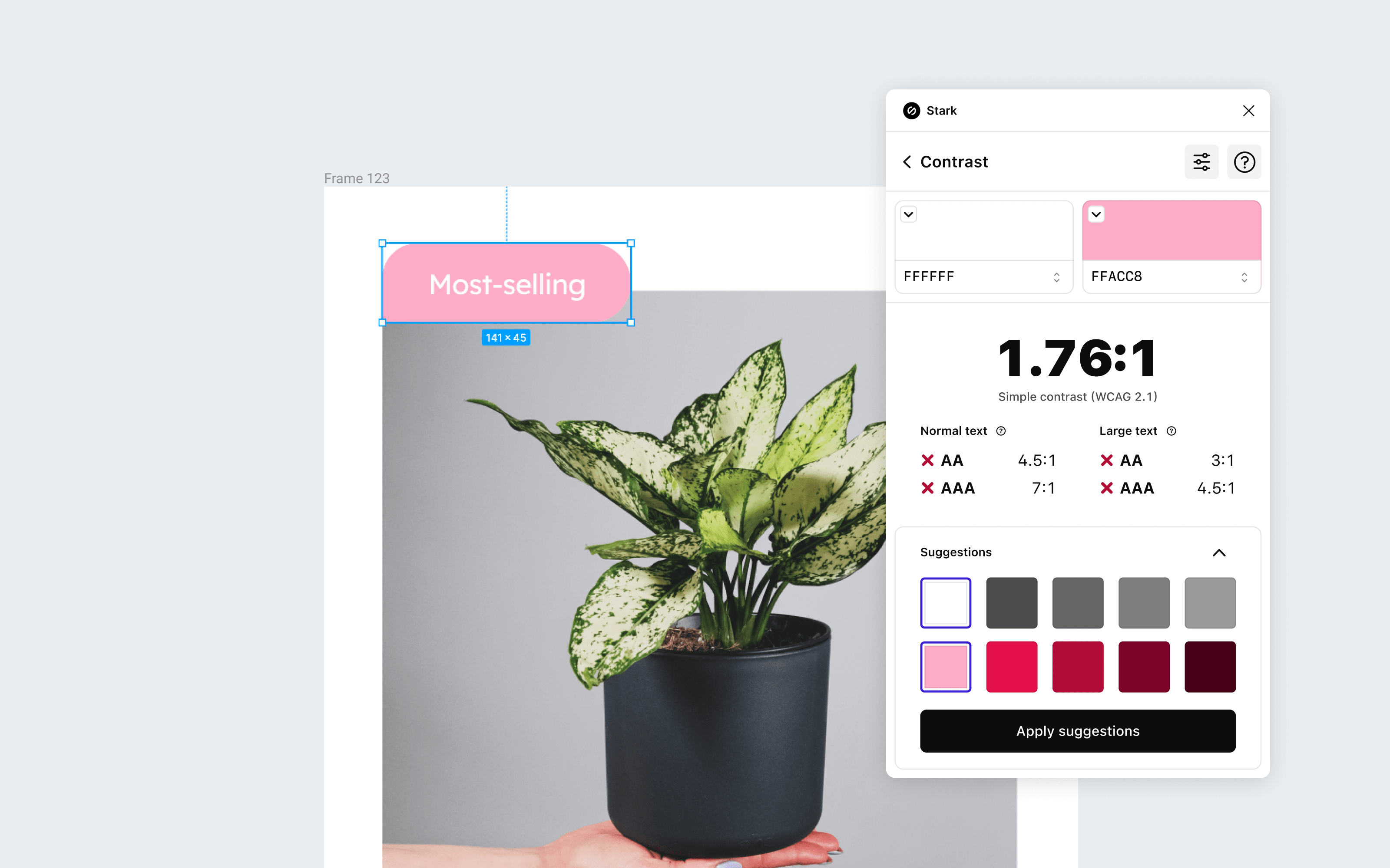
To use Contrast Checker + Color Suggestions, go to Plugins and choose Stark > Contrast.
To start checking the contrast of your text or shape layers, simply select a layer or layers. Stark will do its best to determine which colors to check while also giving you the option to choose which specific colors you want to check.
Remote Library Colors in Figma
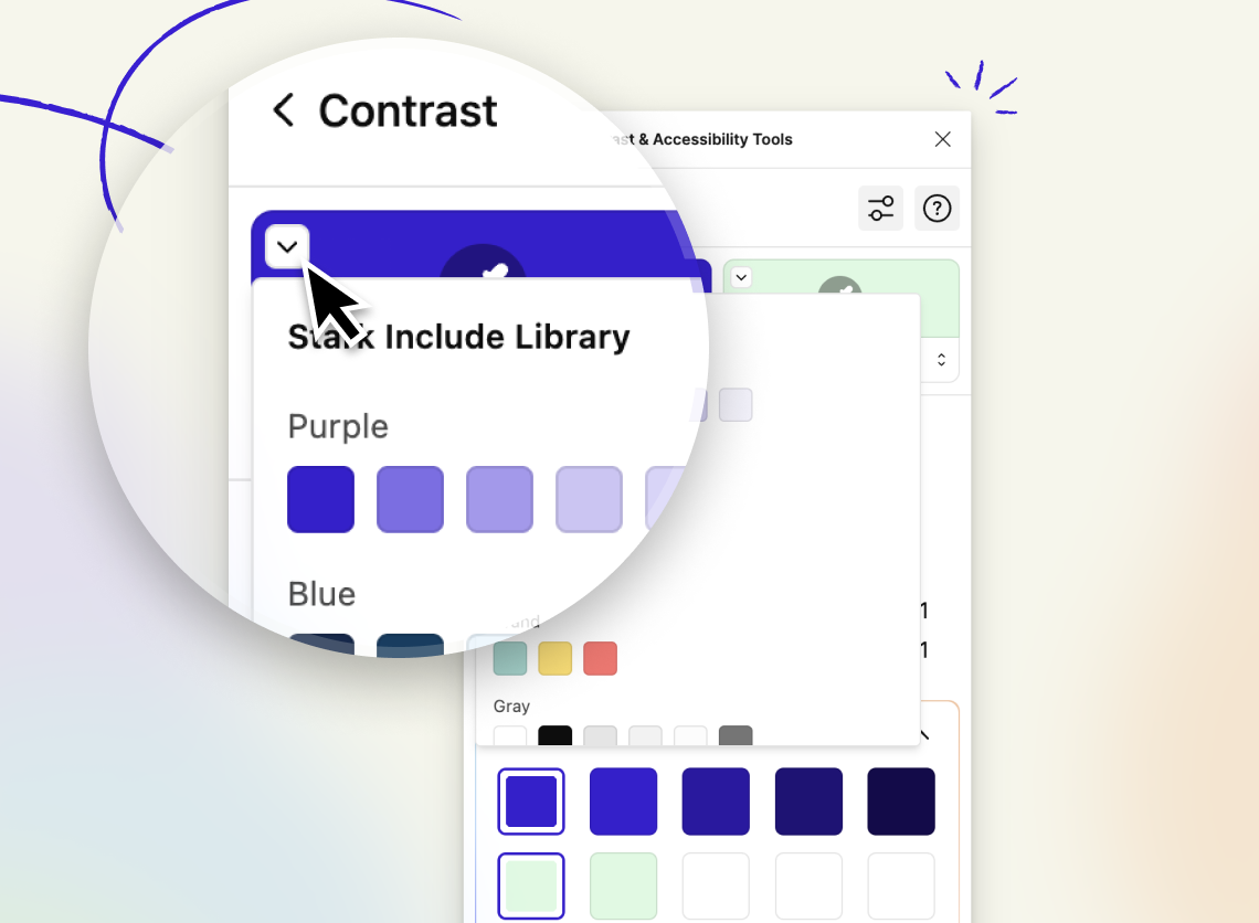
In Stark for Figma, you can select your local variables and colors from your remote libraries right from the color picker.
Color selection in Stark for Figma and Sketch
Stark always attempts to determine the colors you’re comparing in a selected frame with Contrast Checker. In Stark for Figma and Sketch, we add another layer of accuracy by using your text layers as the foreground (top) by default.
Let’s say you have a frame with a background color, a call-to-action button (a rectangle or shape layer) in a different color, and text on top of that button. Since you wouldn’t want to test the contrast of a button on text, the Contrast Checker prioritizes text layers in the foreground, which helps us better identify the colors you want to compare.
Suppose we don’t get the colors exactly right, or you want to check the contrast of other combinations on your page. In that case, you can open the drop-down menu in the top-left corner of your selected color swatches to choose from all the solid colors in your specified frame and page. And Stark removes duplicates, so you don’t see repeated colors in the menu.
Color selection in Stark for Figma
Figma lets you organize styles in your files into groups using the / naming convention. Stark will pull those local styles into the drop-down menu based on your organization structure, making them as easy to find in the Contrast Checker as they are in the Figma sidebar.
Color selection in Stark for Sketch
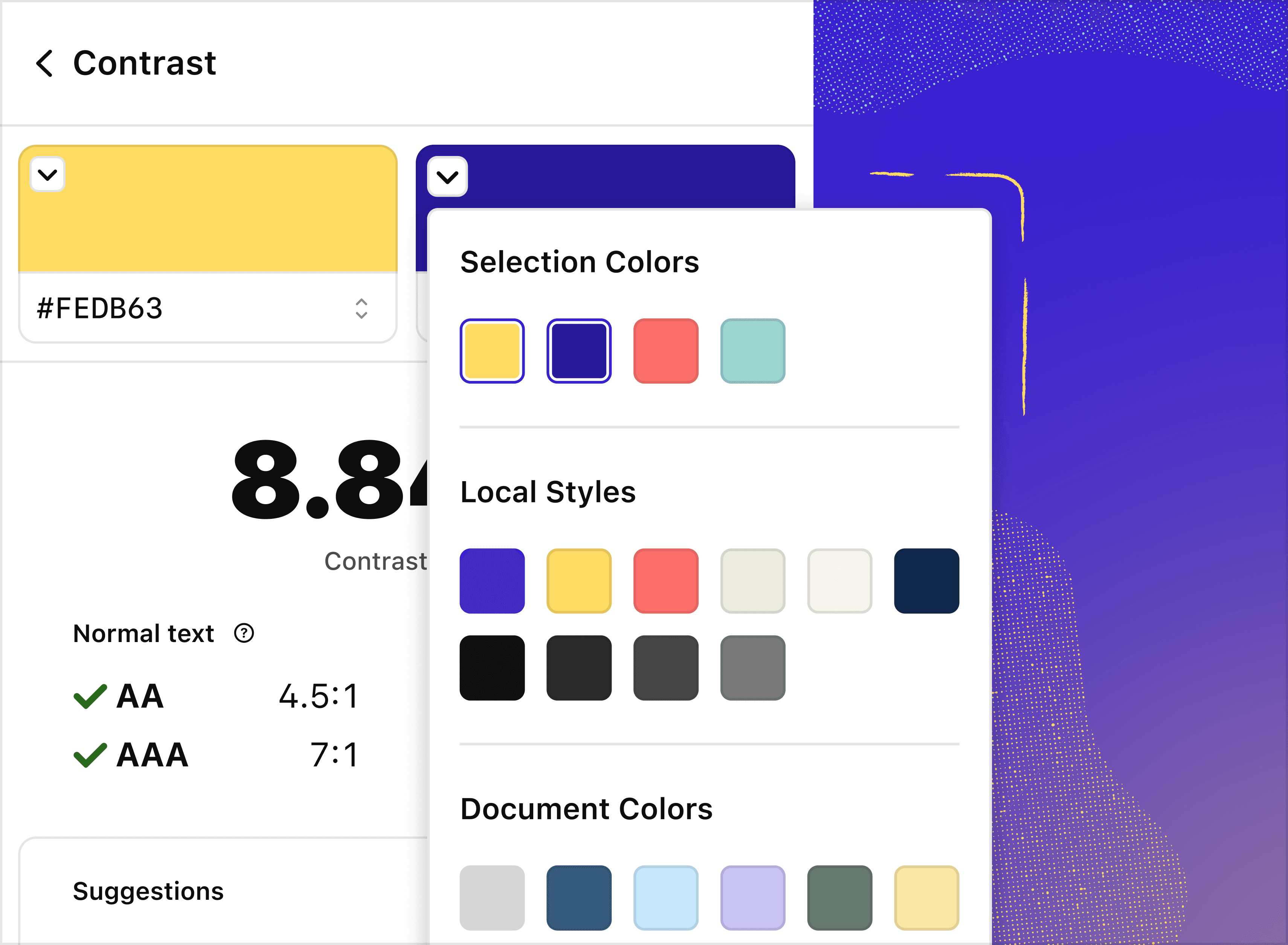
In Stark for Sketch, we pull in colors from your file, default colors from the Sketch library, and global colors from any remote libraries you have set up into the drop-down menu. To keep things simple, Stark categorizes these colors in the menu.
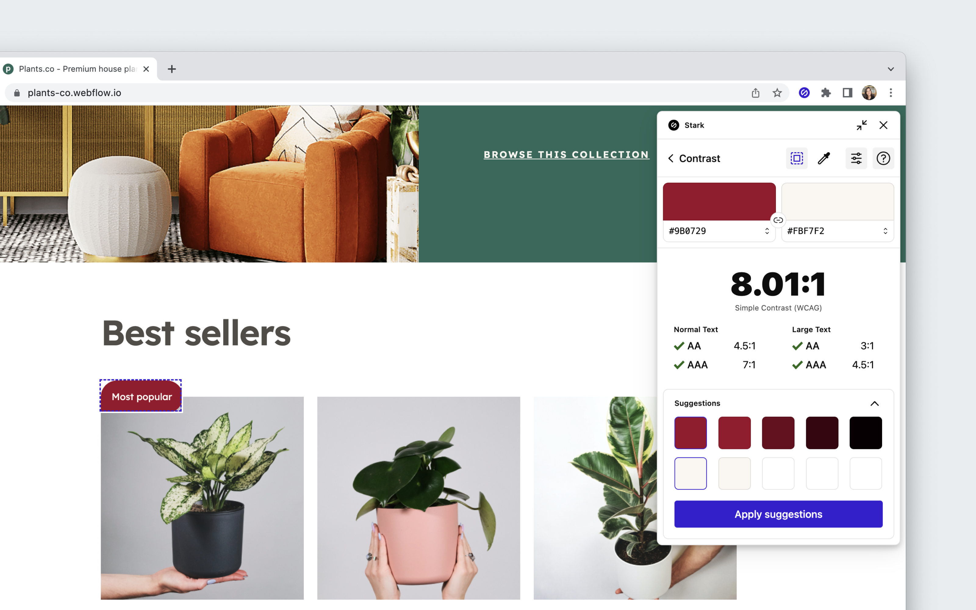
Using Color Suggestions
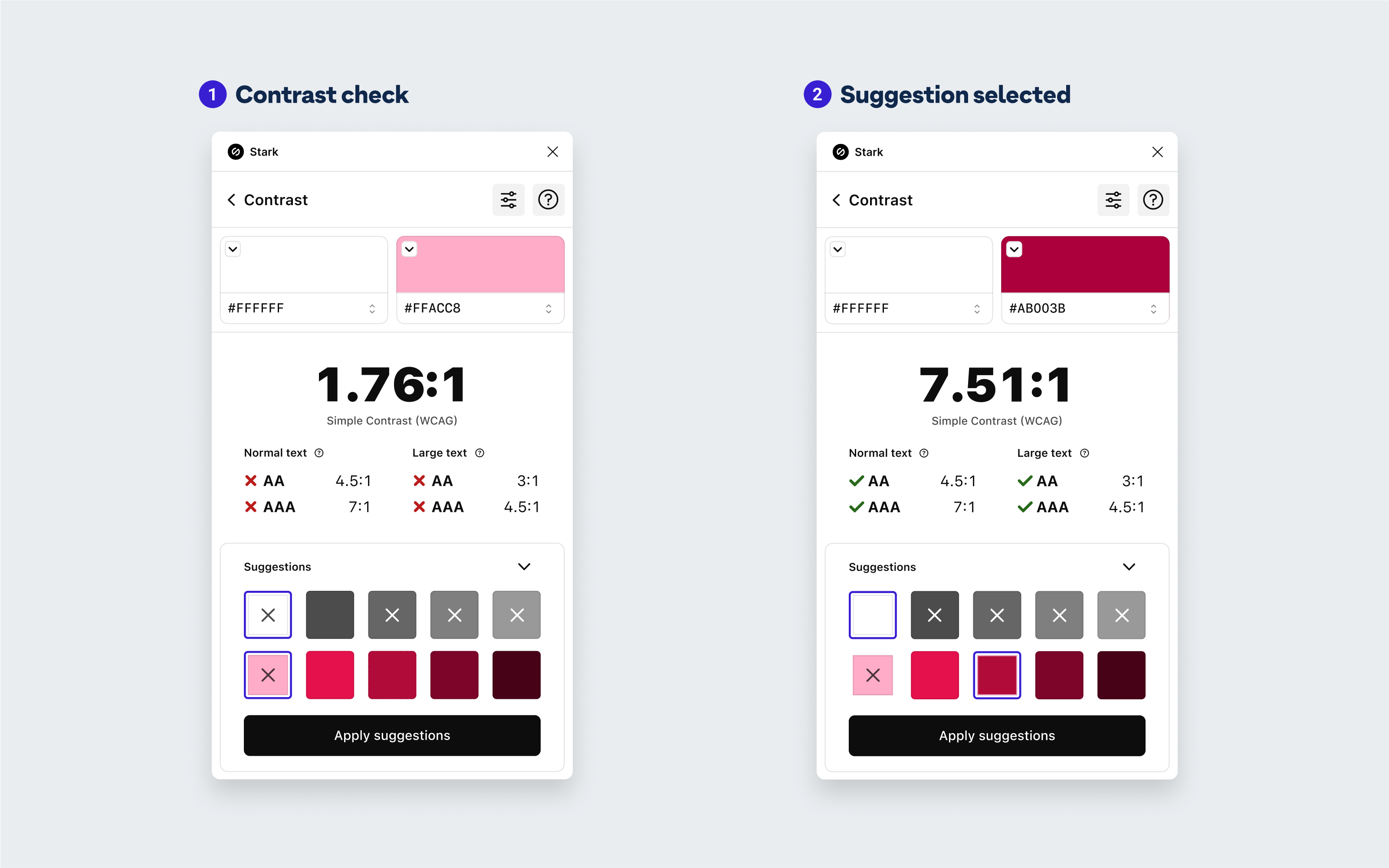
What if the layers don’t pass? We’ve got you covered. With Color Suggestions, Stark provides alternative foreground and background swatches that are guaranteed to meet AA or AAA criteria. Plus, they won’t deviate too far from your original colors and adjust automatically in real time as you select various combinations.
Here’s how it works
- Select the layer(s) or component you want to run a contrast check on. We recommend using a parent component, so Color Suggestions will automatically update all instances in your design system.
- Go to
Plugins > Starkto run the check - If your contrast ratio doesn’t pass, choose from the alternative foreground or background colors that Stark suggests to rectify the issue. If you have remote libraries, Stark will pull from those as well and even use the same category of colors as your selected colors.
When you update your design, you’ll notice how Stark adjusts your parent component (and all the connected instances) in your design system.
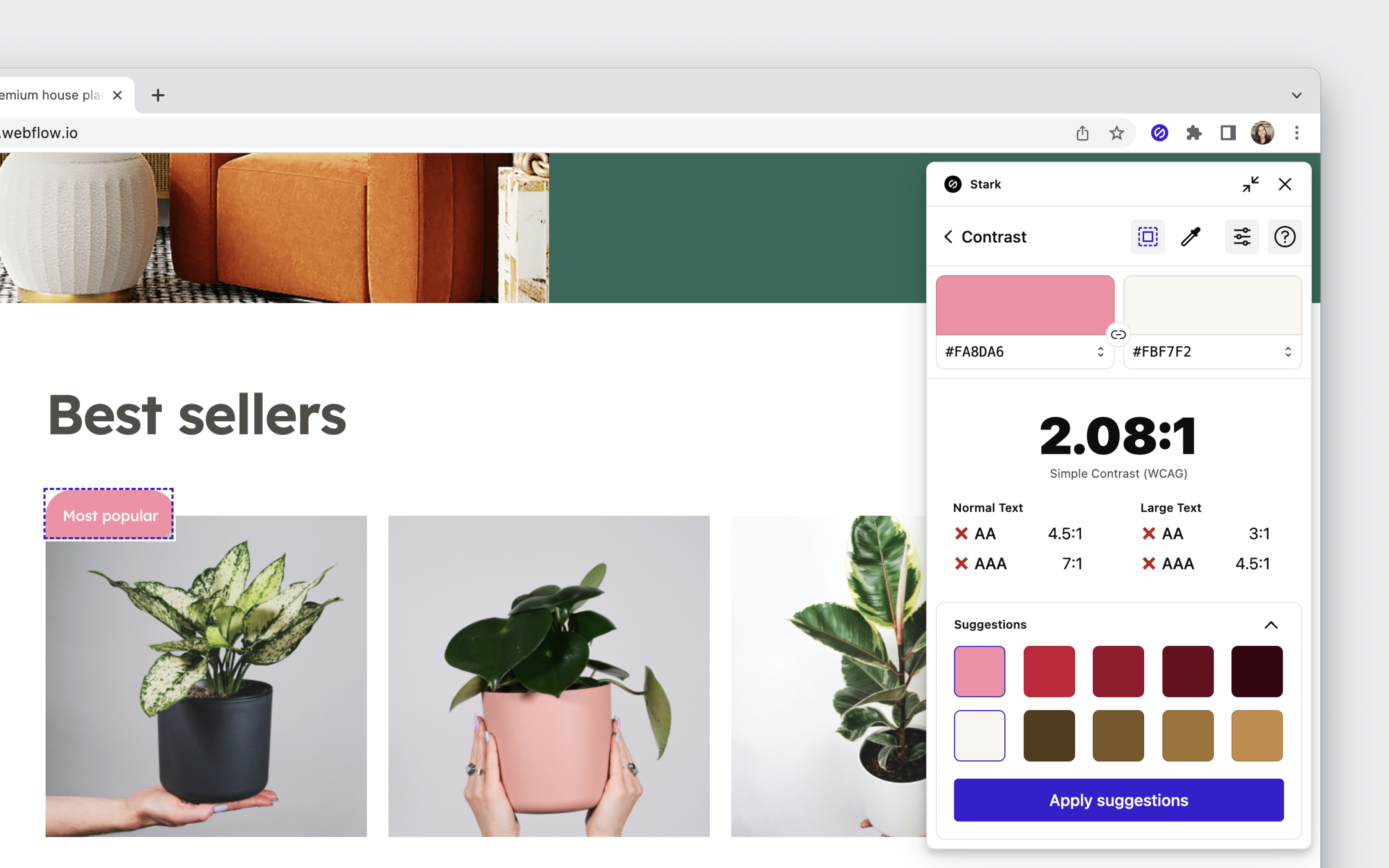
Using Contrast Checker + Color Suggestions in your browser
Download: Stark for Brave, Stark for Chrome, Stark for Edge
To start using Contrast Checker + Color Suggestions, open Stark from your extension menu.
Choose your element
You can click any element on your site to check its background and foreground colors. When you select an element, we draw a box around it to indicate where we’re getting the colors from.
Eye Dropper
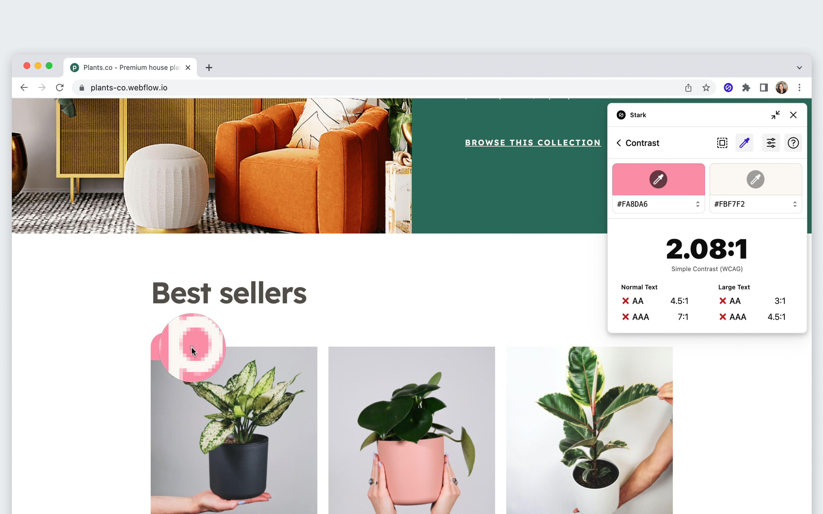
For more control over the colors selected, switch to the Eye Dropper tool by selecting the eyedropper icon.
To compare two colors:
- Click on the eyedropper icon in one of the two color boxes
- Hover over the first color you’d like to compare and click
- Check to see that the desired color appears in the color box
- Repeat the process with the other color box
Once both colors have been selected, you can review their contrast ratio and check if they pass WCAG standards.
Applying suggestions with Live Preview
If an element doesn’t pass AA and AAA standards, you can use our suggestions to find a passing combination. Click Apply suggestions to get a Live Preview of the updated colors on your site.
Stark will try to update all similar elements. So if you selected an h3, all the other h3 elements on the page should have the color suggestion applied.
APCA in Stark (beta) for Figma, Sketch, and Browser Extensions
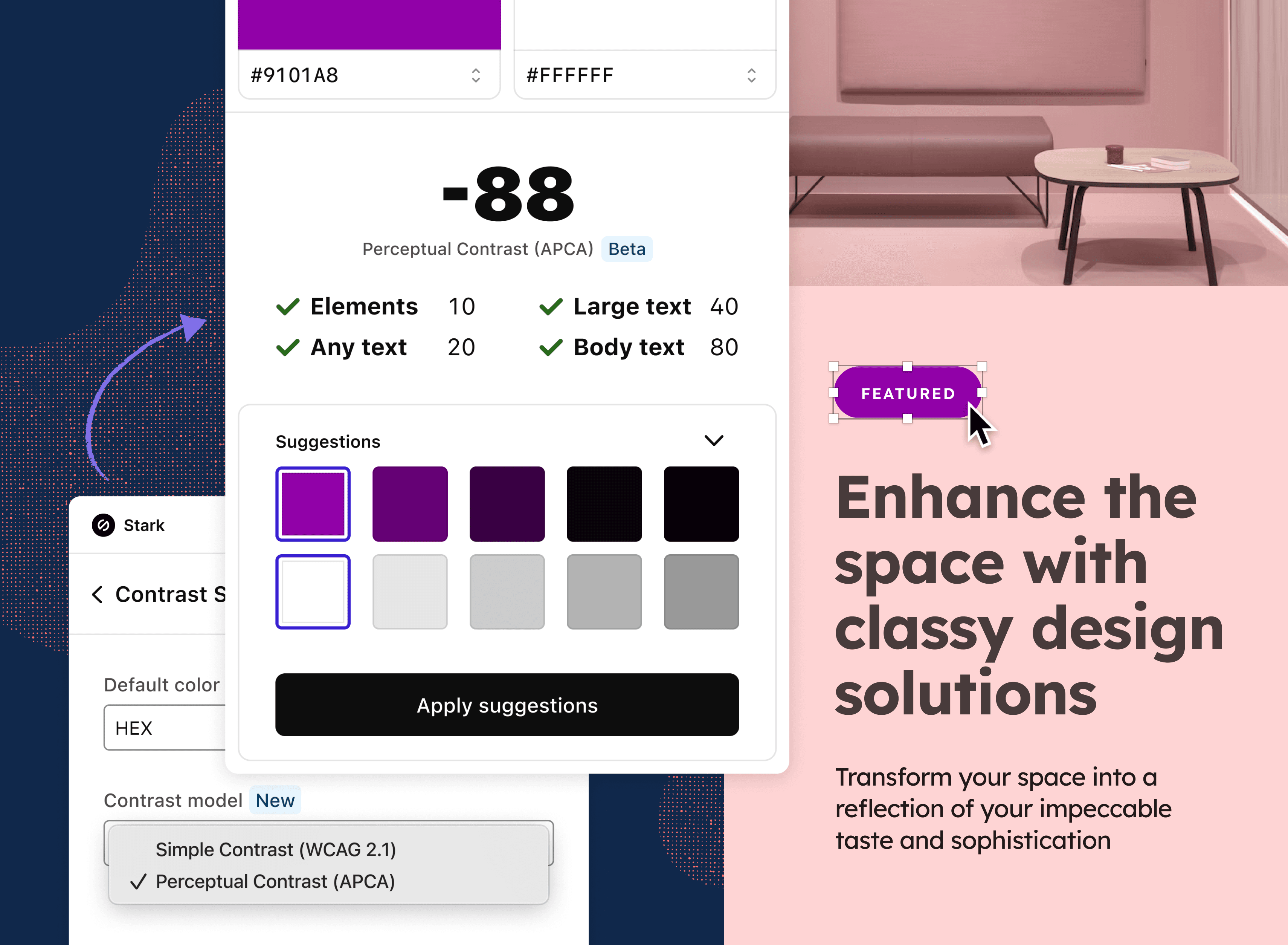
What is APCA?
APCA stands for Advanced Perceptual Contrast Algorithm, a new model to calculate color contrast based on modern scientific research on color perception. It was created with the goal to optimize the readability of content for all users. Compared to the AA/AAA guidelines, APCA is more context-dependent and in turn aims to be more accurate in creating a great, readable experience for people with different types of vision.
The contrast is calculated based on the text’s font weight and size, color (taking into account perceived lightness difference between text and background), and context (for example ambient light, surroundings, and intended purpose of the text).
To turn on APCA mode
- Click the new settings icon in the top right corner of Stark’s Contrast tool.
- Select Perceptual Contrast (APCA).
- Choose from the alternative foreground or background colors that Stark suggests to rectify any contrast issues.
Have any questions about using Contrast Checker + Color Suggestions? Don’t hesitate to reach out to us at support@getstark.co.
📝 APCA Disclaimer
APCA is a method for predicting text contrast on self-illuminated displays for web-based content. Some use-cases are prohibited by license, including the following: use in medical, clinical evaluation, human safety related, aerospace, transportation, military applications, are strictly prohibited without a specific license in writing granting such use.
https://git.apcacontrast.com/documentation/WhyAPCA
W3C Software and Document Notice and License
This work is being provided by the copyright holders under the following license.
License
By obtaining and/or copying this work, you (the licensee) agree that you have read, understood, and will comply with the following terms and conditions. Permission to copy this work without modification, except as needed for integration to a specific language or environment, for any purpose other than those specifically excluded, and thereafter without fee or royalty is hereby granted, provided that you include the following on ALL copies of the work or portions thereof, including modifications:
- The full text of this NOTICE in a location viewable to users of the redistributed or derivative work.
- Any pre-existing intellectual property disclaimers, notices, or terms and conditions. If none exist, the W3C Software and Document Short Notice should be included.
- Notice of any changes or modifications, through a copyright statement on the new code or document such as "This software or document includes material copied from or derived from [title and URI of the W3C document]. Copyright © [YEAR] W3C® (MIT, ERCIM, Keio, Beihang)."
Disclaimers
THIS WORK IS PROVIDED "AS IS," AND COPYRIGHT HOLDERS MAKE NO REPRESENTATIONS OR WARRANTIES, EXPRESS OR IMPLIED, INCLUDING BUT NOT LIMITED TO, WARRANTIES OF MERCHANTABILITY OR FITNESS FOR ANY PARTICULAR PURPOSE OR THAT THE USE OF THE SOFTWARE OR DOCUMENT WILL NOT INFRINGE ANY THIRD PARTY PATENTS, COPYRIGHTS, TRADEMARKS OR OTHER RIGHTS.
COPYRIGHT HOLDERS WILL NOT BE LIABLE FOR ANY DIRECT, INDIRECT, SPECIAL OR CONSEQUENTIAL DAMAGES ARISING OUT OF ANY USE OF THE SOFTWARE OR DOCUMENT.
The name and trademarks of copyright holders may NOT be used in advertising or publicity pertaining to the work without specific, written prior permission. Title to copyright in this work will at all times remain with copyright holders.