Accessibility and usability: The dynamic duo
Every good designer should combine these two approaches for building products that are both inclusive and usable. Here's how...

Sagal Muse
Apr 14, 2022
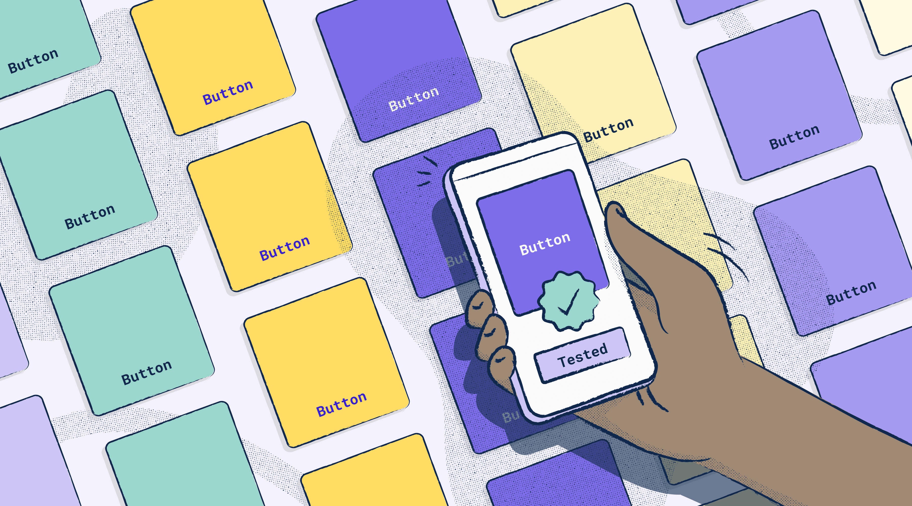
Like Batman and Robin, accessibility and usability are principles that do their best work together. For instance, when testing for accessibility, you’ll most likely encounter usability issues that might have otherwise gone under the radar. The two principles in this case are working together to solve for issues that go beyond ability, condition, or circumstance. On the flip side, considering one principle without the other may result in a disservice for some of your users—where a particular group may feel the burden of your design choices and struggle to use or even access your product with ease.
Take this example that a Stark community member brought to our attention for instance.
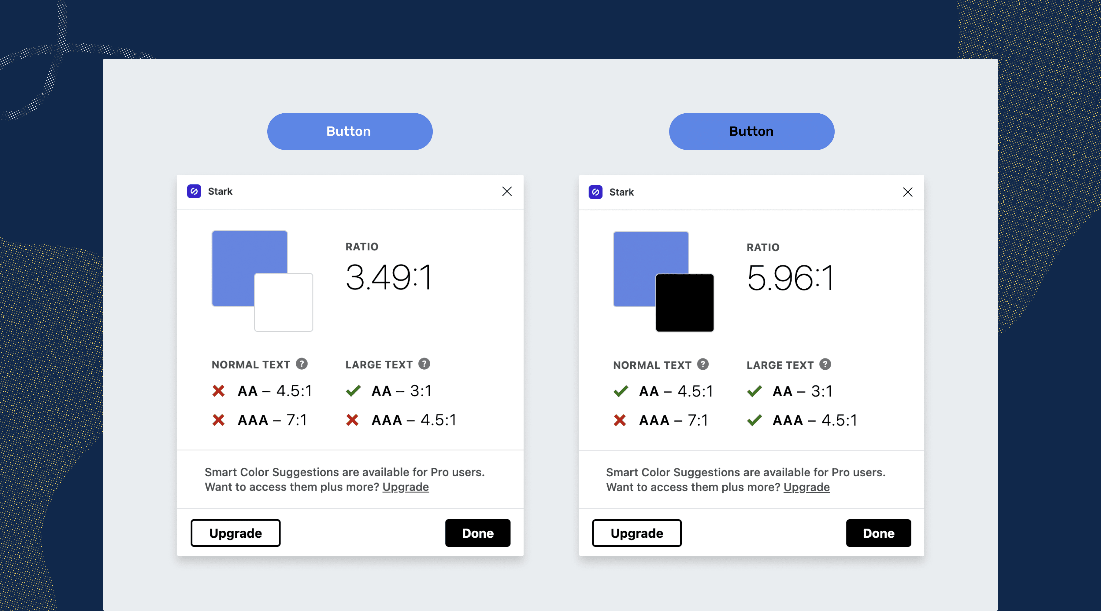
As a sighted user, when looking at both buttons side-by-side, you may think to yourself that the blue and white button on the left is “more readable” and “easier to look at” than the blue and black button on the right.
However, when you use Stark's contrast checker to see which of these two buttons is more accessible, you notice that the “more readable” option (i.e, the blue and white button) doesn't meet accessible contrast ratio requirements. Instead, you surprisingly see that the blue and black button is compliant, even though it’s the “less readable” option.
So which of the two buttons do you implement in your design?
In a case like this, you’d be right to ask around to get a second, third, or even tenth opinion. But with all of the confusion, you may settle for ignoring the results of the contrast checker and going with the subjectively “more readable” option instead. It’s at this moment that you should ask yourself the following questions:
- Who was included in the group of people I tested with? Were they fully sighted?
- What questions did I ask myself, my peers, or user interviewees, to prompt their answers? Were my questions framed within a biased lens?
- Did I consider the context in which users will engage with my design?
Once you answer these questions for yourself, you’ll notice a few important points.
Accessibility tests should include all types of users
While gathering feedback, you may have asked those closest to you, such as your co-workers, for their perception rather than conducting accessibility testing with all types of users—including those with visual impairments or sensitivities. This method leaves out insightful perceptions that may be different from yours and can lead to an exclusionary decision.
Research questions should avoid bias
When conducting your research, you may have asked questions framed within a biased lens without realizing it. For example, asking, “Isn’t the blue and white button easier to read than the blue and black button?” yields biased answers. This is because it leads your audience to subconsciously look for ways to agree with your perception, rather than making their own judgment.
Context matters
In general, you may have also forgotten to consider the context in which your product will be used. Depending on how your users interact with your product, including the inaccessible blue and white button can lead to issues for even sighted users. For example, your users may have difficulty reading the button if they’re trying to engage with it outside, in a car, or an office with bright overhead lights. And it's even worse if you factor in the poor peak brightness of cheaper or older smartphones.
Finding a happy medium is key
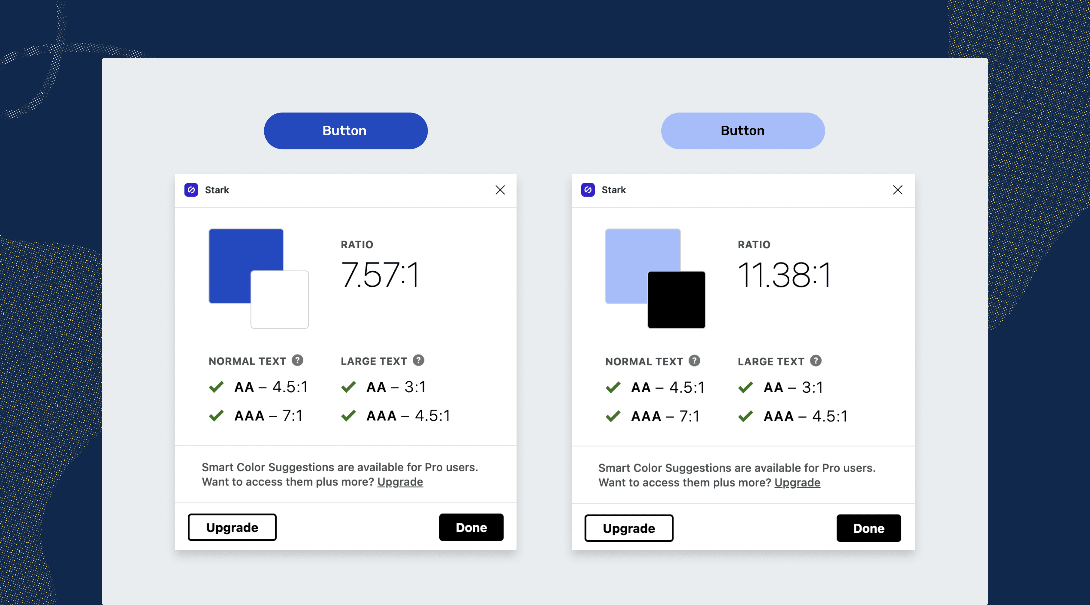
For this example, the trick to finding a happy medium between accessibility and usability is to adjust the colors until you get a result that passes ratio requirements. For the blue and white button, you can go a tad darker in the background color so that it passes contrast. And for the blue and black button you can lighten the background color a bit more to make it readable.
As you can see, designing with one lens while failing to consider the other can result in an exclusionary design for some. Testing for both accessibility and usability will allow you to recognize, diagnose and solve issues that may arise as early as possible. By taking this approach, you’re benefiting not only those who may have disabilities but your entire audience as well.
Want to join a community of designers, developers, and product managers to share, learn, and talk shop around accessibility? Join our Slack community, and follow us on Twitter and Instagram.
To stay up to date with the latest features and news, sign up for our newsletter.