3 steps to creating accessible components in design and code
Looking to build accessibility into your product at the component level? Here are three productive steps to help get you started.

Sagal Muse
May 12, 2022
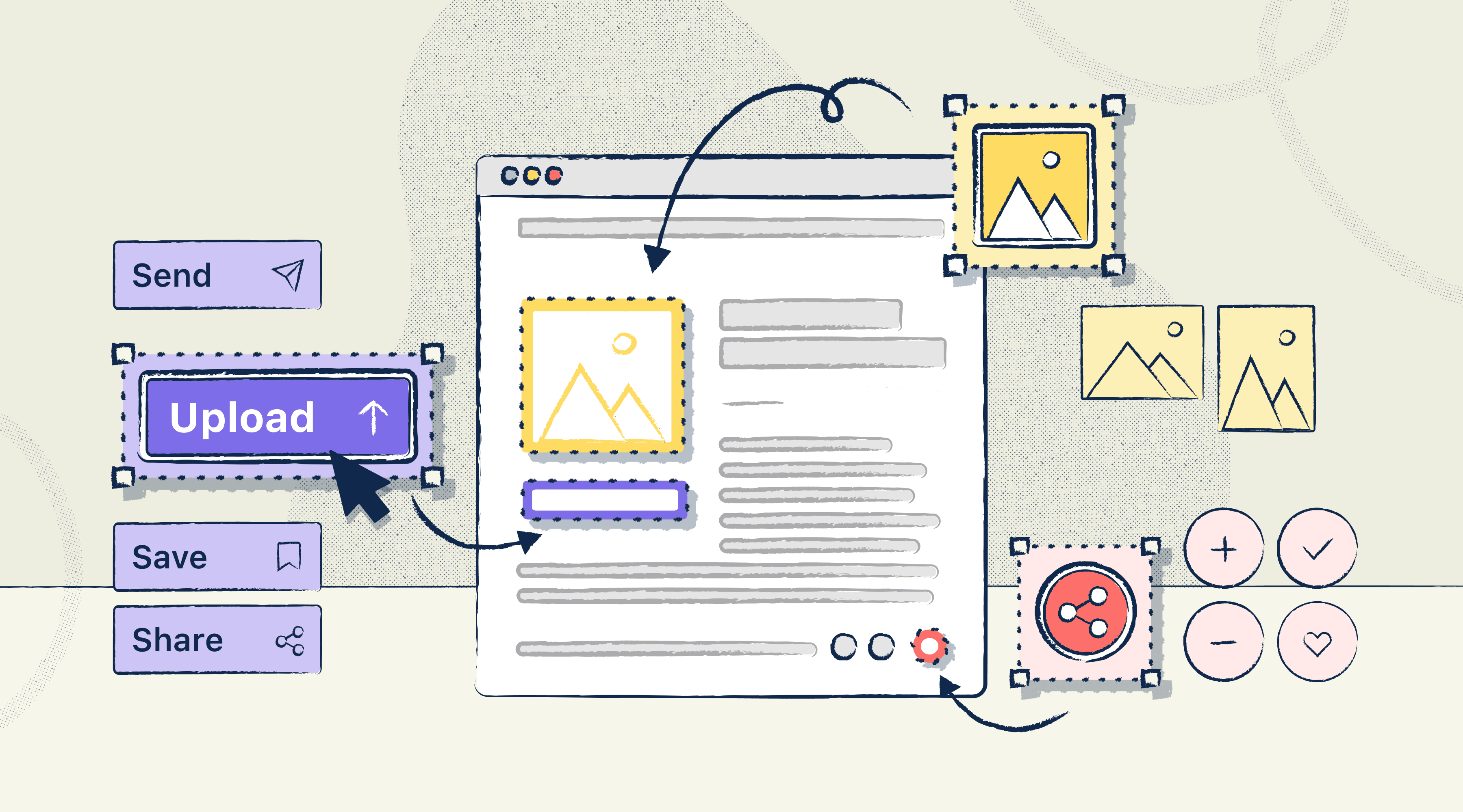
Components are powerful. When they’re published within a design system and reused project-wide, as much as they help with efficiency, the slightest mistake can replicate and become a real headache down the line. For instance, if you publish a flawed component that requires a two-hour fix to be accessible, the component itself will then carry two hours of accessibility debt. If it’s reused 10,000 times, that debt could become 20,000 hours or ten person-years!
On the flip side, the most simple accessibility improvements will spread immediately across all your designs—reducing your likelihood of a more significant accessibility deficit. It’s just a matter of getting started early and consistently implementing accessibility considerations into your product as you continue to build onto the foundational blocks.
Here’s how you can simplify the process with these three productive steps.
1. Identify existing accessibility issues
In many instances, you may be tasked with making accessibility improvements to an already published website or digital product. In this case, you’re going to want to address the problem at a design system level and conduct an audit to identify the accessibility issues that need to be addressed immediately. For your team, this may look like an audit of all interactive components to identify any missing focus states. For others, it may be an audit of the text and background colors used within your components to determine which ones are passing or failing contrast ratio requirements.
Regardless of what issues you decide to prioritize, you can complete a successful audit by keeping the following tips in mind:
-
Determine the scope of your audit by reviewing your users’ journey and focusing on high-priority customer-facing components.
-
Kickoff a cross-functional hackathon to rally everyone around the same goals and deadlines.
-
Use accessibility tools such as Stark for Chrome and our Figma, Adobe XD, or Sketch plugins to make the auditing process more efficient.
-
Don’t strictly rely on automated auditing tools. Instead, make sure to also audit manually to catch any issues you may have missed otherwise. For example, you can navigate your website using a keyboard or assistive tools to test for compatibility.
-
Document your findings and first gut reactions in a collaborative platform like a whiteboarding app. You can make notes of the issues that have come up, the number of instances you’ve noticed the same problem, how it impacts your users, and the severity of that impact.
-
Once you’ve completed your full audit, focus on rectifying high-priority issues and those proven to be low-effort, quick wins.
2. Apply the 4 core principles of accessibility
When getting started with baking accessibility into your existing or even new components, it’s best to plan ahead and become aware of all the considerations that are required to make your design as compliant as possible. You can start by building a baseline of accessibility into every component by considering the following core principles:
Perceivable - see, hear what's happening
Operable - operate the product's controls
Understandable - comprehend what's going on
Robust - access content using various devices and tools
As outlined by W3C, there are several accessibility considerations that fall under each principle that you should prioritize. Although this isn’t a comprehensive list of all the requirements you need to implement, it should be enough to help you get started:
-
Perceivable
-
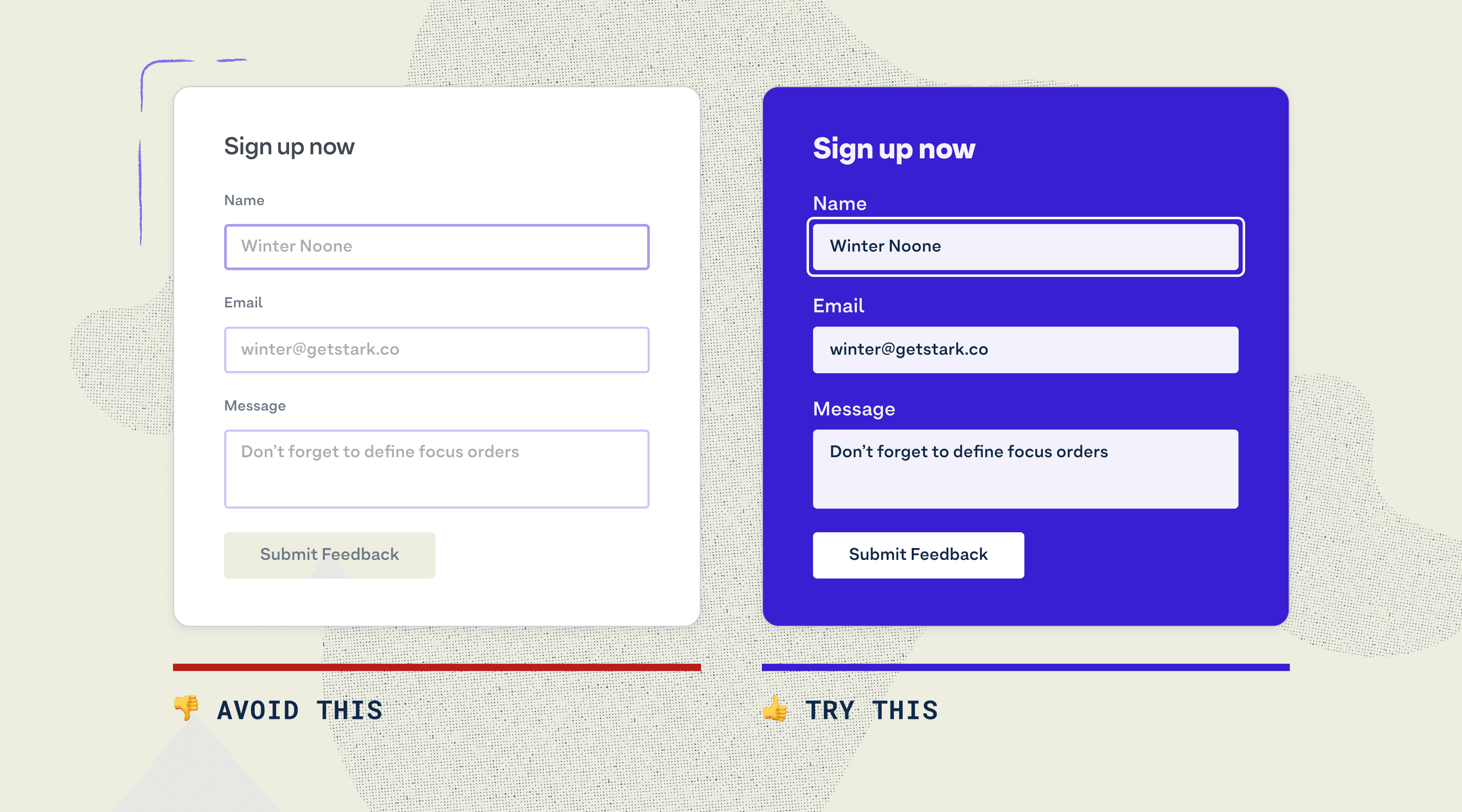
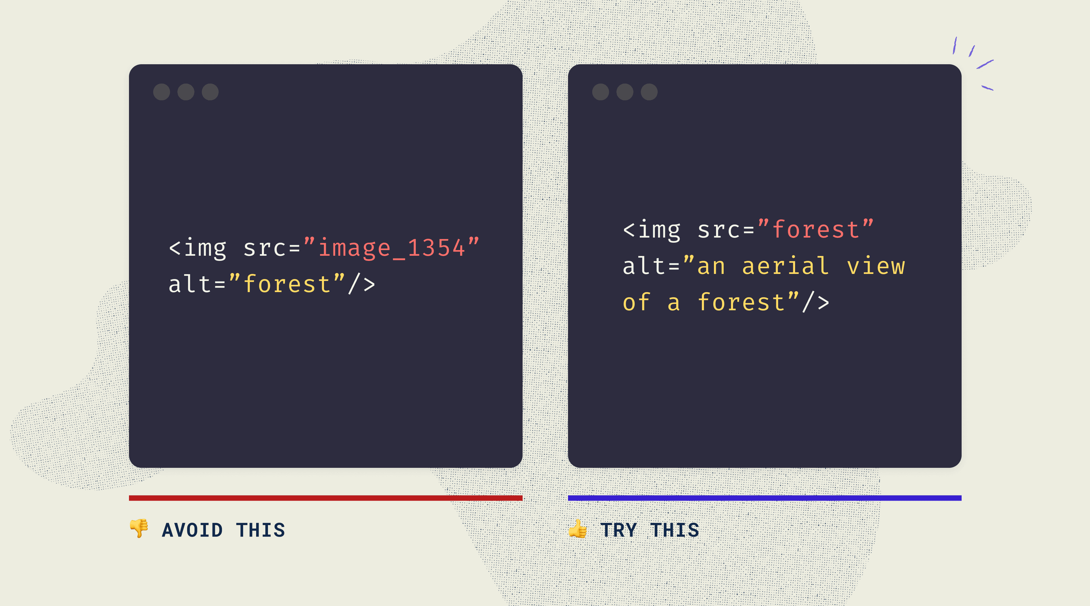
Text alternatives such as data descriptions and alt-text should be available for non-text content like images, icons, and buttons.
-
Transcripts, captions, audio descriptions, and even an ASL interpreter should accompany multimedia.
-
Users should be able to adjust or adapt your content to suit their needs best (ex. portrait vs. landscape view).
-
Content should be easy to see and hear (ex. background audio can be turned off or lowered).
-
Operable
-
Users should have ample time to consume content (ex. option to pause carousels to take in information).
-
There needs to be a warning for flashing content, or it should be removed to avoid causing seizures or other physical reactions.
-
Your content should be easy to find and navigate (ex. screen reader users can navigate your website with the help of landmarks).
-
Users should be able to access your content through various input modalities (ex. keyboard, touch activation, voice recognition, and gestures).
-
Understandable
-
Text should be readable and understandable.
-
Content should operate and appear in a typical manner (ex. your navigation bar should appear the same from page to page).
-
Mistakes should be easy to avoid and correct (ex. ability to edit a form after submission).
-
Robust
-
Your content should be compatible with various devices, browsers, and tools such as current and future assistive technologies (ex. include a name, role, and value for every non-standard component to help maximize compatibility).
3. Test regularly and fix quickly
Accessible components don’t always mean an accessible digital product. It’s essential to take a holistic approach and actively test for issues at the components level and beyond. This can look like:
-
Component testing to make sure your master components are as accessible as possible.
-
System testing to make sure they work well in combination with other components.
-
Functional testing to make sure the end result (i.e. navigation at the page level) works well with keyboards and assistive technology.
Depending on which type of test you're conducting, you’re going to want to take a hybrid approach where you test with internal experts and external users. Similar to the audit, you can test internally by using automated tools and a screening process to spot general issues. However, to get a deeper understanding of how accessible and usable your product really is, you’re going to need to test with real people.
In addition to testing, the most inclusive products are the ones where users bring up accessibility issues, and teams prioritize fixing them the same way they would with product bugs. This is because accessibility issues are usability blockers for your disabled user groups. So if they’re not taken seriously and fixed in an adequate amount of time, you’re risking losing a large segment of users and opening yourself up to a potential lawsuit.
The beauty of building accessibility right into your components is that the improvements you make from the start multiply as you use and reuse the component in your digital product. It allows you to fix any accessibility issues that arise brick-by-brick and quickly rebuild your house without incurring too much accessibility debt.
If you’re starting your accessibility journey a little later and looking to update your existing components, that’s okay too! It’s never too late to start an audit, iterate in parts, and document the steps you took to make the components accessible.
Want to join a community of designers, developers, and product managers to share, learn, and talk shop around accessibility? Join our Slack community, and follow us on Twitter and Instagram.
To stay up to date with the latest features and news, sign up for our newsletter.