How we’re evolving Stark’s color palette to scale
Our design team set out to create a single color palette to use across the Stark experience—everything from illustrations to buttons. Here’s what we’ve learned from the process.

Tanguy Géréec
Dec 08, 2022

Over the years, our existing color palette grew organically. What started as a couple of brand colors—teal, purple, bone, and yellow— that encapsulated Stark’s humanistic values in a world full of inaccessible technology now contains elements to cover all our product design needs.
But as our palette was getting more extensive, it was also getting messy. We wanted to find a way to keep things clean and scalable as the product continues to grow.
Because we’re a small design team here at Stark, we sometimes have to solve problems on a case-by-case basis. When it came to our color palette, we found that we were often creating new colors that could serve similar purposes. We had too many shades of individual colors and no clear rules for creating and using them across our product experience.
Given the speed at which we build and ship new products, chaos was waiting to happen.
Our original color palette was simple, with strong, vivid colors that reflect who we are as a company. While we chose these colors to work for various audiences (e.g., we picked slightly muted colors that wouldn’t feel overwhelming to neurodiverse people), they weren’t as effective for Stark’s growing functional UI needs. So, we needed an approach that would make our palette more flexible and give our designers more choices.
We’re excited to share how we’re evolving our color palette to scale while keeping it as uniquely Stark as ever.
Our setup
I want to quickly mention the importance of choosing the right criteria and tools. We 1st tried to create consistency and structure around our color palette a few months ago, but it was unsuccessful.
Why? The rules we created focused too much on the how, not our desired results. By the end, we had a color palette that didn’t quite feel like Stark, even though it was technically well-constructed.
This 2nd time around, we applied our learnings and defined a list of criteria to inform our work.
Our goals
As I mentioned earlier, our existing palette didn’t have rules to guide us or ensure consistency across the experience.
So we aligned on criteria for our new palette to keep us focused:
-
Create a predictable yet open system
-
Leave our brand colors intact
-
Include enough shades to cover a variety of use cases
-
Ensure all shades have the same level of perceived lightness
Once we had our goals, it was easy to translate them into constraints we needed to solve. Take create a predictable yet open system as an example. As a goal, it’s too broad and doesn’t give us clear objectives. But we can add some parameters to make it a constraint:
To create a predictable yet open system, we shouldn’t exclude certain color combinations. Instead, we should clarify which combinations pass accessibility criteria.
This way, you enable a much faster way of working while allowing designers to experiment with color pairings. And we could do this with our other goals, too:
-
To leave our brand colors intact, we need to incorporate them as is in the palette.
-
To include enough shades to cover a variety of use cases, we want colors to have
-
2 light shades, mainly for backgrounds and illustrations.
-
3 medium shades, mainly for illustrations.
-
5 dark shades, mainly for meaningful content.
- To ensure all shades have the same perceived lightness, we need to work within a uniform color space like CIECAM02 (the color appearance model published in 2002 by the International Commission on Illumination) or Oklab (a perceptual color space for image processing).
Our method and tool of choice
When starting from scratch, creating a color scale usually works like this: You find a color you like, then increase or decrease the lightness to make different shades.
That’s why so many designers love to work with HSL (hue, saturation, and lightness) representation rather than raw RGB values. HSL is predictable because it follows this basic principle: A higher L value means a lighter color, and a lower L value means a darker color.
While HSL is useful for creating a linear palette, I saw 3 main issues:
-
You end up with inconsistent contrast ratios. For example, a red and blue shade with the same lightness value of 90 will have different contrast ratios when compared against white.
-
It’s time-consuming since you must manually figure out which shades you can use for content based on the WCAG guidelines.
- Linearity isn’t ideal if you need to keep existing colors intact. Keeping our brand colors would break the linear aspect of the scale.
Throughout this journey, we relied on Stark’s Contrast Checker to assess multiple color combinations. What better way to build a tool than to use it daily?
We also used the tool Leonardo since it allowed us to generate more representative color scales.

Doing the work
When we set out to create our predictable system, we started with a question: In our palette, what if all dark shades could be accessible against all light ones? For example, what if a dark shade of green or blue could be accessible on a light shade of orange or red without a designer having to overthink the color pairing?
Then, we went to find an answer.
Starting with light shades
We use the 2 bone colors in our palette quite extensively on the Stark website, like on our homepage.
These bone colors are light enough to feel discrete but not so light that they’re essentially white. That’s a good thing! We want to avoid pairing very bright and dark colors together. Why? Very high contrast can cause eye strain and create issues for people with dyslexia.
To create a palette based on contrast ratios, we needed to start by comparing our bone colors to white and use the values we found as the basis for all our light shades. With Stark, we learned that our bone colors have contrast ratios of 1.08:1 and 1.18:1 against white. For perspective, white against white would have a contrast ratio of 1:1.
Our next step was to generate light shades for each color in our palette. The goal was for each shade to have the same contrast ratio against white as our 2 bone colors. Plus, we wanted all the colors to have the same perceived lightness. To do so, we took the values we found with Stark and entered them in Leonardo.

Let’s move on to how we continued this process to build a predictable system for our color palette.
Building a predictable system
We knew our light shades wouldn’t pass WCAG standards for meaningful content—we needed dark shades. And we decided that our new color palette should have 5 dark shades per color.
Five dark shades might seem like a lot, but not when considering the different minimum contrast ratio requirements defined by the WCAG.
At level AA:
-
3:1 is the minimum recommended for large texts
-
4.5:1 is the minimum recommended for regular texts
At level AAA:
-
4.5:1 is the minimum recommended for large texts
-
7:1 is the minimum recommended for regular texts
That’s already 3 shades we needed to create. When we factored in component states, we needed at least 5 shades to cover every use case in the Stark experience.
We imported our brand colors into Leonardo to find these dark shades. When creating our light shades, we noticed they all had lightness values above 93. And since our light shades will be used as background colors, we needed to ensure that any of our dark shades could pass against them. That’s why this time, we checked everything against a background color with a lightness value of at least 93.

Only 2 of our brand colors would pass certain contrast ratios without making any changes—one at 7.64:1 and the other at 12.23:1. Since we want our brand colors to appear in the palette untouched, we knew we needed to create our dark shades based on these values:
-
3:1 defined by WCAG as the minimum requirement for large text (AA)
-
4.5:1 defined by WCAG as the minimum requirement for regular text (AA)
-
7.64:1 a ratio we reached by comparing our brand colors that also meets the WCAG minimum requirement of 7:1 for regular text (AAA)
-
9:1 a value arbitrarily selected to fill the gap between shades in the spectrum
-
12.23:1 a ratio defined by comparing our brand colors
Then, we returned to Leonardo to generate dark shades that matched the contrast ratios against our background colors. And, once again, we’ve ensured they all have the same level of perceived lightness.
Finding our medium shades
We created our medium and dark shades at the same time. Since our 3 medium shades are mainly for decorative illustrations, there were no strict contrast ratios we had to meet.
So, using the same method, we looked at the contrast ratios for our remaining brand colors and used Leonardo to generate our medium shades accordingly.

We have our color palette!
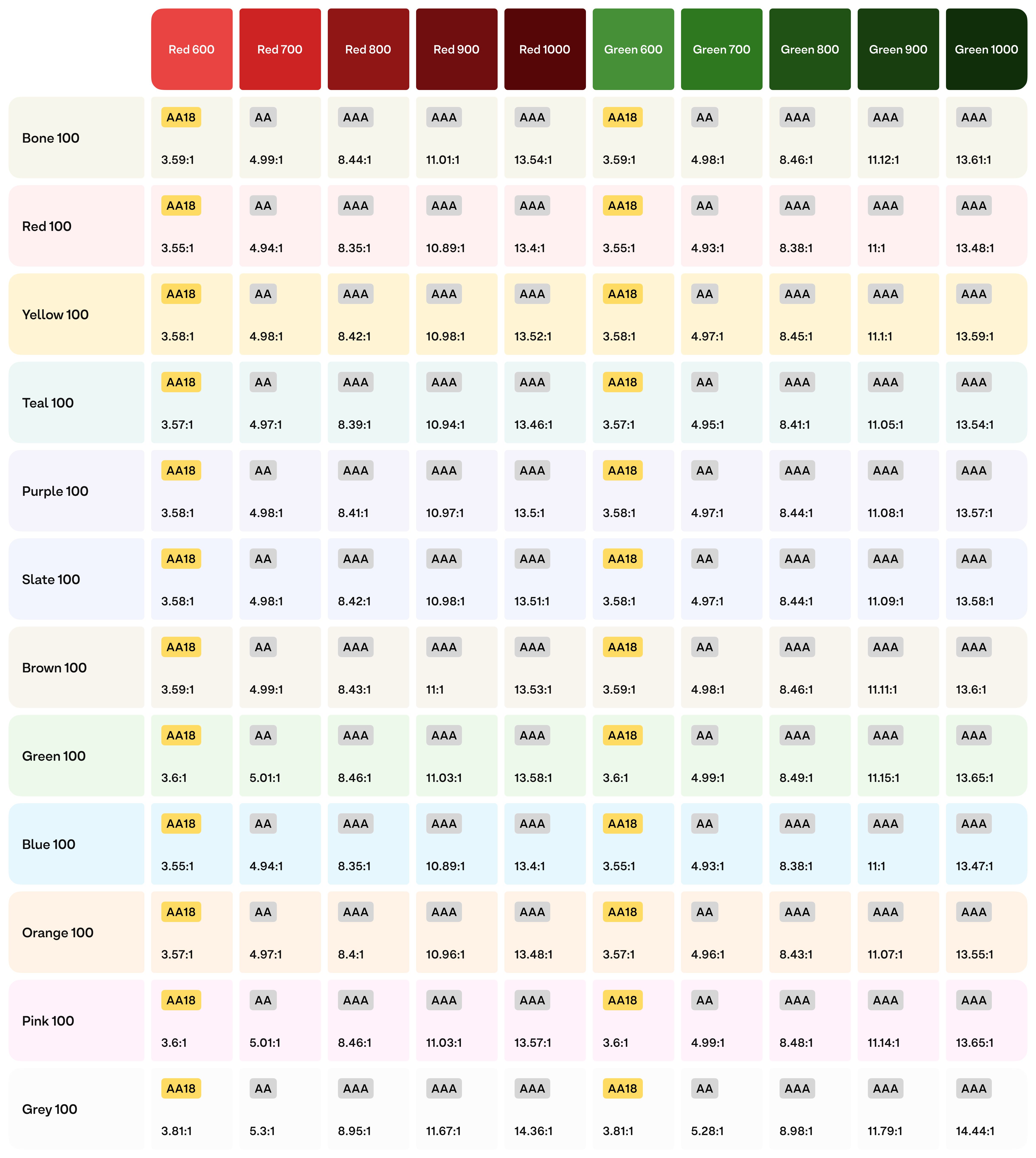
Designers at Stark can now work more efficiently because they know that all our dark shades will have a contrast ratio of at least 3:1 against any light shade. Better yet, the contrast ratios are uniform across shades: Color-600 is at least 3:1, Color-700 is at least 4.5:1, and so on.
That’s predictability!
A quick note about our grayscale
We needed our grayscale to be flexible enough for text, dividers, and other UI elements.
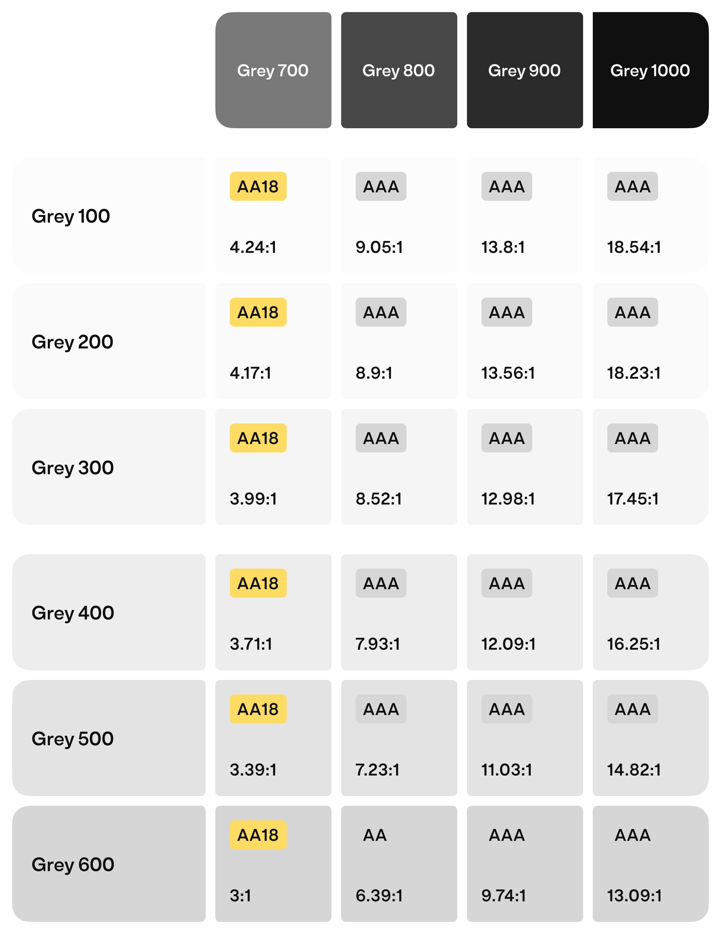
So we ensured the contrast ratios for our dark shades of gray would pass on light shades of all our colors and medium shades of gray.
Key takeaways
We’ve covered a lot in this article. Here are the main things we’ve learned from this process.
Set guidelines, not limits
One problem we ran into with our original palette was that it was too rigid. When we couldn’t find a color we needed, we had to create a new one. Our new palette has established rules to better guide designers on how and when to use different colors.
Complex problems require simple solutions
When setting out to create a color palette that can scale to work for everything, it might seem counterintuitive that the answer is simplicity. But keeping it simple is the best way to ensure consistency and alignment.
Deviating is OK as long as you test
There’s no right or wrong way to create a color palette, but every designer should be confident in making choices. There are a lot of choices to make, but don’t let that scare you—any color pairings are OK as long as you test. Speaking of testing, why not use Stark’s plugins to help make on-the-fly decisions?
So, what’s next?
All that’s left to do is roll out the new color palette, learn from customer feedback, and continue improving. Now that we have this robust system for light mode, we’ve also started working on dark mode.
I want to know whether our customers will notice if the colors have changed. If they don’t, that’s a win because we would have succeeded in retaining the essence of our brand. Ultimately, it’s about everyday use and keeping things simple for customers, and that’s where the real test lies.
Creating colors is easy—the question is whether our customers will welcome them.
Want to be part of a community of accessibility superheroes? Join over 50,000 experts in our Slack community, and follow us on Twitter, LinkedIn, and Instagram.