Introducing an all-new Stark for Figma, Sketch, Adobe XD, and Chrome
Our biggest redesign to date introduces an all-new Stark that gives you a simpler, faster, and effortless experience. Let’s take a closer look at what’s new.

Team Stark
Jun 22, 2022
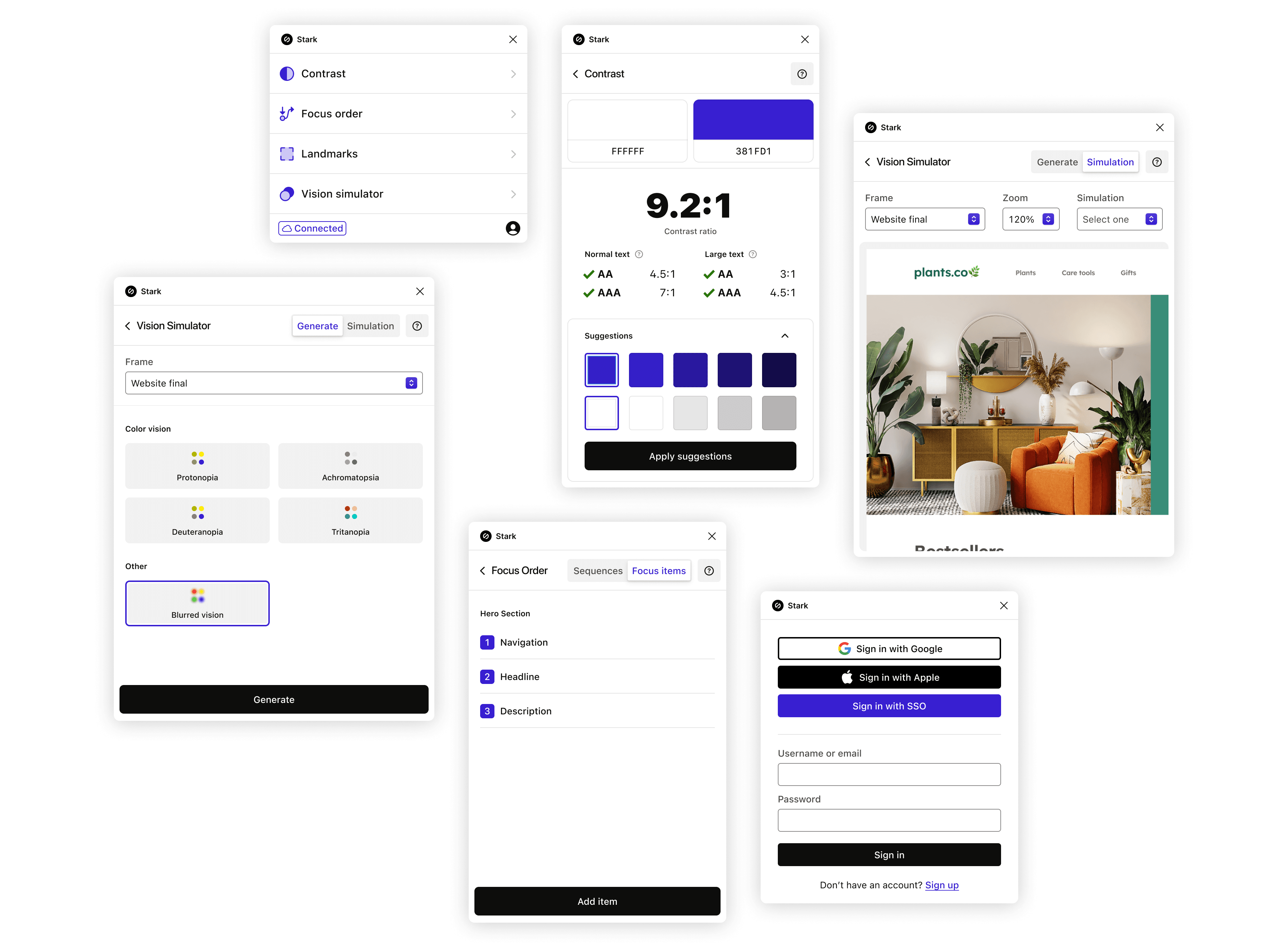
We’re always looking for ways to improve and innovate our products here at Stark. That's why we’ve been busy working on a redesign for our Figma, Adobe XD, and Sketch plugins and our Chrome extension.
For this redesign, we have to thank you, our users, for continuing to give us feedback on how we can make your work easier. You'll see that we focused on simplifying how to access and use the integrations so that you can better streamline your workflow.
As the product grows, simplicity and ease of use will always be our guiding principles. There shouldn’t be a learning curve for using our products. And our new design language allows us to create a consistent experience, no matter which integration you're using.
Let’s take a closer look at how we redesigned our plugins and Chrome extension from the ground up.
How we got here
We have a big vision for our products, and reaching this vision requires the right foundation. Sometimes we have to take a step back and look closely at what we've done so far. In this case, we wanted to see what—if any—parts of the product could be simplified and made easier for your use.
Our process started with a comprehensive audit of our design landscape. That’s a fancy way of saying that we gathered a lot of screenshots showcasing our products and placed them in a Figma file.
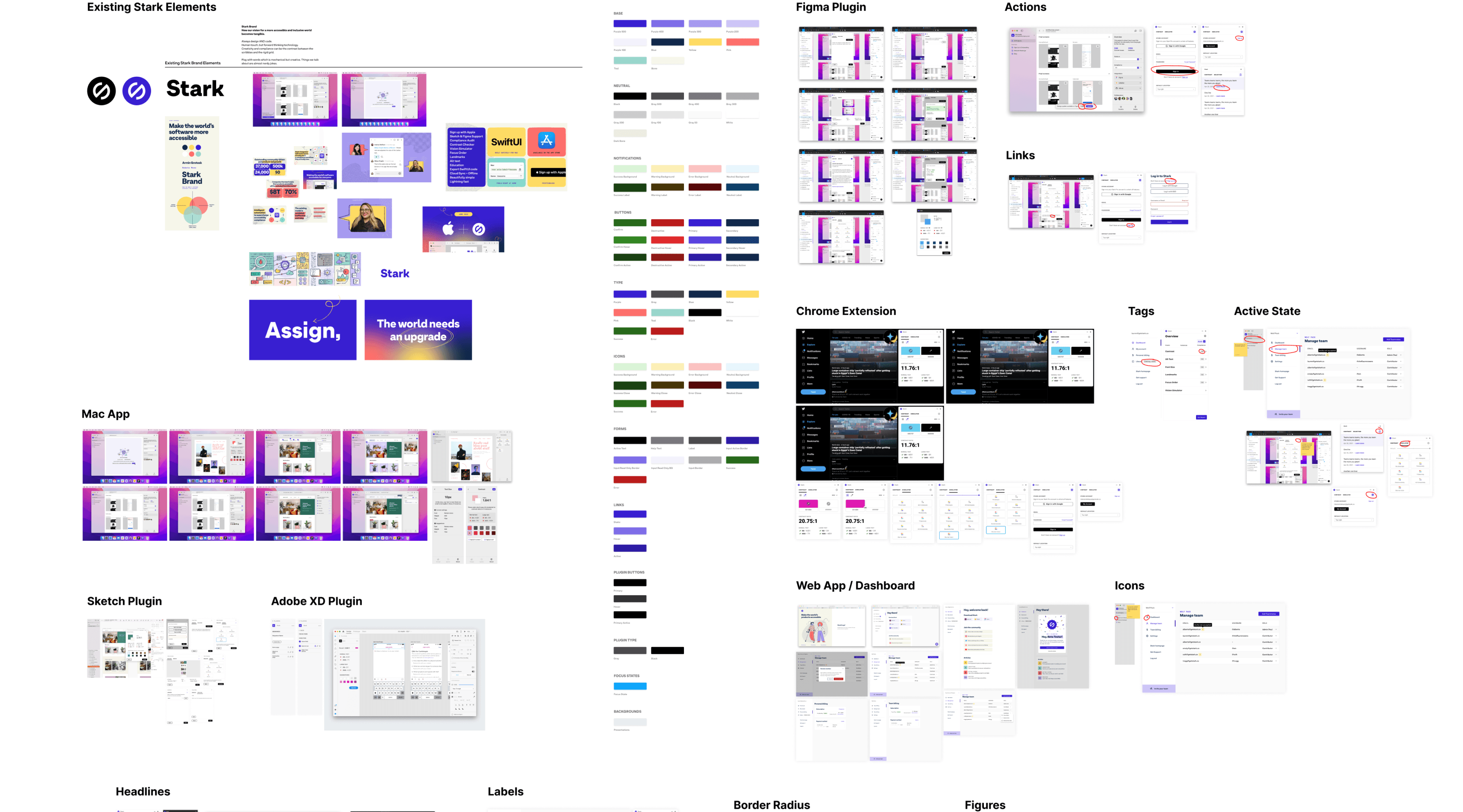
Seeing all these images in one place gave us the holistic view we needed to visualize the full Stark experience. We looked at everything from the entry points of the integrations to the smallest components of every feature.
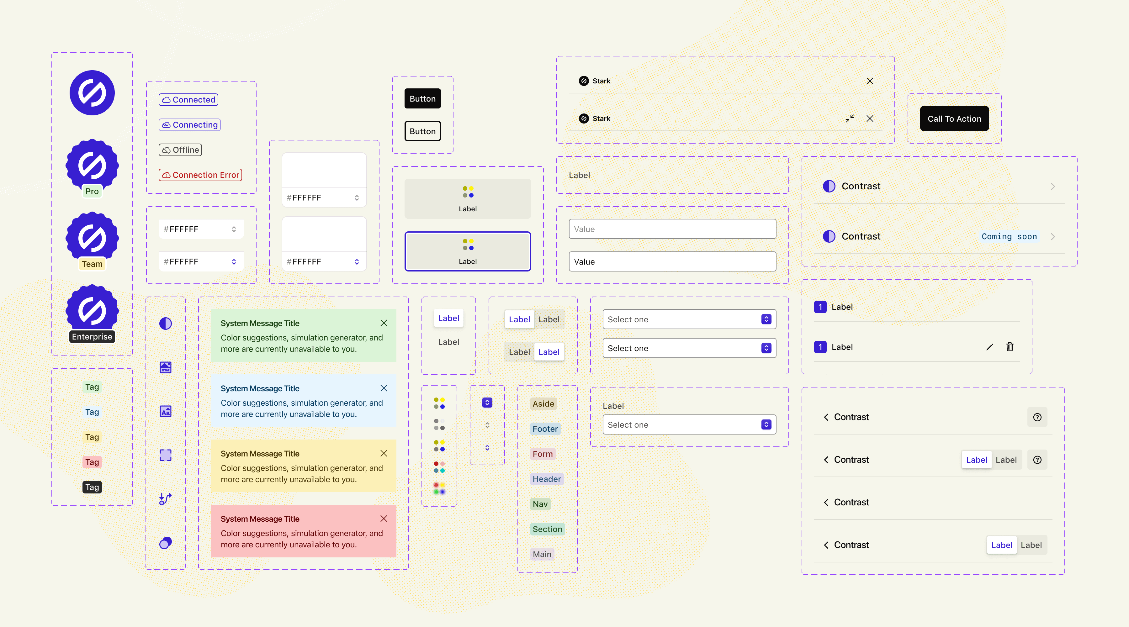
This helped us make important decisions about what our design language should be moving forward. Our hope then is to use this new language to push out the updates you want and need even faster.
The big reveal
Our new design includes better organization, simplified UI, and the accuracy you need to build accessible and beautiful products. We know that you care about the details, and with this update, you’ll see that we do, too.
Better organization to get your job done in no time
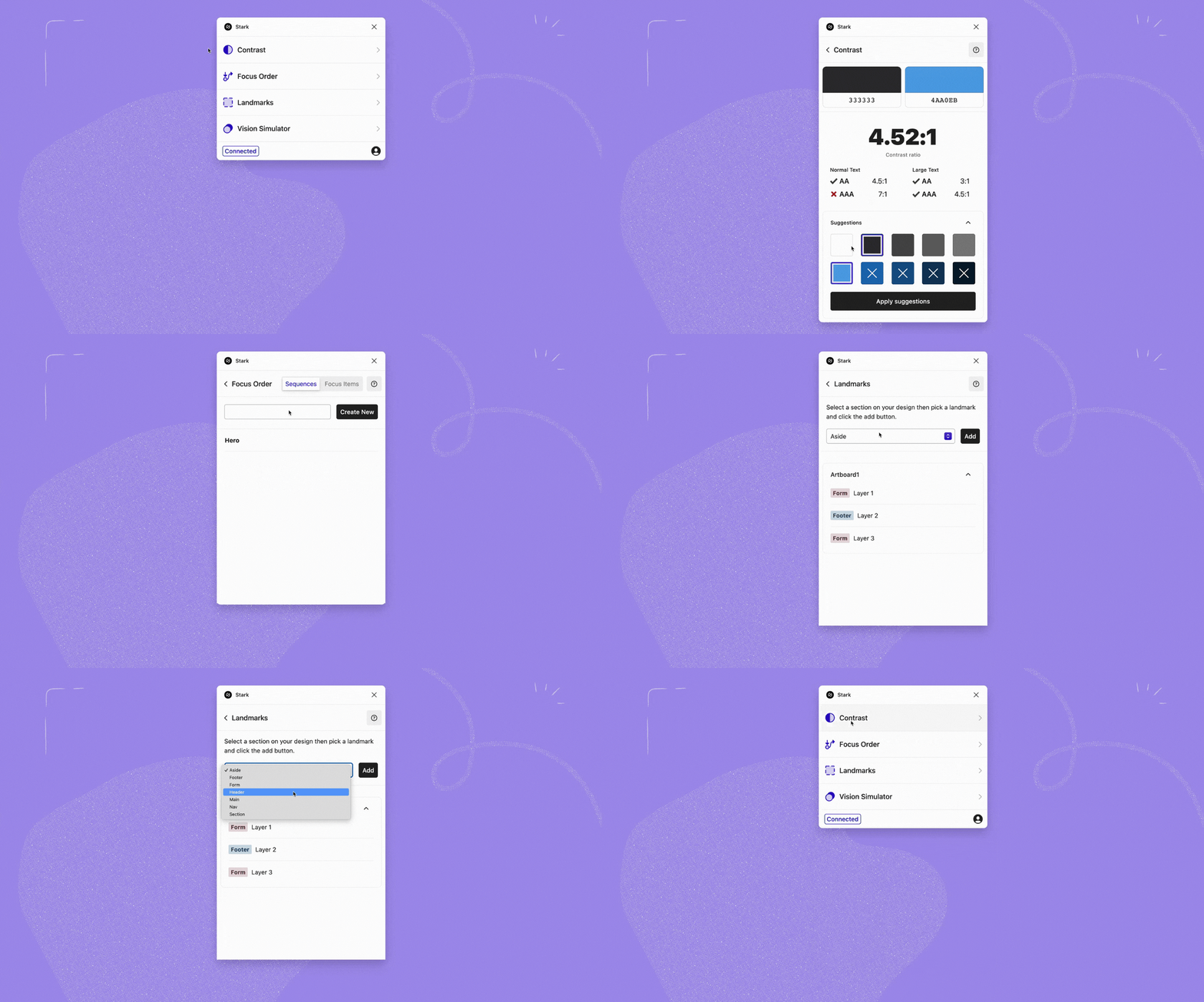
The old way: Searching for tools with your cursor and closing one window you’ve been working in to open a new one.
Now, it takes one click to open Stark, and right away you’re greeted with an overview of all the tools you need to do your best work. Whether you’re checking contrast ratios or defining landmarks, you can keep all your work in one view.
A clearer design for our Contrast Checker
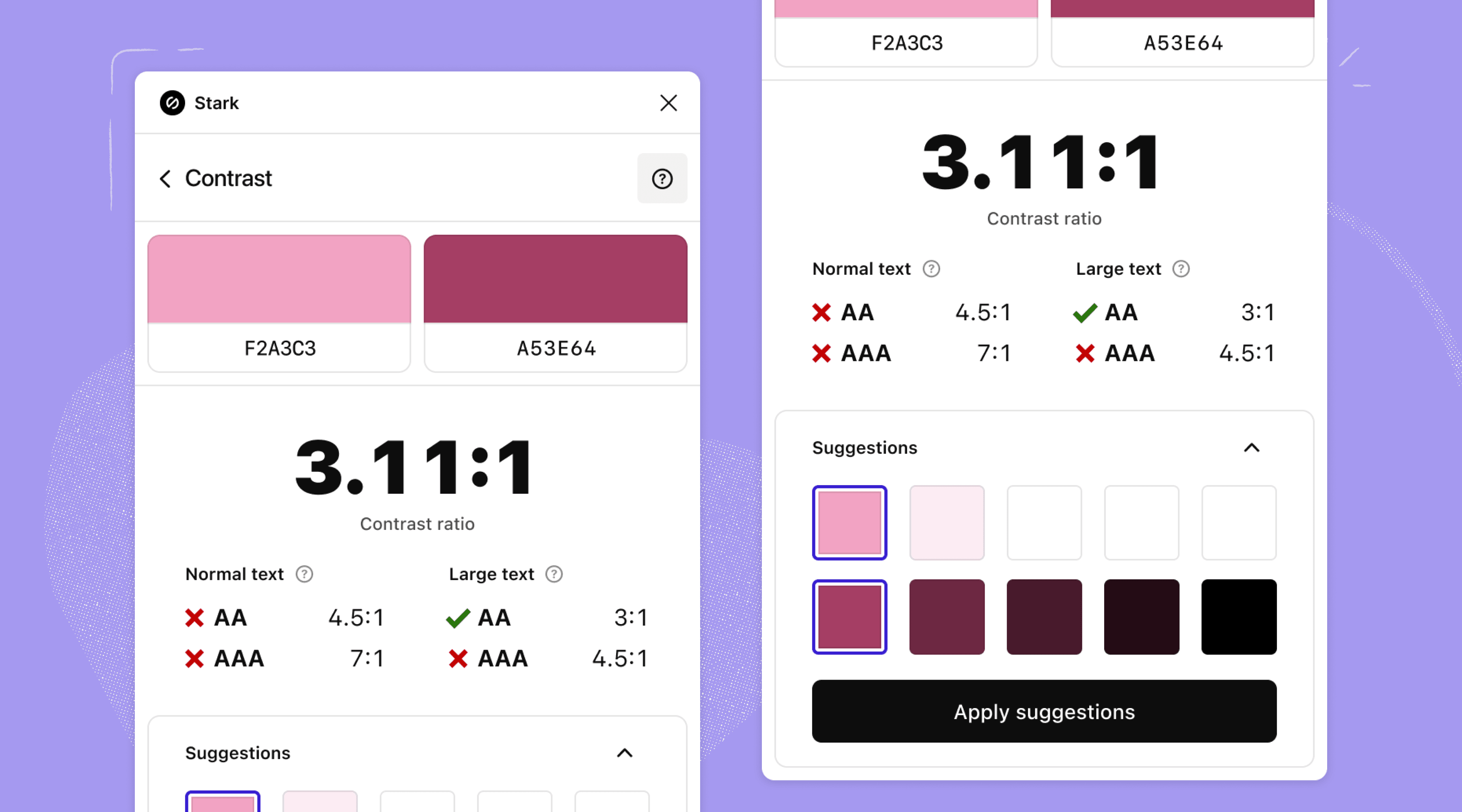
We’ve rearranged the Contrast Checker to make everything easier to grasp at a glance. You’ll also see the color hex codes available as you select the various colors within your design. This makes it easy for you to copy the codes from the value fields and apply them to other areas of your project.
Simplified vision simulations for more accurate results
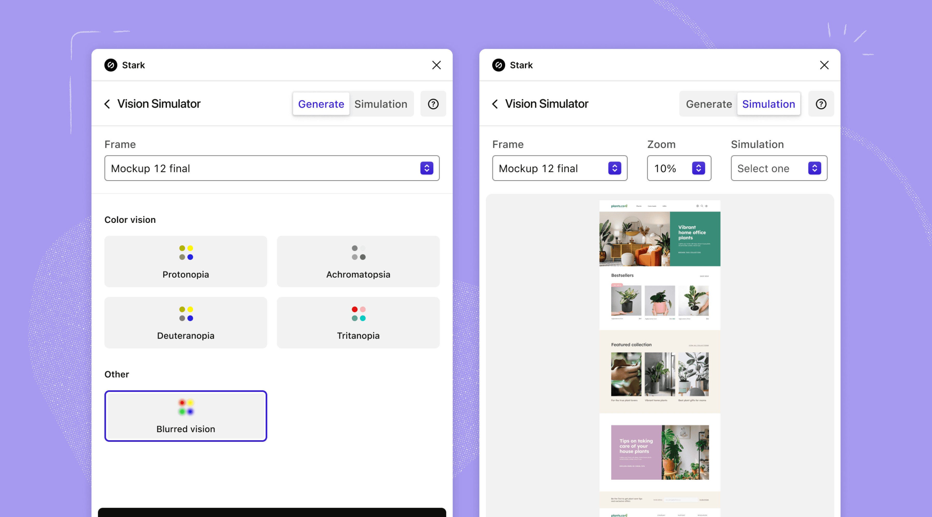
We announced a couple of weeks ago that we've updated our Vision Simulator to adhere to the latest models for generating simulations. Today, we’re excited to share some of the UI tweaks we’ve made to provide you with an even more seamless experience.
You'll see that we've divided the different simulations you can run by type on the ‘Generate' tab. This simplifies your ability to see which simulation is selected at any particular point in time.
Stay tuned: We’re just getting started
Redesigning Stark for Figma, Adobe XD, Sketch, and Chrome is only setting the stage for what’s to come in the next few months. Watch this space for future updates!
In the meantime, jump back into or download our integrations to see what’s new.
Want to be part of a community of accessibility superheroes? Join our Slack community, and follow us on Twitter and Instagram. You can also sign up for our newsletter to stay up to date on the latest features and news.