Simulations are perfectly imperfect
A deep look at the efficacy of simulating color blindness, how to appropriately use simulations, where simulations fall short, and why that is okay.

Tregg Frank
Feb 04, 2021
A core feature of Stark's plugins is the ability to simulate different variants of vision including 4 forms of color blindness and blurred vision. With our growing set of product offerings, it's important to reflect on (and restate) the purpose of our simulations. These simulations can be a really valuable gut check for designers to approximate how someone might see their designs. However, we have to acknowledge where simulations fall short and what their intended uses are.
My name is Tregg Frank, I’m a Product Designer here at Stark. I have severe deuteranopia color blindness, a form of red/green color vision deficiency.
I was nearly held back in kindergarten for not being able to identify colors. One trip to the eye doctor later, we learned that I’m colorblind just like my grandfather was. I’m not certain how severe his color blindness was, but I know that he always wore baby blue because he could always pick it out in the morning. I always wear black.
One of the worst things about being colorblind, beyond struggling to read poorly designed graphs and charts, is the litany of things people inevitably say when they find out. When I was in elementary school people would simply not believe me, or they'd have a complete misunderstanding of what color blindness was. And as I’ve gotten older, the things people say have gotten more “sophisticated”, but no less annoying.
“What color is my shirt/this thing/that thing?”
Didn’t know there would be a test for my disability today.
“What color is grass/the sky?”
I’m colorblind, not unintelligent. Despite all the signals I must give off.
“So is everything black and white? Like Casablanca?”
That’s incredibly rare and not my form of color blindness.
“What if we all see the world differently? Like, what if my red is different from everyone’s red?”
🙄 And what if the moon was your car and Jupiter was your hairbrush? This one is annoying because it feels dismissive of my personal experience while also being 100% unarguable. You can’t really prove or disprove this in a short conversation, despite it being essentially debunked with the use of gradients. However, let's give this a fair shake and deep dive.
This thought experiment isn’t new. The 17th century enlightenment philosopher John Locke wrote about this and called it the “inverted spectrum”. When not taken to be so literal, it raises interesting questions about “qualia” or variations in our individual perceptions of reality.
The concept of qualia as a whole is hotly contested by some philosophers because it can't be proven or disproven scientifically. Qualia aren't supposed to be tied to any physical differences, and in the case of color blindness and other vision disabilities there are observable physical traits leading to the disability. That said, it's a helpful device for us here. If you can imagine that some people have different experiences, we’re on the right path. This is a big part of why it's so important to have diverse teams and to test your products with a diverse group of people.
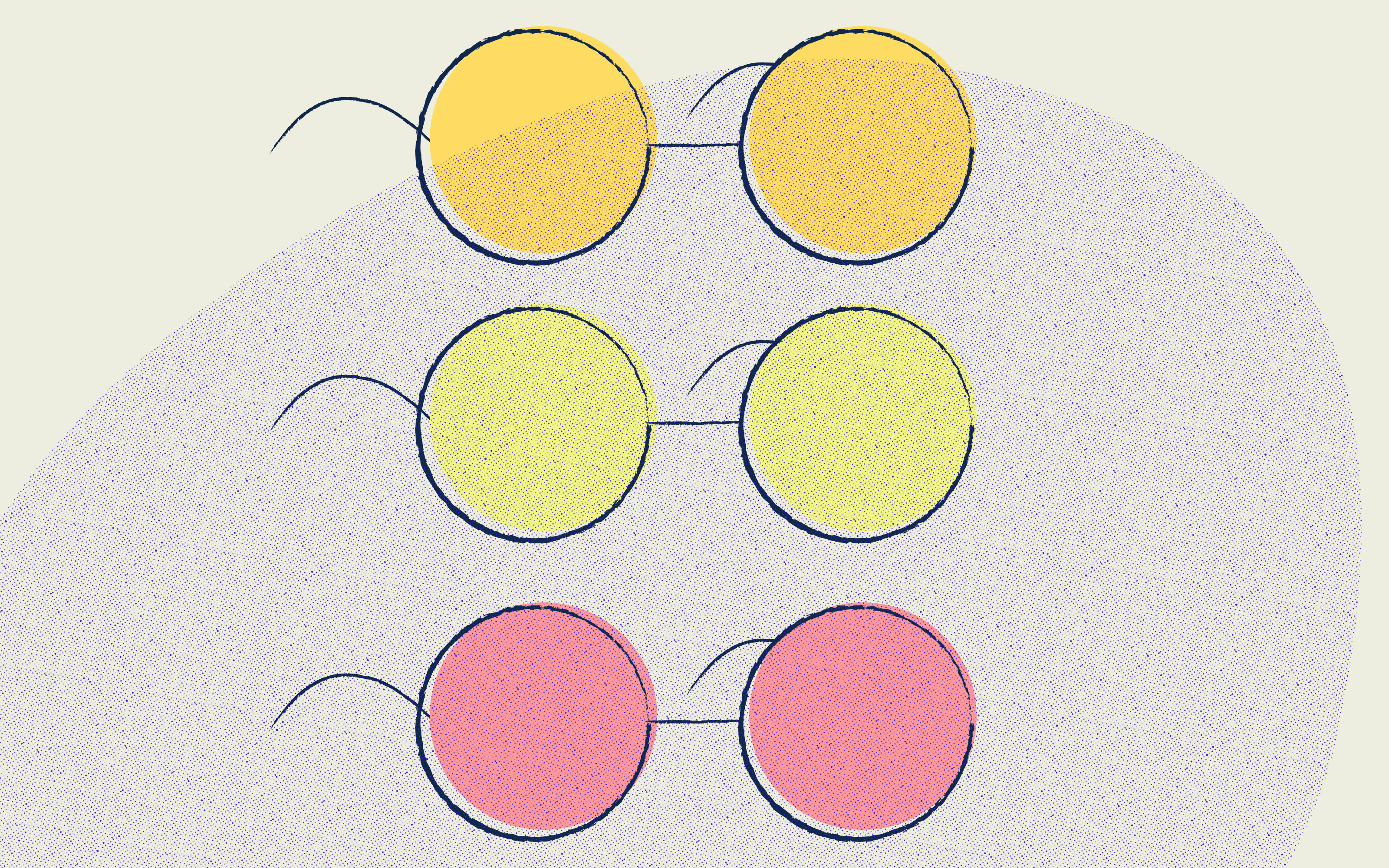
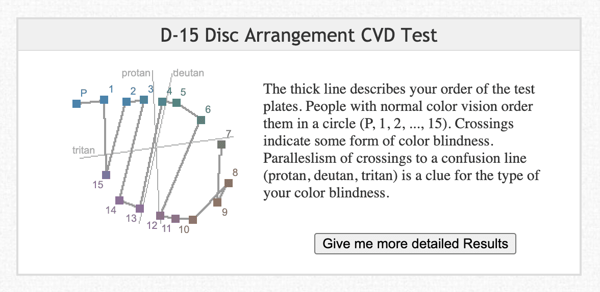
No two people experience the world exactly the same. Your blue just might be a bit different than my blue. While I completely disagree that your blue may be my yellow, it stands to reason that people have different color vision sensitivity. You can prove this with a color arrangement test. Color arrangement tests are my preferred test for color vision deficiency. The test taker is presented with tiles and told to put them in order. The results reveal specifics about how your color perception varies from normal color vision and the severity of the deficiency rather than just being a boolean yes or no answer. Have any number of people with normal color vision take the test and you’ll still see small discrepancies.
Now, since we’re on the philosophical topic of subjective experiences and qualia, we should talk about simulations and simulacra.
Simulacra are imitations of real things, experiences, and people. Approximations. The product development world is chock full of simulacra, and odds are high you're already using them. Personas, user journeys, user stories—all of these things are simulacra.
Personas can be a good way to build compassion and use as a gut check as you work. For teams and companies who aren't used to actively designing for their customers at all, you can ask yourself things like “how would Pat respond to XYZ?” as you work on new features, imagining how Pat might respond.
However, personas will never be able to replace your customer. The problem a lot of people have with personas are that they often are used as a replacement for research. That should scare you, not entice you. You don’t consult a map to learn about the culture of a country, you visit it and talk to the locals. A persona cannot replace a real customer’s rich stories and experiences.
The French post modernist Jean Baudrillard argued that simulacra are just as real as the original, but wholly new. And that they no longer require an original as they become just as real. He’d say this results in a “hyperreality” where what is fiction is real, and there exists no clear distinction between simulation and reality.
In unobscured words, and with a dose of my personal opinion, sometimes we take simulations and make them more real than they actually are. Doing so is risky and we should be careful with it. Stark’s vision simulations are not real people’s vision; they are simulations of people’s vision averaged out into one image. They are simulacra. If we were to assume that our simulations were perfect and accounted for everyone's vision we would inevitably run into situations where that was not true and it could result in broken experiences for people. Much like a persona doesn't replace a real person looking at what you've designed, a Stark vision simulation cannot fully replace them either.
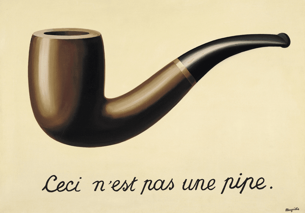
You may have heard the phrase “the map is not the territory”1 before. That is to say, a map of something is not the thing itself. A map of Texas is not Texas, it is a map. A painting of a pipe is not a pipe, it is a painting. A simulation of color blindness is not color blindness. These things are representations. Also a form of simulacra.
Yet it’s fairly common to see people running the same design through our simulations and a couple other simulation tools in order to compare and nitpick the results. When there are inevitably differences, they’ll send them our way. While it's clear this behavior stems from a well intentioned place (bug checking for us, wanting to do right by their customers, etc.) I also believe their doing so is rooted in a fundamental misunderstanding of the use of a simulation like this.
Our simulations are not literally seeing through someone’s eyes, and neither are the other simulators out there. They are simulacra. They are a map. And we hope (and urge) you to use them as tools to gut check your designs, not as a replacement for, but rather in conjunction with, real people. Hopefully they help make those first conversations easier, but you still have to have the conversation.
Simulations are not reality.
It is an approximation of the experience of a colorblind person.
Color blindness is not a universal experience.
It's impossible to perfectly emulate every possible way someone could potentially see your product because people are just more complicated than that. This is echoed in human behavior as well. People are rationally irrational, and our data as product teams is only as good as the questions we ask and the means by which the answers are measured. My color blindness looks very different from my colorblind friend’s experiences. He loves to wear purple because it’s a color he can pick out while I don’t know that I even fully understand purple. The Stark brand purple looks blue to me, and our deep blue looks purple. Wild, I know. There is no good way for us to know how differently we see the world, but it’s clear that we do.
Simulations are not a call to fine tune your hexcodes.
We are not saying “a colorblind person will see your design exactly this way”, we are saying “this might be what a colorblind person will see”.
The way to triage those issues shouldn’t be to fine tune hexcodes so that they just barely work across all the different types of color vision, but instead to make them different enough that it doesn’t matter at all. The colorblind simulations should enable you to push yourself towards accessible design decisions, such as having more than one identifier of state than color alone. This could include shape, pattern, iconography, font weight, underlines, shadows, and more. Just change two things between states at a minimum, and you'll be groovy.
While our simulations currently don't offer explicit solutions to gestalt issues, hierarchy issues, or interaction design missteps out of the box, it's our intention to provide you with a set of tools to discover these issues on your own as a first step. And, at the end of the day, that's what Stark provides you with; tools. Our tools often start conversations. I hear stories from our community all the time about how they ran the Stark simulator or checked the contrast of a UI element in their design system and it failed, sparking a lengthy ongoing conversation about rectifying these issues. So while it's our job to work every day towards helping you solve your problems, the onus is still on you to have those conversations, internally and externally.
Real people—your customers—provide you with rich stories, personal experiences, compassion, meaningful empathy, and often genius solutions. You just have to talk to them.
2. Michel Foucault, This Is Not a Pipe, Published August 16th 1983, Available on Goodreads
What is your opinion? Where do you draw the line on simulating other people's experiences? How do you use simulations in your daily workflow?
Join the conversation with other designers, developers, and product managers on our Slack community, or chime in on Twitter and Instagram.